Monday, October 31, 2011

Halloween Distractions: Infographics as Literacy

Source: ANidea
As teachers, we know that Halloween is a distraction for most students, young and old, so why not turn it into a lesson using visualizations? Heck, they already have prior knowledge about the topic, even though they may not know all the facts represented in the infographics seen here. What better way to teach to their interests than to keep them glued to the blood and guts of the holiday? It is not unlike the post we did on S'Mores and other sweets that focused on candy as a universal theme to engage students. These graphics, though, have images and data about costumes, candy, pumpkins, treat-or-treating and more.

Take a look at Halloween Trends: 2011 from ANidea to find out the percentage of people attending parties or dressing up their pets. Have students locate the number of people who plan to carve pumpkins or how many billions of pounds of pumpkins are produced each year in the United States. Better yet, engage them in a little math with the number of trick-or-treaters their age or percentage of the total population.
Source: History.com
Want them to sink their teeth in a little more? Try using the infographic Halloween by the Numbers designed by History.com and Column Five or Halloween by the Numbers from Credit Donkey. Each of these provides a host of data related to the holiday rituals.
Source: Webtrends

Source: Bit Rebel
Spooky Stats Halloween Buzz from Webtrends is one more to add to the mix. Check out the hottest Halloween costumes of 2011. It looks like the Zombies have it in the classic category by 35%. Have students analyze the information in these infographics to determine and compare the differences in reporting the data. This can lead to a good discussion on checking sources and looking for conflicting information. These visualizations can lead to broader discussions about the financial and media impact on the consumer.

If you want to add a little geography and folklore to your Halloween lesson, check out Ghost-Proof Your House: 11 Ways the Superstitious Keep Evil Spirits at Bay by Colin Dobrin. This neat little infographic contains tidbits about superstitions, from not having the number of stairs divisible by three in the Philippines to building a tall spire in the northwest corner of your property in Japan to fight off evil spirits. For the older students and the not-so-sweet side of Halloween, take a look at The Darker Sides of Halloween from Bit Rebels. This infographic contains some pointed facts and numbers on Halloween crimes, pokes fun at holiday paranoia, and describes bank robbers in costume.

If nothing else, on Halloween when their attention is on candy, costumes, and getting out of school to trick-or-treat, infographics such as the ones seen here can keep them engaged in the classroom. More importantly, they provide a fun way to give students practice at analyzing visualizations to increase their skills in graphicacy, to learn a little economics, and to understand the hype behind Halloween.

Saturday, October 29, 2011

Using Visual Language in the Classroom

Most teachers try to incorporate hands-on activities that invite students to use their imaginations. Sometimes these investigations involve technology, but often they rely on everyday pens and paper. If students are drawing political cartoons, diagramming maps, or decorating Greek urns, they often complain that "they're not good artists." Telling them, "it's okay, just draw stick figures," seems like a strange response from an educator. We wouldn't tell a math student, "it's okay if you're not good at multiplication, just use addition." We wouldn't tell a music student, "it's okay if you're not good at piano, just hit middle C again and again." We would ask them to try, right?

Even though we're not art teachers, we like to use visual projects in our lessons. Art is fun for children and excites the mind, so it's worthwhile to build in a few specific tools to enhance the joy of learning. Developing a common language to talk about visual literacy can be helpful in designing graphs, timelines, flowcharts, and PowerPoint slides.

Dave Gray, founder of the Visual Thinking School and writer of Communication Nation, has developed a short lesson in visual language. He offers an insightful overview of forms, fields, and flows -- the specific dots and lines that make up a picture. In a soothing voice and unassuming manner, he presents a terrific video about "the alphabet of visual language."


This basic primer in communicating through drawing has numerous benefits in daily lessons. Students can effectively generate Prezi layouts and decision boxes. They can create organizational charts, map legends, and meaningful spaces. The little skills of perspective and unity lead to larger skills of cause and effect and sequencing. Moving from the literal to the symbolic is a valuable mindset not just for art but also for math, literature, history, etc. In drawing and coloring, students are unknowingly internalizing the techniques of graphicacy.

By the way, Gray's book, "Gamestorming: A Playbook for Innovators, Rulebreakers, and Changemakers," seems like an interesting read for young entrepreneurs. Gray has experience in starting a business himself with his visual thinking firm, XPLANE.

Wednesday, October 26, 2011

THINK - The Imagination Age

Source: IBM, ASIDE
Leading educational thinkers have dubbed the current century the "Imagination Age," in which schools need practical approaches for teaching conceptual thinking. A project out of the University of Louisiana at Lafayette, led by Rita J. King and Joshua Fouts, has assembled a laboratory of resources and ideas to aid educators in teaching imagination. GOOD magazine notes the directors' emphasis on "a time during which humanity must imagine and then create, together, the systems of the new global economy and culture." These rich lessons and tools aim to "create the future of education and work."

Source: IBM, ASIDE
In a similar vein, the IBM THINK exhibit, celebrating creativity and innovation, ended its month-long staging at Lincoln Center in New York City on Sunday, October 23. The modestly promoted presentation honored the company's 100th anniversary by attracting curious crowds to its free, multi-sensory experience. Euro-techies and whiz kids mingled with century-savvy seniors in equal appreciation of the on-going pioneering work done with data. IBM's mesmerizing three-part showcase made for a rapt hour of education and enjoyment. It reminded us of MOMA's riveting "Talk To Me" display in its stunning visuals and enlightening facts. If you missed IBM's show, here are the take-aways:

The exhibit unfolded in three successive parts: the data wall, the immersive film, and the interactive experience.


The data wall spanned the length of Jaffe Drive beside Avery Fisher Hall. In a benched alley, visitors could absorb streaming figures and extended visuals about air pollutants, boulevard flows, world nutritions, and other animated illustrations. Live sensors around the city – and around the world – collected statistics about exhaust and traffic to relay immediately to the enormous digital display. Much like starkness and immediacy make Washington, D.C.'s Vietnam Memorial an emotional experience, so, too, did the THINK wall ask humility in the face of everyday life.
Source: IBM, ASIDE

After soaking in the graphic wall, ticket holders moved to the inside immersive film. A ten-minute broadcast flashed piecemeal on separate screens, inviting the viewer to submerge himself within distinct scenes played out on different displays. The video chronicled the impact of emerging technologies in improving life-expectancy and life-quality. Specifically, the THINK engineers emphasized five modes of thinking toward human progress:
  • Seeing
  • Mapping
  • Understanding
  • Believing
  • Acting

Source: IBM, ASIDE
Much like the new vocabulary for educators, IBM's notions are the essence of creativity. At the end of the IBM film, each panel transformed into a dynamic touch-screen, on which visitors could explore the nuances of each mode of progress. With five different types of visual interactions, people roamed the room to prod the various forms of visual mapping. They explored means of predicting wealth, weather, and viruses. Each optical panel prompted a poll for viewers to become part of the accumulation of human data.


Source: IBM, ASIDE
In all, the IBM THINK exhibit was noteworthy for its price (free), effort (considerable), and vision (progressive). The larger-than-life design of data made for captivating considerations of birth rates, agriculture, medicines, genomes, avenues, calendars, navigations, and energies. It was visual thinking in a democratic society. If every Fortune 500 company cheers its success with a similarly public commemoration, then we can applaud corporate karma.
Source: IBM, ASIDE
Source: IBM, ASIDE

For students, these lessons about the future of data usage offer thrilling conversations about energy, pollution, agriculture, and security. How to manipulate the world's mountains of information will define the nature of human progress. Teachers can nurture creativity and initiative within today's young people for them to emerge as generational leaders.

By the way, we have no affiliation with IBM. We just thought the exhibit was cool.

Sunday, October 23, 2011

4 Ideas for Teaching about "Occupy Wall Street"

Source: NYTimes,
Seymour Chwast
With the Occupy Wall Street movement growing in global strength as it heads into its second month, our students increasingly have been asking questions about its origin and message. Since we constantly press them to pay attention to the news, it seems counter-intuitive to avoid a lesson about this particularly topical "current event."

Source: NYTimes, Triboro
We've talked before about incorporating visual analysis into current event discussions. For us, these news chats often occur on Monday mornings or after primary debates, as both students and teachers are warming up to class time and reacting to louder-than-normal headlines. For the Occupy Wall Street (OWS) protests, as with presidential elections or foreign invasions, it might be worthwhile to devote more time to a full, educational investigation. Here are four possible ways to incorporate visual methods into teaching about OWS:

Source: NYTimes,
Chermayeff & Geismar
Messaging
Many questions are being posed about the purpose of the marches or the demands of the protestors. The New York Times recently commissioned leading graphic artists and marketers to design possible logos to brand the OWS movement. We've used branding lessons before with our students as part of our media literacy curriculum. Here, the OWS events offer keen opportunities to combine media literacy with financial literacy. The two literacies lie on the same spectrum and are more closely linked than most students might realize. Integrating media and financial literacy, rather than isolating them in simplified units, helps students see connections between stock markets and corporate identities, between profit seeking and advertising. In the coming months, we will be sharing ideas about blending media and financial literacy at the annual NCSS and AMLE conferences. If you are planning to attend either of these valuable gatherings, look for our presentation, "Where Financial Literacy Meets Media Literacy: Integrate, Don’t Isolate."

Source: NYTimes, Ji Lee
With our seventh graders, we took the creative New York Times illustration and split it into individual slides. We then showed each of the logos to the students and asked which emblem they found most compelling. We first displayed the images, and then we revealed the designers' rationales. Each description offered a chance to talk about regional movements, wealth concentration, and graphic icons. The students voted that Triboro's circle logo was the best badge to capture the heart of the OWS message. Some of their comments were: "It has a hidden meaning." "I like the circles, because they're easy to recognize and anyone can draw them." "It's simple like Nike or McDonalds." "It relates to America."

Source: NYTimes,
Project Projects
Opinion
To survey popular perspectives about the OWS movement, political cartoons can offer a sampling of clever opinions (check out this earlier post about cartoons in the classroom). Daryl Cagle's Political Cartoon Index features the leading editorial cartoons each day from all major news categories. Cagle's collection of OWS cartoons presents sharp commentaries from both the pro- and anti-protester camps. In working through these drawings with students, we use four discrete steps to understand an image. These steps include: Substance, Scaffold, Story, and So What?. Our students enjoy finding cartoons in newspapers and magazines and bringing them in for our class bulletin board. Their student-initiated habit helps inspire self-motivation and visual thinking.

Primary Sources
In order to get a sense of the actual people populating the protests, we showed several photo slideshows from Zuccotti Park. Putting faces to the movement helped students identify the human side of the rallies and camp outs. It allowed students to make up their own minds about whether they supported or disdained the characters in the demonstrations. Many news sites feature high-quality photographs. C-SPAN Classroom also assembled a brief educational video vignette. These organizations each offer slightly different slideshows and interactive displays to give a sense of the activists:
Source: NYTimes, Drea Zlanabitnig

Statistics
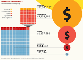
Finally, income gaps and wealth disparities can be difficult concepts for students to internalize. Fitting today's statistics into historical lessons about the 19th-century Gilded Age or the Roaring 20s credit balloon can help put profit and debt into perspective. Also, several pages from the U.S. Census and other sources can help students view actual figures of current household earnings. This article from Yahoo! Finance's Daily Ticker, titled "The Top Five Facts about America's 1%," is a straightforward, data-driven look at the "99%" message motivating the OWS protestors. For a more visual (and opinionated) look at wealth disparity in infographics, check out these meticulously curated collections from Mother Jones, titled "It's the Inequality, Stupid" and "Who Are the 1 Percent?"

 Source: Mother Jones, Emmanuel Saez

Update: A new website, Occupy Design, aims to build "a visual language for the 99 percent."

Thursday, October 20, 2011

Design Thinking - Invisible Hearts Project

The Invisible Hearts Project
In this day and age it is routine to hear the daily news reports about cyberbullying and its effect on today’s youth at all ages. Perhaps, too, because it is so often in the news, the victims become another statistic in a world somewhat desensitized to hearing so much negativity. This, however, did not stop a group of Australian students from Ravenswood School for Girls and Knox Grammar to do something about it. They decided that they had had enough and collaborated to create the Invisible Hearts Project to bring awareness to this growing problem.

Without possibly realizing it, these students were engaged in the process of design thinking. They displayed empathy with the issue of cyberbullying by immersing themselves in the feelings, thoughts, and attitudes of those affected. According to Wikipedia, design thinking “is generally considered the ability to combine empathy for the context of a problem, creativity in the generation of insights and solutions, and rationality to analyze and fit solutions to the context.”

Invisible Hearts Project-Our Story
These students identified with their cause, which enabled them to figure out design opportunities to work toward ending a real-life problem by setting up goals they wanted to achieve. They used design thinking to investigate the issue, analyze it, and come up with a creative solution to make the most impact. By soliciting others to take photos making a heart with their hands to show solidarity against cyberbullying and the chance to make a difference, they actively engaged the viewer to participate in their cause. These images are the background for the website which still actively solicits participation.

Source: weheartit
The Invisible Hearts Project used the power of technology, the root cause for the spread of cyberbullying, to bring awareness of the problem to its audience using photographs, comments and videos. In addition, the project used music, blogs, surveys and social networks such as Twitter (@hearts_projects) and the Invisible Hearts Project facebook page to further mobilize its efforts. The documentation of first-hand accounts by victims of cyberbullying are powerful and heart-wrenching. The same technology behind the problem was rerouted to promote the positive use of technology to encourage peace, equality and love, the primary message of its mission. By taking a human-centered problem, they were able to use design thinking to try to come up with a solution to gain support for its cause.

Letting students pursue an idea through the design process enabled them to create a powerful vehicle for bringing attention to an issue. Design thinking, like other ideas on innovative design in education, is centered on allowing students to take an active role in their own learning to uncover a problem or need and come up with a particular goal or solution. Whether it was intended in this particular case, the students behind the Invisible Hearts Project exercised their ability as design thinkers to create a compelling message to try to effect a change.

Tuesday, October 18, 2011

Herman Cain - Designing A Candidacy

Conservative radio host and businessman Herman Cain recently harvested a bale of positive press after leaping into first place in October's NBC / WSJ Republican primary poll. This lead comes after Cain's sure-spoken debate performances and his convincing win in Florida's Presidency 5 GOP straw poll. These symbolic victories have registered nil in actual primary votes, but they've filled weeks of political news about supporter passion, campaign effectiveness, and media fairness. The mafia-pizza impresario is now receiving renewed appraisals by many in the Tea Party. Even though few in the professional cable class think that Cain will win the nomination, he could springboard into the Vice-Presidential slot or the rabble-rousing Sunday roundtables of Michele Bachmann, Ann Coulter, and Sarah Palin.

Source: Friends of Herman Cain, Inc.

As a candidate, Cain's brand features a white background, with his full name delineated in generously spaced, UCLA blue, all-caps, serifed letters. The characters are clear and easy to read, befitting a lesser-known aspirant to the highest office. The rest of Cain's emblem, however, is as quirky as his policies, testifying to his outsider status but possibly jarring to mainstream voters.

Beneath Cain's name is an italicized gray afterthought, "President 2012," which neither emphasizes an urgent "vote for me" message nor sheds light on Cain's character or qualifications. The mild, washed-out font echoes the popular criticisms of Cain, specifically his lack of policy heft and executive leadership.

Most striking about Cain's banner is the carefully rendered (and artistically constructed) torch that dominates the logo. The ribboned flame bifurcates both Cain's name and office, suggesting perhaps that his inner fire burns strong. The choice of a torch as Cain's symbol triggers much design debate, helping Cain's publicity even as it inspires criticism.

The torch invites echoes of Lady Liberty. It suggests Manifest Destiny and Columbia's light of freedom. Curiously, though, the torch is a rarely used icon in American politics. Maybe that's because a flame held aloft seems oddly Masonic, or Druidic, evoking incantations and fringe ceremonies. Or maybe it conjures images of torch-wielding villagers, coming to take us away. Additionally, many Americans think only of the Olympics when they see a torch symbol. For whatever reason, the unfamiliarity of the logo is as much a liability as a benefit to Cain's candidacy.

Since none of its connotations invokes a "presidential" feel, Cain's logo reinforces his prior fringe space. He may assail frontrunners with his singular ideas (such as his increasingly-publicized 999 plan), yet he can't help but occupy a less-than-mainstream podium among current Republican runners. If he keeps up his momentum over Mitt Romney, however, this popular conception could easily change.

Check out our other posts about design and education in the 2012 election.

Saturday, October 15, 2011

Wikipedia Vision is Watching the World's Words

WikipediaVision is a nearly real-time visualization showing worldwide updates to Wikipedia entries. Pictured on a map of the world, bubbles pop up to pinpoint where on the globe anonymous editors are changing Wikipedia articles. It's a surprisingly mesmerizing site. Seeing which entries are being changed – by unexpected users in unlikely locations – is a lively reminder of Wikipedia's all-access policy. It's also a good grain of salt to add to our romantic trust in Wikipedia's accuracy.

Source: WikipediaVision
The creation of László Kozma, WikipediaVision is still in beta testing. Kozma's blog gives hints to his other projects, such as FishEyeTabs and random wiki image wallpaper.

In the classroom, WikipediaVision offers a great jumping-off point to discuss global collaboration and worldwide access to technology. It also presents an easy way to evaluate the pros and cons of Wikipedia's open-source model, where anyone can edit any article. These issues of accuracy and source quality are crucial for young researchers. They may be surprised to see who is rewriting articles about Thurgood Marshall, climatology, and Don't Ask Don't Tell.

Source: WikipediaVision

Wednesday, October 12, 2011

Graphicacy: Infographics As Literacy

Graphicacy is the realization of information in a visual format. It is a literacy on par with textual, oral, and numerical skills. Graphicacy often takes a backseat in traditional classrooms, because understanding pictures is thought to be a natural consequence of basic vision. The conventional wisdom says that if people can see, then naturally they can comprehend what they see.

Parents, however, know this is untrue. They know children must learn to decode images and connect the visual parts to the cognitive whole. Mothers dedicate evenings to paging through picture books with their toddlers, pointing out clouds and jackrabbits and smiling moons. Fathers gesture at illustrations to connect colors to words, pigs to oinks, and cats to hats.

Adults know, too, that graphic interpretation is not automatic. Many times they themselves have cocked an eyebrow at a line in their Charles Schwab BAC EPS mountain graph. They've reread a GOP primary cartoon to locate the pun, or they've scanned Zimbabwe to pinpoint their safari.

Source: ASIDE

Teaching graphicacy is crucial in our schools. Infographics can offer engaging examples of graphic instruction, because they often combine data, images, symbols and lettering. Listed below are some of the resources we've found useful in approaching graphicacy in the classroom and using infographics to spur visual thinking:

Sunday, October 9, 2011

A Font Of Knowledge

Source:
Wikimedia
Commons


When writing a standard five-paragraph essay or creating a visual aid, our students have a vast array of textual fonts within their stylistic tool kits. We typically encounter two polar frustrations in viewing our students' work: they either ignore font size and placement altogether, or they go font-crazy. In designing Prezis or PowerPoint shows, they sometimes slap words haphazardly on the screen in squinting colors and heights, wherever their cursor happens to hover at a given moment. At other times, they inflate font sizes to disguise overly brief papers, or they flaunt kaleidoscopes of calligraphies in distracting, artistic spasms.

It's hard to overestimate the effect of a well-chosen font. The right typeface can convey immediate meaning, in its contemporary sleekness or its Old World script. The positioning of words amid other visual elements can unite a graphic and can help communicate an overall message. Sometimes, we give our students strict parameters, such as the timeless "double-spaced 12-point Times New Roman" requirement for basic research papers. At other times, we guide them in moderation of hues and serifs, in order to be visually interesting without being visually disturbing. One of the reasons we like Prezi so much is that its templates limit font options. This helps reinforce the notion of restraint in design schemes. We also, though, find ourselves occasionally encouraging students to experiment with fonts, in order not to fall back on the lazy default or the predictable choice.

Source: Simon Garfield
A lively investigation of print fonts and their connotations is Simon Garfield's recent book, Just My Type. Garfield surveys the gamut of familiar and obscure font choices, and he lends particular focus to the modern cult of Helvetica and the priggish disdain of Comic Sans. He identifies fonts in popular movie banners and praises iconic kernings and drop caps. We've mentioned before the signature effect of President Obama's Gotham font, and we continue to be fascinated by other politicians' letterings. Garfield's book makes a worthy case for paying attention to the quirks and impacts of textual fonts. It's certainly a case we'll keep reinforcing in the classroom.

Thursday, October 6, 2011

D-LIT: Designing Information Using Voki

Designing information is at the core of our D-LIT approach to learning. Using design, literacy, information, and technology together builds a better understanding of content for students. Having flexibility and choice over how to present their information allows them to own it. As in our earlier posts about D-LIT using Storybird and Voicethread, Voki is another Web 2.0 tool that is easy to use in the classroom. Voki lets users design speaking avatars that can be shared and posted on the web. Its ease of use makes for a simple way for students even in the younger grades to publish content about what they are learning. Voki has a host of different characters to choose from to create the avatars, complete with a multitude of voices. Voice information can be typed, avoiding the problems that come with trying to record an entire class. The message, too, is limited to a certain amount of characters, similar to a “tweet.” Voki Classroom also allows teachers to set up an account with a “Teacher ID” for their classes for a nominal fee. With a classroom account, students do not need to sign up, and the teacher can add and manage the account.

Internet Smarts
Two content areas in which we had students use Voki were for our digital literacy and media literacy units. It can, however, be applied to any area across the curricula. In our efforts to promote digital, savvy students on the importance of personal information and online safety, Voki became a perfect tool to present their digital tips to their fellow classmates. The choice in allowing students to create the content to teach others was a motivating factor in making this project successful. A selection of these talking avatars was also chosen to share with others at an all-school assembly about online safety and cyberbullying. Their messages were clear, concise and to the point. The students were also proud to present their messages.

Media Literacy
We also used Voki as part of our media literacy unit called “Question It.” Students created avatars to question advertising, understand media industry lingo, and promote awareness when viewing different types of media. Each student was given the task to design a talking avatar to present their information on their specific topics, including television, music, movies, magazines, computer games, news reports and online. It was a successful way for each group to present their information, not only to their own classes but also to younger students, using their Voki avatars to teach about media literacy.

Using Voki, just like other Web 2.0 tools such as Storybird and VoiceThread, was another way to get kids “juiced” about learning. The students created more than required when authoring and publishing their digital and media tips. They took pride in designing information, because they owned it. On top of that, they learned the content that was sparked by their own creativity. Voki was a way to “educate, engage and enjoy” what they were learning using D-LIT.

Monday, October 3, 2011

Graphicacy: Lessons from Student Visualizations

Graphicacy in the early grades relies on careful steps that help children build proficiencies in reading visual inputs. Precise, learned techniques can foster confidence both in deciphering and in creating pictorial representations. Teachers and parents realize more and more that the world is increasingly visual in its inputs, with laptops, tablets, DVRs, smartphones, advertisements, logos, flash videos, and YouTube streams. Digital natives know no other world. It's no wonder that almost 80 percent of them self-identify as "visual learners."

In this vein, on the second day of school, we decided to try a new introduction to our exploration and colonization unit. Our seventh-graders were beginning a two-year study of American history with a link to their prior year's investigation of European trade and enlightenment. Before delving into details of Cabot and Pizarro, of mercantilism and triangle trade, we started with a simple visualization.

We passed out blank pieces of 8½ x 11 printer paper and asked the seventh-graders to draw the Atlantic Ocean. There were no other instructions. We did not give background information about sailing routes or settlements or parameters about what the image should include. We just said to visualize whatever image came to mind with the words, "Atlantic Ocean." After a brief discussion of what it meant to "visualize" (to create a "mental picture," volunteered one student), they began in tentative earnest.

Sources: Wikimedia Commons, ASIDE

A few students hemmed and asked clarifying questions, because they "didn't want to do it wrong." Most charged forward and began tracing lines on the page. After five or ten minutes, we regrouped and asked if anyone would like to share his or her visualization. Almost everyone raised a hand.

Several students roughly recreated the map of the Atlantic and its surrounding continents. Some used just pencil lines, and we talked about white space and borders. Others shaded the land masses, and we talked about legends and visual cues. Most inserted words or keys, and we talked about labels and captions. A few students used colors or focused on one region of the Atlantic, and we talked about perspective and choice.

One student placed the ocean and the Earth amid the Sun and planets. We talked about microgeography and macrogeography. Another student drew herself on the beach at Martha's Vineyard. Since we had never required a "map" in our instructions, we talked about visual interpretation and signs to distinguish this Atlantic beach from a Pacific coast. One girl imagined a scuba diver beside coral, dolphins, and aqua bubbles. We wondered what fish might hint at the Atlantic rather than the Indian or Arctic. A few boys scribbled wave hunches or shaded with the sides of their pencils around the word "Atlantic." These offered avenues to discuss symbols, codes, and gradations.

In all, the variety of visualizations was what we'd hoped. They were all generated in a hands-on, tactile lesson that lasted no more than 15 minutes. Without direction, the students' pictures let us to talk about longitude and latitude, icons and ideograms, scale and focus, and shadows and hues. These are all part of normal geography and graphic arts instructions, but here they incorporated the larger design of information. Giving students a chance to practice visual thinking is a prime way to segue to the core skills of graphicacy.