 |
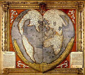
| Source: Wikipedia - Oronce Fine, 1531 |
We love when something our learners do triggers a curiosity in us. Instead of showing our students the many infographics we’ve collected about Valentine’s Day that tabulate the amount of money spent by men and women on items such as flowers, chocolate, and jewelry, we chose to show these beautiful heart-shaped maps that so wholly connected to their designs. As expected, our students delighted in seeing the connection to their creations, especially since they had no idea of their connections to history.
We uncovered other examples of cordiform map projections that obviously take their influence from Oronce Fine's beautiful cartographic design. The maps below, illustrated by Giovanni Cimerlino and Pierre Moulart Sanson, were done more than a century apart.
 |
| Source: Rare Maps (Left) and Britain (Right) |
 |
| Source: Dan's Topical Stamps |
 |
| Source: Biographile |
These maps clearly illustrate the change in design from one era to another. The map of Seattle represents a more typical illustration at the turn of the twentieth century, whereas the subway map, completed more than a century later, closely follows the style of a modern visual illustration or infographic.
 |
| Source: Zero Per Zero |
Sometimes it's the innocence of children that triggers inquiry in adults. We attribute our curiosity to them. Finding other models based on their creativity led to the discovery of historical references. Connecting history through primary sources reinforced their global view of the world.
With the continued onslaught of violence and terrorism in the news, we could all use a little more heart.

This is my first opportunity to visit on this great blog. Such an incredible stuff you have posted here. Thanks for sharing.
ReplyDeleteThank you for this relevant article.
ReplyDeleteThanks for the information your article brings.
ReplyDeletehttps://medical-interiors.com/da/feasibilty-analysis
It become an attractive part of a blog when author uses indirect speech while writing a blog. It shows your creative mind as well as make your written essay different from others.bioresonantie haren
ReplyDeleteWeldone!
ReplyDeleteLogo Design Packages
Amazing Post and very helpful. Thank you for sharing with us.
ReplyDeletePhp Web Development Company Bangalore | Ecommerce Website Designer India | Internet Marketing Company in Bangalore | Bangalore Ecommerce Development Company
Very good article Characteristics of Typography
ReplyDeleteWow, this looks so amazing. This heart shape world map really inspired me. That idea of your students is so appreciable. Now it's time to avail https://www.vfixphonesandtech.com/ for more information.
ReplyDeleteGreat survey, I'm sure you're getting a great response. Hey check about evangelistic ministry.
ReplyDeleteI found this is an informative and interesting post so i think so it is very useful and knowledgeable. I would like to thank you for the efforts you have made in writing this article. Love to talk about the best cbd oil 1000mg.
ReplyDelete