
 |
| Source: The Miniature Earth Project |
The Miniature Earth Project video breaks down what the earth's population would look like if it were reduced in size to a community of 100 people. The clarity of the data presentation, along with the images and music, mesmerize the students in such a way that they want to watch it several times. They are amazed by the distribution of numbers from religion to income. The Miniature Earth Project uses infographic storytelling to create a fluid delivery of information.
 |
| Source: David Smith |
National Geographic's "Who Is the World's Most Typical Person?" uses the infographic storytelling technique as well. It is full of statistics that bounce along to playful music to paint the world's most typical person. According to National Geographic, that person is a 28-year-old, right-handed, cell-phone-owning Han Chinese man. Before showing the clip to students, we ask them to make predictions.
Pairing this video with The Miniature Earth Project allows for media literacy tie-ins, because the music has an effect on the way the message is perceived. The somber music of the The Miniature Earth Project is different from the melodious tune of the other. This streaming infographic is not unlike others we've mentioned, such as the NPR video Visualizing How a Population Grows to 7 Billion by Adam Cole, or How to Feed the World by Denis van Waerebeke. In all of these multimedia presentations, the visual simplification is highly effective for learners. Kids can wrap their heads around numbers they can relate to, and the design reinforces what might otherwise be abstract concepts.
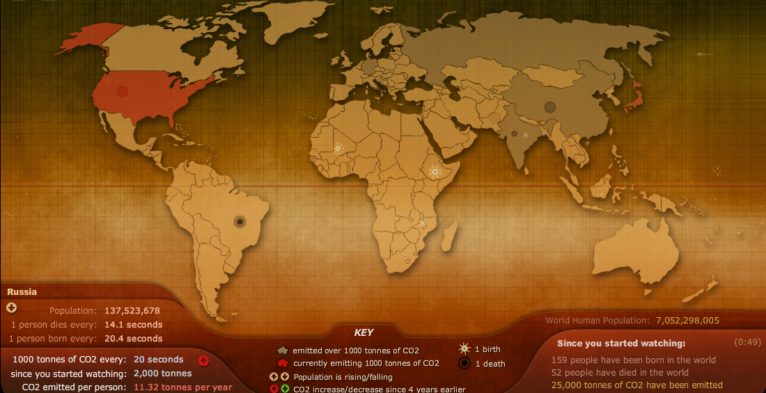 |
| Source: Breathing Earth |
Any one of these resources adds to the delivery of information and clearly represents how the design can stimulate visual thinking and reinforce the skills of graphicacy for learners.


)
No comments:
Post a Comment