Showing posts with label interactive infographic. Show all posts

Tuesday, July 19, 2016

Visualizing The 2016 Conventions - Interactive Tools To Learn About Parties & Politics

Source: 2016 DNCC, 2016 Republican National Convention

The quadrennial political conventions of the Republican and Democratic parties offer a mix of serious-minded civics and high-octane pageantry. For students, teachers, and outside observers, the 2016 extravaganzas provide important forums to dissect the details of the delegates and to hear our nation's leaders speak directly to us.

Whether for use now in July or for lessons in the fall, a host of valuable visualizations exist to explain the esoteric proceedings. These interactive infographics and animated videos touch on a range of learning standards. They also let users explore the conventions at their own paces and levels.

History And Civics


Political conventions as currently staged are relatively new phenomena on the historical landscape. The explainer video (above) from The Guardian supplies a helpful tutorial in the germination and the evolution of party gatherings.

Source: Independence Bunting

The "National Conventions 2016" infographic from Independence Bunting also does a good job of summarizing the essential facts for this year's stagings, with an emphasis on the numbers and statistics beneath the process.

Source: The Economist

The Economist goes back to the nineteenth century with a year-by-year pictorial timeline of candidates and events that marked each party choice. The Economist also delves into personal identification by visually outlining the liberal or conservative leanings of current and past voters.

Delegates And Primaries


Source: 270 To Win

The political site 270 To Win aggregates polling and election data to compile data-driven maps and charts. These are excellent tools for both social studies and mathematics education.

Source: 270 To Win

For example, the colorful U.S. map of Democratic delegates combines month-by-month coding with primary and caucus breakdowns. The Interactive Republican Delegate Calculator presents similar information in an enlightening statistical table.

Maps And Geography


Source: DiscoverPHL

On their convention pages, each political party provides engaging information about their host cities. The Democrats link to a multi-layered interactive map of downtown Philadelphia. The Republicans include similar Cleveland maps, but they also include a hoverable floor plan from inside the Quicken Loans arena.

Source: Cleveland.com

Streaming And Social Media


Source: Engage

The official websites of the Republican and Democratic Conventions will be streaming live the gavel-to-gavel coverage. Social media is also in play, with the Engage "Scorecard" tracking Facebook, Twitter, Instagram, and other mentions in real-time. For a comprehensive look at news and opinions, The New Yorker is posting a continuous series of cartoons, histories, and graphics about each convention.

For other teaching ideas about the 2016 election, check out:

Monday, March 28, 2016

Good Interactive Design Taps Into Student Engagement

Source: Inequality Is
It goes without saying that in the world of our students today static doesn’t cut it. We get it, and we’ve abandoned many old PowerPoints, moved away from textbooks, and discarded our opus of worksheets. That’s why we are constantly on the prowl to find resources to help make learning participatory. When content is combined with good design, it provides a context for stronger understanding; when the design of information is interactive, it prompts students to engage with the material in a physical way.

Each of the interactive infographics below offer students active ways to connect with content. Each one is designed slightly differently, but they all hook users into wanting to know more.

Inequality Is

In this interactive infographic about income inequality, the audience is made to feel that the issue is “personal,” and it’s hard not to stay engaged when the user is told how much they will earn based on gender, age, education, and ethnicity. It also allows for custom comparisons that instantly adjust on the screen.  Check out the video under the “created” link, adjust income distribution under "real," or head over to “fixable” for some possible solutions to the issue. Inequality Is is an eye-opening way for students see the correlation between education and personal income.

Source: Inequality Is

Evolution Of Insight

This interactive infographic tells the story of market research using a timeline to navigate from 1890 to today. As participants travel through the decades, they learn how the growth of consumer research began from the early development of public opinion polls and focus groups to the age of big data today. It provides just enough useful bits of information for students to grasp the history of media and marketing. Evolution of Insight is a good resource for media literacy lessons, or in discussions on the ethical uses of gathering data.

Source: Evolution Of Insight

115 Years Of American Homes

This interactive is designed as if the user is taking a road trip looking at homes across the decades. In this case, the design is conducive to the timeline of travel, and with each new era the car transforms to adjust to the style of the decade. There are also interesting tidbits of information regarding fashion, home furnishing, and more as the user travels through time. Use this website in social studies classes to make historical comparisons between then and now, or perhaps even to predict what’s next.

Source: 115 Years Of American Homes

Designing content to be interactive elevates the participatory part of what modern learners want. The more active they are in the pursuit, the more likely the content will stick.

For other resources please visit The Benefits Of Good Design.

Saturday, December 19, 2015

The 5 Best STEM Animations For 2016

Source: scenes.https://vimeo.com/126733859, WWF Brazil - Marine Program

2015 was a banner year for animations to engage students. These dynamic explainer videos proved definitively that print textbooks cannot keep up with educational, up-to-date motion graphics, especially in the sciences.

The sphere of subjects that fall into STEM's orbit keeps expanding. For better or for worse, K-12 courses are now binarly split into either "STEM" or "Humanities" categories. We would argue that this bifurcation is harmful, erasing the natural overlaps between the sciences and the liberal arts.

The effect, however, is that more and more designers and educators are creating brilliant interactive companions to traditional learning. Here are five favorite animations from the past year that will allow science and math teachers (as well as those in the Humanities) to kick off 2016 with a bang:

1. Math


This lively explainer video from Vox offers a primer in chart theory, as well as a caveat for undiscerning viewers of graphs. Entitled "Shut Up About The Y-Axis. It Shouldn't Always Start At Zero," the clip reminds math students that context is key in both reading and creating data graphics.

2. Environmental & Marine Science


WWF Brazil - Marine Program from scenes. on Vimeo.

This beautiful stop-motion animation offers a moving case study about the effects of urbanization on pollution. The "WWF Brazil - Marine Program" video, made in collaboration between scenes. and Wildgroeiers, highlights critical issues of conservation and biodiversity for any age group.

3. Astronomy


BBC Earth has designed a clear and compelling motion graphic to emphasize the size of the universe and the speed of earth's galactic travels. The 3D visualization employs time and scale to bring astrophysics to life.

4. Oceanography & Earth Science


Source: Cameron Beccario

Software engineer Cameron Beccario (@cambecc) has programmed a stunning representation of the earth's weather conditions. With regularly updated ocean currents, waves, temperatures, and anomalies, this interactive globe allows students to zoom in and rotate a la Google Earth. The educational opportunities range from oceanographers analyzing climate change to historians studying ancient trade routes.

5. Medicine


Source: The Washington Post

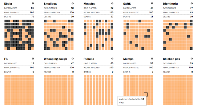
The recent Ebola panic prompted The Washington Post to create this precise simulation that compares the disease's spread to other historical pandemics. Although the original interactive graphic pre-dates 2015, the updates are important to medical students and social scientists who are trying to track contraction, infection, transmission, and vaccination.

Honorable Mention: Ecology & Forestry


This seemingly simple motion graphic by Nature Video brings into startling relief the rate of global deforestation. Researchers made 421,529 separate measurements around the world to produce an irrefutable data-driven image of the changing planet.

For more resources, take a look at last year's five best animations, or some of our other posts about animations in the classroom:


Sunday, January 4, 2015

The 5 Best Interactive Infographics For 2015

Source: Valentina D'Efilippo

Each January, the folks from Lake Superior State University (LSSU) release their (vaguely snarky) list of Words Banished from the Queen's English for Mis-Use, Over-Use, and General Uselessness. This year, the term "curated" was put on the chopping block for being, as one commenter noted, a "pretentious way of saying 'selected.'"

Even though Pinterest and One Kings Lane may have catapulted "curated" into popular jargon, we respectfully disagree with the lexicographers at LSSU. Rather than being over-used or hackneyed, far too few students today are being properly schooled in the skill of curation. Curation is a key proficiency in face of today's instantaneous access to information. Sifting through a sea of sources and aggregating the most relevant research are critical expertises in the world of big data. Alan November actually recommends that on the very first day of school, teachers should train children in proper online searching.

In this vein, we have curated five fascinating interactives to help inspire learners for the year ahead. For the humanities, these animated videos and infographics encapsulate a wide range of explorations into history, geography, sociology, and globalization. Although they may have originated in 2014 or earlier, they paint a riveting potential for the year ahead in literacy and the social studies.

1. The Infographic History Of The World


The Infographic History of the World from Valentina D'Efilippo on Vimeo.

The Infographic History Of The World reminds us of an earlier, mesmerizing Solar System video from the Kurzgesagt design team. With art by Valentina D'Efilippo, this motion graphic pops with swirling images of the globe from the Big Bang to civilization's beginnings to nation building to the modern world. It pairs well with her infographic book, co-authored with James Ball, but also serves as a tantalizing teaser to excite young learners about world evolution.

2. In Charted Waters - Mapping A Brave New World


Source: In Charted Waters

In Charted Waters - Mapping A Brave New World allows users to swipe through a riveting visual timeline of oceanic exploration. Created by MSC Cruises, this interactive website invites students to trace the history of human civilization through maps and indeed to explore the transformation of mapmaking itself.

3. Manifest Destiny - The Story Of The U.S. Told In 141 Maps


Source: Michael Porath

Michael Porath, a Data Visualization Consultant and Information Scientist, has generated a clever tool to explore the territorial expansion of the United States. His interactive page, Manifest Destiny - The Story Of The U.S. Told In 141 Maps, takes existing map data and reimagines it as a scrolling, clickable, and hoverable series of images for students to investigate at their own paces and tangents.

4. The Story Of All Of Us - The Age Of Exploration


Source: History.com

A partnership between the History Channel and Column Five Media has produced an excellent collection of infographics around the theme of "Mankind - The Story Of All Of Us." Their graphic about The Age Of Exploration is perhaps the most detailed and instructive, with intriguing facts and clean visuals to attract students. The other teaching tools are excellent as well, such as History Of Pyramids and Rome: Ancient Supercity.

5. The Kids Aren't All Right


Produced By Healthcare Administration Degree Programs

The Kids Aren't All Right is an interactive infographic that highlights key metrics of childhood development across the globe. Sponsored by Healthcare Administration Degree Programs, this site allows students to click on factors such as infant mortality, child labor, and primary school enrollment to see the real data about which conditions put children most at risk in world countries.

For further information about teaching with interactive graphics, we recommend:

Friday, June 13, 2014

Visualizing The World Cup - Interactive Infographics Of Tournament Math & History

Source: Bloomberg
The World Cup soccer tournament has enthralled and bedeviled fans since 1930. This year's contest, however, emerges in the age of big visual data, in the era of user-customized digital technology. Partnering with the real-time ebb and flow of each match are a host of new interactive apps that allow viewers and students to visualize each nuance of the sport. Soccer zealots can make statistical predictions, and curious students can play with the clickable interfaces.


To explore all of the tournament information for every game and group, the Rasenball visualization (above) is unmatched. Created by Mondula to capture the results and venues in a tidy display, this HTML5 creation features both a desktop and mobile version. Featured on the Visualizing.org site, Rasenball is likely to earn a lot more publicity as the tournament progresses.


via ChartsBin

In charting the "FIFA World Cup Countries Best Results, 1930 to Present," a terrific map (above) from ChartsBin allows students and patriots to hover over nations and see the history of their greatest triumphs. The options include views of the raw data tables, as well as the rare choice of geographic projections, such as Robinson, Gall-Peters, Mercator, and others.

Source: Robert Ivan

To explore a similar win-loss history, the clean interactive from Robert Ivan allows users to click on each year and see a flag-coded banner highlighting the outcome. From the same creator as the Fake Heatmap Generator, the "Visualizing The World Cup Final" design updates the traditional table of results with photographic appeal.

Source: MatchStory; Mirror

Quirky but sometimes revelatory statistics of each competing squad come to life in the MatchStory matrix (above) that allows users to shuffle teams according to soccer superlatives. Researchers can sort the sides by average age, most capped, Champions League players, and other criteria.


Finally, to pick a winner of the quadrennial joust, Andrew Yuan has developed a comprehensive tool (above) that combines geographic webs and circular synapses. Eager pupils can move through the intricate but intuitive interface to gauge the probability of their team claiming the championship.

For other ideas about teaching with the tournament, check out "The World Cup In The Classroom - Visualizations Of FIFA 2014 As Teaching Tools."

Wednesday, January 22, 2014

Trends Come And Go, But Social Media Keeps Going

Source: 2Factory
We thought this past year went fast, with all of the new tech tools out there for us to try. Well, get ready for 2014. It seems we just get settled in when new applications come along to add to our growing list of "need to know this," and we're not talking about Pinterest, Facebook, and Twitter.

If the motion graphic Social Media Trends 2014 from 2Factory is any indication of what's ahead, we have our work cut out for us as teachers and parents in trying to keep up with our tech savvy students. To be sure, they may use technology's newest applications, but if your students are like ours, they need constant reminders about protecting their privacy. Even if we don't use these tools ourselves, we need to know about them to help navigate kids to use them responsibly.


SOCIAL MEDIA TRENDS 2014 from 2 FACTORY on Vimeo.


Source: Comfortably 2.0
Formal professional development cannot possibly keep up with the hottest new technology trends among students. It's another reason why teachers should participate in some form of social media or follow education blogs to stay aware and be current.

The recent post called Education Is the Best Medicine from Comfortably 2.0 lists a host of apps with descriptions for parents and teachers alike on what teens are using. We stumbled across a few applications that we did not know ourselves, such as Voxer, Wanelo, and Whisper.

Source: Comfortably 2.0
Other social media applications to add to the list are Pheed and Line. According to Forbes, teens drove Pheed into the number one social media app spot last year, and we still have many teachers not even using Twitter.

Line is a mobile app with over 200 million users who can create messages using an array of stickers. It's huge in Asia and making its way east fast.

These apps are all free. This allows kids to easily download them onto their devices, and it is all the more reason why teachers have to be aware of what's out there. We may not use each application, but knowing them will help us educate our students to use technology as good digital citizens.
Source: Line


For other posts on social media, please see:


Tuesday, December 10, 2013

Visualizing Apartheid - Teaching Students About Nelson Mandela

Source: "The Life And Times Of Nelson Mandela," from the Nelson Mandela Centre Of Memory
With dignitaries and patriots converging in Johannesburg to honor Nelson Mandela, the hero's funeral has presented an intriguing educational opportunity for school children around the world. The media coverage devoted to Mandela's life as a civil rights champion and a global statesman has refocused attention on the horrors of Apartheid. This system of institutionalized racism, which gave Mandela such a bitter struggle and an enduring triumph, had previously been relegated to somewhat of an afterthought in many pages of contemporary history.


Children of the 1980s grew up with Apartheid in their daily consciousness. They heard news reports about protests and crackdowns, and they regularly reminded each other which collusive corporations to boycott. Children today, however, even at the Advanced Placement and collegiate ranks, often spend no more than a few minutes of one class period noting the sorrows of the Apartheid era before moving on to the next test topic.

It can be particularly difficult for teachers of younger learners to encapsulate these decades of discrimination and violence in an age-appropriate way. It can be equally as challenging to summarize Mandela's life, with its exuberant achievements and its occasional contradictions, in a clear manner.

Source: The Nelson Mandela Centre Of Memory
Fortunately, a few key visual resources exist to help broach this important legacy. One of the best videos is the animated series called "The Life And Times Of Nelson Mandela," from the Nelson Mandela Centre Of Memory. These brief clips offer understandable, dynamic avenues toward understanding the complicated history of the Apartheid generation. If you only have a few minutes, Part 3 documents the principle acts surrounding Mandela's imprisonment. If you can spare more time, though, be sure to watch Parts 1, 2, and 4.

Source: Know More, from The Washington Post
Source: ABS-CBN
(click for detail)
Another terrific tool from the Nelson Mandela Centre Of Memory is the Interactive Timeline tracing his life and accomplishments through text boxes and captivating photos. The smooth interface allows for quiet reflection and independent exploration of the events and culture.

For statistical data, an unambiguous graph from the Washington Post's Know More blog reveals "How Nelson Mandela Transformed South Africa In One Chart." The rise in national pride tracks closely with Mandela's own return to the citizenry.

For other educational resources in teaching about Mandela, we highly recommend:
Regarding background information about the decrees of Apartheid itself, the infographic from Anatomy Of Data lays out core facts and figures about this long span of segregation. The video "Cry Freedom - South Africa Under Apartheid, 1948 - 1991" also chronicles a rich photographic history of Apartheid through primary images and news snapshots. As a mild warning, a few of the photos could be somewhat jarring for younger viewers.


By the way, many thanks to our colleague Stefani Rosenthal (@StefRosenthal) for suggesting the idea for this post.

Source: Anatomy Of Data

Tuesday, September 24, 2013

Engaging Tools To Teach Social Media

Source: Avalaunch Media
We could not resist using the creativity of Avalaunch Media products with our students. The company has truly designed some fun graphics to help explain social media not just to kids, but also to other educators and parents who are not quite as up to date. The interactive infographic on The Complete History of Social Media, the entertaining cat video entitled Social MeowDia Explained, and for the dog lovers out there, the Social MEDogIA Explained are all gems. Each in their own right makes for a perfect resource to engage learners.

The colorful graphics and witty catch phrases are the ideal mix to get the point across about what social media is and does. They're done with a tongue and cheek sense of humor, making them just the things to keep kids focused. We would not be surprised if our students play and replay the cat video time and again for fun.


We also love the connections made by the interactive timeline to explain the history of social media. Kids often think of the here and now, and they don't necessarily realize the evolution of communication tools. For most of our learners, Instagram and Twitter are their immediate responses to, “What is social media?” They rarely mention Facebook; it's been relegated to adults, particularly their parents.

Source: Avalaunch Media
This interactive site is also perfect to use with younger children and could easily be made into a history scavenger hunt activity. The Abominable Snowman-like creature named Eddy moves his arm up and down the timeline with a click of the mouse, providing details about social media from B.C. to the 1800s, 1900s, and 2000s.

Source: Avalaunch Media
Avalaunch Media refers to this as “the amazing story behind social media” today and raises the question, “So, what’s next?” It would make an interesting discussion to have students predict what they think will happen in the future, and it could easily be used for a creative writing assignment.


All in all, any of these visualizations make excellent resources for educators.

Source: Avalaunch Media

Related Posts Plugin for WordPress, Blogger...


Pin It