Showing posts with label graphicacy. Show all posts

Friday, January 14, 2022

What Is Wordle? 5 Ways To Use The Latest Puzzle Craze In The Classroom

Source: Wordle

If you haven’t yet heard about – or played – Wordle, you will soon. The current avalanche of Twitter mentions run about 50 / 50 between “I'm addicted to Wordle!!” and “What the heck is Wordle??” Our friend Dr. Gina Sipley (@GSipley) tipped us off to the craze via a writer's poignant plea in McSweeney’s for a moment's escape from the Omicron nightmare.

At its heart, Wordle is just a guessing game. Players have six chances to guess a randomly generated, five-letter word. After each entry, the tiles light up to signify whether the letter is not in the word (gray), in the word but in the wrong location (yellow), or in the correct location (green). The rules reappear at the start of each game. CNET, of course, has a terrific, lengthier explanation, complete with smart tips and tricks.

Source: Powerlanguage.co.uk

For teachers, this web-based game hits all of the technological sweet spots: 1) it's free; 2) with no logins or accounts; and 3) works on any device. And its addictive gaming properties turn out to be the exact same characteristics that make Wordle ideal for use in education:

Source: Wordle
Language And Linguistics

Wordle is the perfect opening activity to a Language Arts lesson, at almost any level. It also offers countless opportunities to explore the building blocks of the English language – such as vowel and consonant combinations (phonemes, diphthongs, etc.); common starting and ending pairings; and familiar vs. rare individual letters. The shear number of five-letter words in the English language (over 150,000) presents the challenge. Solving the riddle, however, is simple phonemic detective work.

Logic

Any mathematics or logic course could make great hay out of Wordle’s elegant solving patterns. The reasoning relates clearly to geometric proofs and properties. An entire period could be spent leading the class through a group-solve. It echoes those LSAT puzzles when Priya is holding a red balloon and Xavier can only sit next to the dog in the yellow vest. Philosophy professor C. Thi Nguyen has an interesting thread about Wordle’s game theory and “agency expansion.”


Homeroom Or Advisory

Wordle is a lively activity to engage students in a quick challenge. The unique thrill is that only one puzzle appears each day. This creates an increased anticipation and savoring of the moment. You can welcome students to work in groups or to compete in speed vs. accuracy. Be a sport and play the game yourself, to show that you’re not afraid of some friendly fun.

Source: Wordle


Visual Thinking

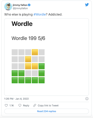
The clean, elegant interface belies the effectiveness of its iconography. The simple visual codes contain the game’s entire meaning and feedback. The sharable results, rendered only in colored cubes, represent masterful lessons in visual literacy and graphicacy.

Social Learning

Everyone plays the same puzzle each day, which lends a contagious camaraderie to the effort. Results are easy to share on social media. This does lead to some humble brags and “woe-is-me,” but it's refreshing to find some fun and support during these oft-disconnected times. You might even run into a celebrity or two.


As an aside, we are old enough to remember when a “Wordle” referred to a visual cloud representing the frequency of word usage in a passage.

Finally, don’t tell, but there is an open-source version on GitHub where you can play the game as many times as you’d like.

Saturday, December 4, 2021

I Con, I Saw, I Conquered - Digital Fluency

Source: ASIDE 2021


One thing we quickly learned during remote and hybrid learning involved the lack of understanding of screen iconology. We realized that our students needed to navigate the changing landscape of communication, not only for this unusual situation in pandemic learning, but also to understand the language of symbols on any digital device. It was one of those moments when adjustments to our instruction required a closer look at ensuring digital literacy to read and process crucial technology skills.

Source: ASIDE 2021
The pandemic emphasized just how much we took for granted our students' visual literacy of the icons that appear regularly in front of them. As with so much of visual literacy and thinking, graphicacy is the underpinning skill that our students require, and the need to educate learners beyond the written text in the illustrative and technological arts is essential.

The adjustments we made in the curriculum to build in skills for students to develop a range of pictorial proficiencies for decoding icons and their functionality paid off, particularly with our remote learners.

Visual fluency requires training and practice much the same as it does for reading; visual comprehension does as well. Today, students need to master multiple fluencies just as they do multiple literacies. Both require nurture and development to acquire these skills. We turned the learning process into a spy game for students to decipher the coded message using the icons. We provided a mentor text for them to grasp the idea and a one-page list of 32 icons to create their messages. Click here for a PDF version.

Source: Student Work

To save time, we set up a folder with small icons that we downloaded from the Noun Project in Google Drive that we shared with the students so that they could write their own coded messages. Click here for access to our icon folder. The students loved it.

This not only reinforced their learning of the icons, but it also allowed us to build in a variety of technology skills for retrieving the resources they needed from a shared folder, importing images into a Google Doc, and adjusting image size and text for readability. The students had a ball sharing their coded messages with each other, and we had the results we were looking for in developing the their digital device iconology.

Sunday, July 16, 2017

Data Fluency Follow-Up - Beware of Content Manipulation

Source: TED Ed
In light of our recent post, we thought it worth sharing one of the latest TED Ed videos released this summer. It is entitled “How To Stop A Misleading Graph,” by Lea Gaslowitz. We haven’t used this with our students yet, but we plan to this fall. Graphs can aid us in grasping complex data; that does not mean they always tell the correct story. With the so many visible software resources available today, it’s easy to design graphs, charts and tables for all types of media.


This video makes for a perfect mini-lesson to reinforce visual literacy, one of the core skills of graphicacy. Just because a graph looks good doesn’t mean it’s accurate. We want our students to look beyond the sleekness of design and not be swayed by colors, shapes, lines, and curves. Instead, they should question the labels, numbers, scale, and content. In other words, ask what the graph is trying to convey and not take it at face value.

Source: TED Ed
Graphs should represent data, not an opinion. By distorting the scale on either axis, they can be intentionally manipulated. The video provides straightforward examples of “cherry picking” the data points to skew the scale for the purposes of persuasion or bias. As we’ve stated in our previous post, our students are growing up in a data-rich world that increasing relies on the design of information. It’s for this reason that they need to be more discerning about misleading content. Visually literacy is a necessity now more than ever.

Friday, July 14, 2017

Building Data Fluency - Visually And Literally

ASIDE 2017
In this data-rich world, our students face growing amounts of statistical content. That's why we believe  teaching graphicacy is vital to the modern classroom. We develop ways to incorporate visual literacy and visual thinking in some capacity in most assignments and consistently look for ways that students can transfer content from a linear to visual format. This process enables them to connect more deeply with the material. The graphs in this post represent statistics on immigration that our students used to build graphs for a project-based learning unit on immigration.

ASIDE 2017
Each student studied a particular immigrant group for the project. For the graph assignment, they gathered the data for their group’s country of origin, as well as immigration data for two other countries. They recorded the information in a table format for five consecutive decades. While the organization of the data gave them a quick overview, the disparity in size of immigration over the course of 50 years was not immediately evident.

ASIDE 2017
Giving the students the opportunity to literally construct the graphs allowed them to experience visual data firsthand. Using the decades along the horizontal axis was easy; however, the vertical axis required a bit more intellectual work to determine the coordinates for plotting the data. Some had to revise their decisions several times by reexamining the numbers to adjust the coordinate values.

ASIDE 2017
The process of using statistics to construct meaning regarding immigration to the United States as visual data reinforced their understanding from both a historical and mathematical perspective. The students could visually see the highs and lows by group over time in addition to the places where immigration intersected or overlapped.

ASIDE 2017

Using statistics is an effective tool for learning. Since we know that our students will encounter numbers on a daily basis, the more we can do to build in data analysis, the better they will be able to make choices based on evidence and authenticity. Visual data is used in everything from household products to political campaigns. Without the proper skills, learners, like any other consumer, can be misled. Interpreting the pictorial representation of information is an essential skill of graphicacy; all students must master this proficiency.

Friday, March 3, 2017

Make Your Mission Matter: From Vision To Values - NAIS 2017

Source: NAIS

The National Association Of Independent Schools (NAIS) 2017 Annual Conference just wrapped up in Baltimore, Maryland. The two days of sessions, speakers, and confabs all highlighted the evolving roles of schools and school leaders within the ever-competitive learning landscape.

We want to express our sincere thanks to the room full of educators who came to our Friday session, “Where Learning Meets Design: Taking Control Of The Visual Classroom.” The questions and ideas made for a terrific conversation about graphicacy and the importance of visual proficiency in both a student’s and a teacher’s toolkit.

Source: ASIDE 2017

All of the links, resources, and videos from our workshop are posted on our “Visual Classroom” website. The PowerPoint from our presentation is also now live on the page. If you happen to take a look at the slides and graphics, please feel free to get in touch with your feedback and additions.

We also appreciate the enormous encouragement from our school’s Headmaster and Director of Communications in supporting our trip. It was a real treat as well to see our former head from 15 years ago pop into the back of the session room.

Source: ASIDE 2017

The highlight of this year's conference was without a doubt the lively and thought-provoking talk by Sir Ken Robinson. With characteristic wit and insight, Robinson reminded us that children are learning organisms. They love the internalization of language and ideas, but they don’t always love “education.” This is because the nation's school systems operate on efficiency, not talent. They prioritize shared cultural knowledge, rather than the inner yearning for discovery.

Source: NAIS
Other speakers included Susan Cain and her ruminations about the power of introverts to change the world, as well as intriguing sessions that focused on data-driven assessments and alumni engagement. The most fun, however, came from the accidental hallway encounters with long-time friends and colleagues from across the country. These sorts of run-ins are what make this gathering so meaningful.

Obviously, we didn’t make it out of Baltimore without sampling some crab cakes. We recommend The Oceanaire for their super-fresh, super-local seafood. Also, BricknFire Pizza Co. in the Baltimore Marriott Inner Harbor makes the best caramelized onion and mushroom pizza we’ve ever had.

Thanks to all of the NAIS organizers for staging such a smooth conference. And if you weren’t able to attend this year’s symposium, follow the #NAISAC tag on Twitter for great on-sight reporting and resources.

Tuesday, February 14, 2017

Student Projects In MySimpleShow - Explainer Videos Have Never Been So Easy To Create

Source: MySimpleShow

Explainer videos use clean graphics and voiceover narrations to teach viewers about a particular subject. They often include clever icons and whiteboard-style backgrounds. They once were produced exclusively by high-end design studios, since complex software and marketing professionals were required to create dynamic motion graphics. Now, thanks to the extremely intuitive interface of MySimpleShow, any layperson — or student — can combine text, images, and voice to yield an extremely effective animated movie.


Explainer videos are pitch-perfectly suited for student projects, because they hit all the sweet spots of higher-ordered thinking and layered proficiencies. They require storyboarding to map out each clip. They demand a smooth script to educate the audience. They also benefit from logical reasoning in transitioning clearly from screen to screen. Finally, they rely on the core tenets of graphicacy, in picking symbols to represent crisp visual meanings and metaphors.


Source: MySimpleShow
MySimpleShow (@mysimpleshow) makes the design and publication of these videos enormously easy. For students and teachers, they offer pre-made templates to guide the text and the progression. The intelligence of the video creator automatically searches and provides pictures to correspond to the nouns in the script. And the superb narrative options allow users either to upload their own voices or to select from two automated personas. For our middle schoolers, who are often nervous about recording their own voices, the choice of a “robot” narrator was a blessing in and of itself.

Source: MySimpleShow

Although the team at MySimpleShow has apparently been producing videos for years for corporate clients, this new consumer version seems to have benefited from high-quality feedback in providing a welcoming and successful tool. Without overstating it, the account creation, built-in tutorials, interface understanding, text-to-speech rendering, icon menus, upload options, and download ease are among all the best in the #edtech world. Our kids quickly figured out how to create their own videos (even though their teacher did watch the step-by-step tutorial).


The student project featured in this post centered on inventions of the late 1800s. During their history class unit about the Gilded Age, each eighth-grader researched a new technology and animated it thanks to the range of graphics and transitions within MySimpleShow. They then easily uploaded their class creations to YouTube, to share via Twitter and in digital portfolios.

The students also immediately began to realize other fun ways to use MySimpleShow — in their other academic subjects, when they had a choice of visual projects, and in their family lives, for birthdays and social media channels. This tool is a valuable addition to the suite of video creators that help bring kids’ ideas to visual life.

For other ideas about video projects, check out:

Friday, December 2, 2016

Maps Vs. Mapping: Visualizing History & Geography

Source: ASIDE 2016

Interactive mapping techniques invite students to connect with content to visualize information beyond mere location. Mapping challenges learners to think, develop literacy skills, and understand the complexity of global issues. It enables learners to seek new ways to look at information through a lens of inquiry-based analysis.

Fresh perspectives on traditional maps can help students classify the images they encounter and can assist them in developing their own visualizations of places and events. This finely-tuned practice reinforces the notion of relational meaning. It taps the core skills of graphicacy through the synchronicity of visual literacy and visual thinking.

As a result, our students become better geographers and designers by interpreting existing maps, by drawing their own maps with a cartographer’s eye, or by creating visualizations with a keen sense of space. Students must decode the augmented reality (AR) by "reading" images and internalizing pictorial stimuli. These precise, learned techniques foster confidence both in deciphering and in creating pictorial representations, as well as developing critical thinking skills to better understand the world.


Lessons And Resources


Mapping Activities For The Classroom


Current Events & Map Engagement


Monday, April 4, 2016

Why Design Matters For Educators And Learners

Source: ASIDE 2016
We just finished attending the New York College Learning Skills Association (NYCLSA) Symposium in Saratoga. We met impressive educators who shared their expertise and resources, and we presented “Design Gives Context To Content To Engage Learners.” The following is an excerpt of why we feel so passionate about this topic.

The harmony between form and function not only applies to design, but it also relates to the synergy between educator and learner. It supports both. Good design of information guides the attention of our students, creating a relationship between context and content. It allows for engagement without distraction.

Design Matters, because it can:

  • Steer the eye of the viewer
  • Remove the noise and congestion
  • Separate ideas into succinct areas
  • Create a consistency across materials
  • Align information for clarity
  • Establish a hierarchy of content
  • Make information easier to navigate

Design plays an integral part in the skills of graphicacy, visual literacy, and visual thinking. If companies spend billions of dollars on advertising to grab our attention, it would make sense for educators to think about information design as well. With the growing industry of online learning, how we incorporate visual information makes a difference not only in the way a student engages with the content, but also how he or she comprehends the information over the long run.

Source: ASIDE 2016
Attention, comprehension, and retention, or “ARC,” are inextricably linked when the visual information is included in the overall design of content. It’s why people and kids remember commercial, jingles, logos, and brands. The connection increases engagement with the material, making it memorable. The more we incorporate these aspects into our teacher toolkit, as well as in the options that students have to deliver content, the deeper the link to the material.

Source: ASIDE 2016


Design can influence the perception of information, the visual communication, and the engagement with text. It enables learners to make associations, and it provides opportunities for greater understanding.

Thursday, May 7, 2015

The Benefits Of Good Design - Resources For Community College Learners

Source: ASIDE 2015

Community college students everyday interact with a range of materials: handouts, worksheets, outlines, templates, PowerPoints, etc. From the simplest to the most complex, these resources are sometimes the primary conduits for information and training. The design of these materials, therefore, matters. The visual presentation of instructional tools can make the difference between detachment and engagement, between reticence and retention.

One of the touchstones of the design world is the unity of form and function. This “big picture / small picture” harmony is an equally crucial lesson for teachers and learners of all ages. Whereas art is something we look at, design is something we use everyday. It gives context to content and supports the relationship between the two. Good design of information delivers content that is engaging to the eye without becoming a distraction. It guides the attention through carefully controlled and selected visual components; it retreats to the background, enabling the purpose of the finished product to come forward.

Source: ASIDE, Tommy McCall

In creating both tangible and digital presentations for college learners, educators can ask themselves about the desired purpose, audience, and format of their materials. Similarly, considerations of layout, font, color, and alignment can make positive differences in conveying crucial concepts. A few notions to keep in mind include:
  • Visual media bombard the modern eye
  • Images increase the level of engagement and retention
  • Design creates meaning and relationships
  • The eye reads many types of "texts"
  • Simple tools and techniques can aid understanding
  • Emphasis, typography, hue, layout, and balance are key
Source: ASIDE 2015

We recently had the privilege of discussing these ideas with the faculty of the Department Of Reading And Basic Education at Nassau Community College (NCC) in New York. It was a pleasure speaking to them for their spring professional development. Our session was entitled, "The Benefits Of Good Design: Simple Strategies For Creating Elegant and Effective Materials To Engage Students." All of the slides, links, and resources from our presentation can be found here.

Many thanks to the warm and welcoming educators at NCC for inviting us and for being such gracious hosts. It was a pleasure sharing ideas and exploring the potential of visuals to make a difference in the lives of learners. We look forward to staying in touch and continuing the dialogue about design!

Monday, April 6, 2015

How To Teach Visual Thinking – 5 Strategies From Around The Web

Source: ASIDE, 2015

The misconceptions about visual thinking are alarming. On one hand, this critical skill seems integral for contemporary learning, since almost every modern input is visual in nature. Yet this key proficiency seems almost entirely absent from state standards and daily classroom lessons.

Is visual thinking just a polite nod to Howard Gardner's quaint modalities? Or is it a genuine habit of learning that unites the external codes of pictorial metaphor and digital imagery into a seasoned curriculum of higher-level interpretation?

Source: ASIDE, 2015

Visual thinking is a close partner to graphicacy, which is a spectrum of analytical tools to decode and encode pictures. Luckily, many educators on the web have shared strategies for reaching children via optical data.

Here are five terrific presentations about the power of visuals to craft a layered approach toward teaching with creative design. Each of these slideshows offers a specialized take on graphic learning. They would all be valuable resources for educator professional development or for regular practice with children.

Visual Thinking Presentation


Visual Thinking And The Writing Process


Visual Thinking For Brainstorming, Planning, Learning, Collaborating, Harvesting


An Introduction To Visual Thinking


Visual Thinking Help


Monday, March 23, 2015

"What Is Graphicacy?" — An Essential Literacy Explained In An Animated Motion Graphic


What Is Graphicacy? from The ASIDE Blog on Vimeo.

We live in a visual world. Smartphones, television, Internet, and social media all push information in real-time, all the time. Visual media bombard us in constant streams. Learners of every age, therefore, need to understand how to analyze pictorial information. This skill of parsing images, interpreting pictures, and decoding diagrams is known as graphicacy.

The motion graphic (or explainer video) in this post describes the many reasons for graphicacy education. Maps, cartoons, and photographs all feature symbolic cues and metaphoric elements. An animated infographic itself can become a conduit for graphic instruction.

Sixty-five percent of people today identify as visual learners. In fact, the brain processes optic inputs 60,000 times faster than text. Yet schools and scholarship rarely apply the tools and time to train people how to understand all of these visual streams.

Source: ASIDE 2015


Graphicacy stands with literacy, oracy, and numeracy as one of the four indispensable corners of education. It dates to W.G.V. Balchin's coinage of the term in the 1960s to identify the visual-spatial aspect of human intelligence. What began as a staple of South African geography education has ballooned in importance, especially in today's 1:1 classroom. With today's rightful emphasis on differentiated instruction, contemporary classrooms need to incorporate coaching in graphicacy to reach students via their learning preferences. (Continue reading for more information….)


Visual literacy is about learning how to look. It involves learning how to internalize and deconstruct the images that the brain sees. It involves input. Visual thinking is about learning how to design. It involves imagining graphic representations of new or traditional concepts based on the mind's unique creation. It involves output. Graphicacy, therefore, is the union of the two acuities. It marries the essential skills of decoding and encoding to embrace a range of pictorial proficiencies. (Continue reading for more information….)


Source: ASIDE 2011

Tommy McCall hit the nail on the head when he called “graphicacy the neglected step child in the classroom” during his TEDx East talk on Literacy, Numeracy, And Graphicacy. In the new e-cology to design and create digital content that is transmitted, interactive, and shared, it is even more vital to incorporate graphicacy skills in daily lessons. By training kids to thoroughly study what they see, we reinforce their visual acuity, attention to detail, and ability to notice conspicuous absences of information. We want them to develop a keen eye for seeing, to detect problems, and to understand the message inherent in the design. (Continue reading for more information….)


Graphicacy often takes a backseat in traditional classrooms, because understanding pictures is thought to be a natural consequence of basic vision. The conventional wisdom says that if people can see, then naturally they can comprehend what they see. Parents, however, know this is untrue. They know children must learn to decode images and connect the visual parts to the cognitive whole. Mothers and fathers dedicate evenings to paging through picture books with their toddlers, pointing out clouds and jackrabbits and smiling moons. (Continue reading for more information….)


Whether graphicacy is the “fourth R” or the “third skill,” as Howard A. Spielman refers to it, the format for representing data and visuals is much more complex today. Data visualizations such as infographics and the myriad of designs used in their creation are arguably more complex in many cases. This is quite the opposite of what infographics are by definition, which is to present complex information quickly and clearly. They often combine images and data in ways very different from standard graphs, charts, and maps in most elementary textbooks, thus prompting a need for graphicacy in education. (Continue reading for more information….)

Source: ASIDE 2015


We use four steps in guiding students to interpret charts, maps, cartoons, infographics, and logos. These four steps progress from base-level identification toward more analytical and sophisticated skills. The understandings proceed from: 1) Substance, 2) Scaffold, 3) Story, and 4) So What? (Continue reading for more information….)


Amid the national emphasis on STEM programs, charts are becoming key tools to represent visual statistics. As more and more schools migrate to 1:1 tablets, therefore, students need a foundation in reading and rendering their own optic inputs. The language of apps today is printed in icons. On handheld devices, colorful squares dance across each swiped screen. Children need to recognize these badges and identify the relationships between the logos and the corresponding actions. (Continue reading for more information….)

Wednesday, August 6, 2014

Data Visualized: Simple, Quick, And A Range Of Topics

Source: The WSJ Statshot: Screentime
We continually look for resources to use for “mini” lessons or “do nows” to help learners interpret data and draw conclusions through visual analysis.

The Statshot column in the weekend edition of The Wall Street Journal provides just that. David Goldenberg compiles the data, and the graphics are designed by Carl de Torres. The topics run the gamut, including pop culture, finance, technology, and science.
Source: The WSJ Statshot: Driving Change

Each week, Statshot picks three different subjects and creates a simple graphic to highlight the data in one image. For example, last weekend looked at screentime, self-image, and Nascar. The examples from this column are straightforward enough to use with a variety of age groups, particularly elementary and middle school students.

Source: The WSJ Statshot: Great White Hope

Statshot is part of The Wall Street Journal’s Numbers blog which provides daily posts with graphic interpretations that are more complex and perfect for high school students. The Numbers blog “examines the way numbers are used and abused,” and the topics are equally as diverse as those on Statshot.

Source: The WSJ Statshot: Vanishing Species

Integrating graphic interpretation wherever we can using charts, graphs, and tables helps our students with multi-source reasoning. The pervasive use of infographics, motion graphics, and other data visualization materials requires exposing our learners to as many different modes for deciphering information. It is one of the core skills of graphicacy that they’ll need to be competent in today’s world.

Monday, August 4, 2014

Media Literacy And Graphicacy: 4th Graders Pitch Their States

ASIDE, 2014
Every year our fourth graders complete a state project. Instead of doing the usual travel brochure or poster with their research, we decided to have them pitch their states by designing a travel magazine cover. It sounds simple, but it actually incorporated the skills of media literacy and graphicacy. On the one hand, it required them to think about the message, and on the other, to visually construct the design to sell it.

This involved understanding the vocabulary publishers use to lay out the cover content of magazines as well as the techniques used to engage the eye in persuading people to purchase one magazine over another. It reinforced their ability to hone their visual literacy skills to visually think about how to design their own work.

At the basic level, students know that companies advertise to sell products, but the competition is fierce. The design of information matters. To help them grasp this idea, we posed the question, “If you walked into any waiting room, what would it take to have someone pick up your magazine over any of the others on the table?” The cover sells magazines, just like it sells books.
ASIDE, 2014

We showed our students a host of different examples of travel magazines to discuss design, layout, text, and images. They analyzed the text to separate titles, subtitles, tag lines,  and cover lines. Given that many of our learners love to get carried away with fonts and colors, we talked a lot about selectivity. The students quickly realized that most covers used two or three font styles, and that color was limited and worked with the image. The most important typeface was reserved for the title, and the color complemented the design.

The project strengthened their understanding that media messages are constructed and that design decisions such as font hierarchy, word placement, and color all play a role in the visual branding of a product. Each part is a media carefully orchestrated to maximize that idea into sales.


ASIDE, 2014
ASIDE, 2014

We provided a handout for the students to talk about the cover elements of a magazine, and the students used PicCollage on their iPads to design the images in this post. They used alliteration to create their titles, and they invented catchy, selling tag lines based on a current advertising slogans or jingles to be placed just below them.

One of our examples was, “What’s in your state?” Of course, the kids happily chimed in that it came from the Capital One credit card commercials. This lead to a flood of ideas, including “Idaho Is On Your Side” (Nationwide Insurance), “I’m Lovin’ New Mexico (McDonalds), “Like A Good Neighbor Maryland’s There” (State Farm Insurance), and “America Runs On Peaches” (Dunkin Donuts).

The kids had a great time with this project. They became selective about how to display the content and realized that less is more. Their careful wording to create the cover lines also reinforced their knowledge about the topic.

Ideally, anytime we infuse our lessons to include the techniques used by advertisers, we not only build the media savvy of our kids, but we also enhance their visual thinking to graphically decode information and successfully design their own.

Saturday, March 29, 2014

Graphicacy - The Key To Visual Thinking In A Differentiated Classroom


In the scholastic world's quest to pinpoint new "literacies," one of the most essential skills in a student's toolkit isn't new at all. "Graphicacy" is the vital proficiency with visual inputs that all learners must master in the modern classroom. Graphicacy refers to the encoding and decoding of images, particularly in the close examination of details that construct visual meaning. It stands with literacy, oracy, and numeracy as one of the four indispensable corners of education.

Source: Christopher G. Healey
Graphicacy dates to W.G.V. Balchin's coinage of the term in the 1960s to identify the visual-spatial aspect of human intelligence. What began as a staple of South African geography education has ballooned in importance thanks to the onslaught of learning and entertainment media that all rely on optical displays. Especially in today's 1:1 classroom, with hand-held devices and ubiquitous smartphones, the understanding of visual patterns and pictorial cognition is imperative.

Graphicacy is about more than visual thinking. It is instead a careful roster of skills to comprehend diagrams, photographs, charts, logos, icons, maps, and picture books. With today's rightful emphasis on differentiated instruction, contemporary classrooms need to incorporate coaching in graphicacy to reach students via their learning preferences.

Source: Stephen Few

One key to guiding students in understanding graphs and drawings is teaching them about preattentive attributes. These are the visual marks that the mind's iconic perception unconsciously absorbs. Preattentive attributes are quickly discerned by the eye and rationalized by the brain to distinguish size, shape, color, and alignment. Visual designers employ preattentive attributes to make tables readable and logos memorable.

Stephen Few offers a clean, expert tutelage in the keys of preattentive attributes in "Tapping The Power Of Visual Perception." His graphic (above) presents some of the core distinguishing techniques used in both creating and interpreting images.

Source: Creative Bloq, via Alberto Cairo, The Functional Art

Another valuable graphic (above), which combines single attributes into coordinated displays, is featured in Graham Odds excellent explanation, "How To Design Better Data Visualizations," at the Creative Bloq. Taken from the work of William Cleveland and Robert McGill and published in Alberto Cairo's book, The Functional Art, this illustration is terrific for teachers to use as a tool in laying out the building blocks of visual comparisons. Students can apply the techniques of the optical continuum to decipher political cartoons, historical maps, and scientific displays. Dustin Smith also highlights the value of this graphical instruction at his superb blog.


To catch students' attentions and open their eyes to the power of subtle attributes, we recommend Jason Silva's masterful video, "To Understand Is To Perceive Patterns." In zippy, dynamic narration, Silva races through a visual blitz of naturally occurring frameworks and motifs. It's fascinating and mind-boggling for any viewer.

For further information about graphicacy, we suggest:
Related Posts Plugin for WordPress, Blogger...


Pin It