Showing posts with label explainer video. Show all posts

Tuesday, July 24, 2018

Student Videos: Empowering Creativity and Video Journalism


Teacher videos are terrific learning tools, but student-created videos are even richer. Creating videos, motion graphics, and animations nudge students to blend a host of proficiencies. It involves visual design using colors and templates, just as it requires language skills of narration and storytelling.

The process of using a storyboard to stitch together a narrative enables students to combine logical reasoning, cause-and-effect, and content mastery. These compelling presentations provide opportunities for students to learn, share, and teach others. It reinforces the graphicacy skills they need to learn, design, and communicate a message as journalists.


Kids teaching kids is the purest model of learning where they become the educators of their peers. The examples below are just some the different types of videos, motion graphics, and animations made by our students.

MySimpleShow


Biteable


Magisto


Adobe Spark


Splice


iMovie & WeVideo


Stop Motion


PowToon


Renderforest


Vine


Class YouTube Channels

Patricia Russac
Mercer Hall

Class Tumblr  Pages

Mercer Hall


Tuesday, February 14, 2017

Student Projects In MySimpleShow - Explainer Videos Have Never Been So Easy To Create

Source: MySimpleShow

Explainer videos use clean graphics and voiceover narrations to teach viewers about a particular subject. They often include clever icons and whiteboard-style backgrounds. They once were produced exclusively by high-end design studios, since complex software and marketing professionals were required to create dynamic motion graphics. Now, thanks to the extremely intuitive interface of MySimpleShow, any layperson — or student — can combine text, images, and voice to yield an extremely effective animated movie.


Explainer videos are pitch-perfectly suited for student projects, because they hit all the sweet spots of higher-ordered thinking and layered proficiencies. They require storyboarding to map out each clip. They demand a smooth script to educate the audience. They also benefit from logical reasoning in transitioning clearly from screen to screen. Finally, they rely on the core tenets of graphicacy, in picking symbols to represent crisp visual meanings and metaphors.


Source: MySimpleShow
MySimpleShow (@mysimpleshow) makes the design and publication of these videos enormously easy. For students and teachers, they offer pre-made templates to guide the text and the progression. The intelligence of the video creator automatically searches and provides pictures to correspond to the nouns in the script. And the superb narrative options allow users either to upload their own voices or to select from two automated personas. For our middle schoolers, who are often nervous about recording their own voices, the choice of a “robot” narrator was a blessing in and of itself.

Source: MySimpleShow

Although the team at MySimpleShow has apparently been producing videos for years for corporate clients, this new consumer version seems to have benefited from high-quality feedback in providing a welcoming and successful tool. Without overstating it, the account creation, built-in tutorials, interface understanding, text-to-speech rendering, icon menus, upload options, and download ease are among all the best in the #edtech world. Our kids quickly figured out how to create their own videos (even though their teacher did watch the step-by-step tutorial).


The student project featured in this post centered on inventions of the late 1800s. During their history class unit about the Gilded Age, each eighth-grader researched a new technology and animated it thanks to the range of graphics and transitions within MySimpleShow. They then easily uploaded their class creations to YouTube, to share via Twitter and in digital portfolios.

The students also immediately began to realize other fun ways to use MySimpleShow — in their other academic subjects, when they had a choice of visual projects, and in their family lives, for birthdays and social media channels. This tool is a valuable addition to the suite of video creators that help bring kids’ ideas to visual life.

For other ideas about video projects, check out:

Tuesday, November 22, 2016

Unleash The Superhero In You - NYSCATE 2016

Source: NYSCATE

The theme for the 2016 annual conference of the New York State Association For Computers And Technologies In Education (NYSCATE) was "Unleash The Superhero In You." This effective branding throughout the conference hall — and the colorful capes given to every attendee — spoke volumes to the notion of teachers as heroes in seizing opportunities and embracing technology, and often struggling against the curmudgeonly villains standing in their ways.

Source: NYSCATE
After three days of sessions and keynotes, kiosks and meet-ups, it was more clear than ever that educators are feeling they have the necessary tools to invigorate the learning potential of their students. Every teacher we met was excited to try a new web app or a backchannel to decentralize daily instruction. As Chromebooks catch up to (or surpass) iOS devices, the Google Apps For Education (GAFE) suite of tools is clearly permeating state-wide districts. As videos and online media put information squarely in the hands of learners, both children and teachers feel more empowered than ever to chart their own courses in meeting the various standards.

For our part, we are grateful to the 60+ participants who sat on the floor and stood against the walls for our presentation on Sunday, November 20, 2016, about “Student Videos & Animations Empower Creativity.” We apologize to those who were turned away for space reasons, and we have put all of our resources and slides online to share with any interested parties. Thank you to all of the attendees for the insightful questions and terrific recommendations about lessons and tools related to student projects and videos.

In hearing from the other experts in the terrific workshops during the conference, highlights that stood out included the tips on formative assessments from Steve Garton (@sgarton121) and Jeff Mao (@jmao121) of Common Sense Education, as well as the annual App Smackdown from Rich Colosi (@richardcolosi), Ryan Orilio (@ryanorilio), Mike Amante (@mamante), and Monica Burns (@classtechtips).

Other eye-opening sessions were engaging the writing process using Google Apps, WeVideo, and Recap with Megan Hugg (@Megan Hugg) and Lindsey Peet (@LindsMariePeet); liberating students from paper using ePortfolios with Betsy Hardy; and tapping the lesser-known features of Google with Carol LaRow (@larowc). Student coding, blended writing, and shared collaboration also emerged as recurring themes within the high-quality professional development. Perhaps the keynote comment by Adam Bellow (@adambellow) summed it up best, "Technology does not drive change; it just enables it."

Source: ASIDE 2016

The lake-effect snowstorm that blanketed downtown may have kept some New Yorkers homebound, but it made for a tight-knit group in the warm confines of the Joseph A. Floreano Rochester Riverside Convention Center. It also meant that Dinosaur BBQ was blissfully quiet on Sunday night, as we savored our favorite fried green tomatoes and spicy pulled pork. Pane Vino on North Water Street continued to rank as one of the best restaurants anywhere in the nation. And we also recommend Starry Nites Cafe in the arts district as a short hop away for a quick latte and chicken chili after perusing handmade jewelry at Craft Company No. 6.

Finally, we want once again to give a big shout out of thanks to the NYSCATE conference organizers for all they did in staging this seamless annual get-together. The smoothy run sessions and the high-quality breakfast / lunch / dinner included in the overall fee, as well as the warm welcomes and conversations throughout the event, confirmed once again why this is the best confab of the year. See you in 2017.

Source: NYSCATE

Sunday, November 20, 2016

NYSCATE 2016: Student Videos & Animations Empower Creativity


Creating videos and motion graphics nudges both students and teachers to blend a host of proficiencies. It involves visual design in colors and templates, just as it requires language skills of narration and storytelling. It supports key technological skills in manipulating online media, and it reinforces the importance of publishing in sharing child creations with peers and parents. Kids teaching kids is the purest model of learning. It is the model of the student-centered classroom, because they become the educators of their peers.


Video production allows students to stitch together a narrative and storyboard each moment in the process that combines logical reasoning, cause-and-effect, and content mastery. They also must employ their graphicacy skills to fashion compelling and appealing visual displays. These quick-cut movies and short animations combine icons and text to communicate a message. Explainer videos, for example, are perfect for the classroom. They blend voice, image, and language into compelling presentations for students to learn. Content created using app editors or motion graphics provides a way for the brain to receive information through both the eyes and ears. Learning tools that can tap into both modalities have greater effectiveness in fostering understanding. They add layers of meaning for nuanced, standards-based education.


It is important to employ interactive ways to engage and share student work that builds alternative ways for students to design content, collect feedback, and reflect on the creative process. This requires using resources that engage learners in the classroom much the way they are outside of it. The gradual spread of technology tasks is invariably shifting classroom education toward a more student-directed model. As we move more and more into the blended, flipped, and social world of learning, we need to encourage creative interactions and self-directed investigations with the knowledge that our students can be active participants in the education process.

MySimpleShow


Stop Motion


Magisto


Renderforest


Adobe Spark


Vine


Other Options


Class YouTube Channels

Patricia Russac
Mercer Hall

Class Tumblr  Pages

Patricia Russac
Mercer Hall


Friday, September 23, 2016

Recess Rescue: Why Play Time Should Be Written Into The Students' Bill Of Rights

Source: ASIDE 2016

As our nation’s children head to back to the classroom, many schools find themselves trying to rein in kids’ summer impulses. Strict conduct policies are emphasizing rules and enforcing straight lines on students who are used to gamboling in backyards and lolling for hours.

Many Scandinavian countries, most brain science, and all veteran teachers would encourage the exact opposite. They would argue that instead of limiting play, educators should expand the amount of free time dedicated to socialization and creativity. Imagination itself is not learned, but it can be unlearned due to the drone of worksheets and mandates.

Source: ASIDE 2016

While many schools nationwide are reducing free play opportunities, our neighboring Patchogue-Medford district here on Long Island has actually doubled recess time from 20 to 40 minutes. In fact, a few Texas and Oklahoma schools now schedule recess four times a day. These changes are not capricious; they are part of studies such as the LiiNK Project, which has found that physical activity increases students' emotional well-being and reduces instances of bullying and stress. The American Academy of Pediatrics supports these findings with its seminal white paper about "The Crucial Role Of Recess In School."

Across the board, students, teachers, parents, administrators, kinesiologists, therapists, and test graders are all witnessing the positive outcomes of enhanced play time. The scientist Jaak Panksepp has devoted a career of research to answering two pivotal questions: Where in the brain does play come from? And is it a learned activity, or is it a basic function?

Source: ASIDE 2016

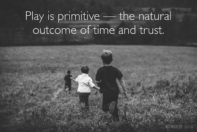
NPR has highlighted Panksepp’s studies, showcasing that play is deep and instinctive, shared across mammals, and integral to survival. Important social skills stem from play, in testing interactions, probing limits, and navigating hierarchies. In other words, play is primitive, the natural outcome of time and trust.

Children need this unstructured time to make mistakes and develop friendships on their own terms. The arena of the soccer field or the sand box is ideal in nurturing successful adults. Recess is not a privilege. It should not be an afterthought. It should instead be written into the students’ Bill Of Rights.

Source: KOIN

Otherwise, what are our playgrounds? Are they monuments to eras past? Are they the still testaments to the naivety of earlier generations? Are they just another hallmark of the sped-up modern day, the never-enough-time-for day, when the things we wish for are just that — wishes?


For other ideas about the importance of play, we recommend:

Tuesday, July 19, 2016

Visualizing The 2016 Conventions - Interactive Tools To Learn About Parties & Politics

Source: 2016 DNCC, 2016 Republican National Convention

The quadrennial political conventions of the Republican and Democratic parties offer a mix of serious-minded civics and high-octane pageantry. For students, teachers, and outside observers, the 2016 extravaganzas provide important forums to dissect the details of the delegates and to hear our nation's leaders speak directly to us.

Whether for use now in July or for lessons in the fall, a host of valuable visualizations exist to explain the esoteric proceedings. These interactive infographics and animated videos touch on a range of learning standards. They also let users explore the conventions at their own paces and levels.

History And Civics


Political conventions as currently staged are relatively new phenomena on the historical landscape. The explainer video (above) from The Guardian supplies a helpful tutorial in the germination and the evolution of party gatherings.

Source: Independence Bunting

The "National Conventions 2016" infographic from Independence Bunting also does a good job of summarizing the essential facts for this year's stagings, with an emphasis on the numbers and statistics beneath the process.

Source: The Economist

The Economist goes back to the nineteenth century with a year-by-year pictorial timeline of candidates and events that marked each party choice. The Economist also delves into personal identification by visually outlining the liberal or conservative leanings of current and past voters.

Delegates And Primaries


Source: 270 To Win

The political site 270 To Win aggregates polling and election data to compile data-driven maps and charts. These are excellent tools for both social studies and mathematics education.

Source: 270 To Win

For example, the colorful U.S. map of Democratic delegates combines month-by-month coding with primary and caucus breakdowns. The Interactive Republican Delegate Calculator presents similar information in an enlightening statistical table.

Maps And Geography


Source: DiscoverPHL

On their convention pages, each political party provides engaging information about their host cities. The Democrats link to a multi-layered interactive map of downtown Philadelphia. The Republicans include similar Cleveland maps, but they also include a hoverable floor plan from inside the Quicken Loans arena.

Source: Cleveland.com

Streaming And Social Media


Source: Engage

The official websites of the Republican and Democratic Conventions will be streaming live the gavel-to-gavel coverage. Social media is also in play, with the Engage "Scorecard" tracking Facebook, Twitter, Instagram, and other mentions in real-time. For a comprehensive look at news and opinions, The New Yorker is posting a continuous series of cartoons, histories, and graphics about each convention.

For other teaching ideas about the 2016 election, check out:

Thursday, April 28, 2016

The Worldwide Water Crisis - Animated Motion Graphics To Educate About The Earth

Source: Kasra Design

Students are always the first to want to care for Mother Earth. At our school’s Earth Day planting event on Friday, the kids asked why we didn’t do this more often — why we didn’t tend the gardens and grow vegetables and think about composting, recycling, and conservation on a more consistent basis.

The ensuing discussion led to questions about water. Each day seems to bring new headlines about the crisis in Flint or California, not to mention the global droughts that affect millions of people. Few people realize that only 2.5 percent of all the water on earth is fresh water. And two-thirds of that fresh water is locked in glaciers and ice caps, leaving only 1 percent to sustain the 7 billion inhabitants.

Source: Kasra Design

Think of the inordinate amount of water we use every day through drinking, cooking, bathing, cleaning, producing food, making products, and generating electricity. It takes 2400 liters of water just to make one hamburger.

A terrifically produced explainer video from Kasra Design, called "Precious Water - Animation Awareness," brings these startling facts to life through a kid-friendly cartoon. The motion graphic, seemingly made for the Iranian Butane Industrial Group, offers 10 ways each of us can make a difference in conservation. These kind of tips resonate with students, because they require little sacrifice but offer a big reward.

Precious Water - Awareness Animation from Kasra Design on Vimeo.

Aside from the obvious advice of not running water while brushing teeth or not letting toilet leaks last too long, there are some clever ideas. For example, if we reduce our shower times by just 60 seconds, we can save 570 liters of water a month.

Source: Matter

Another compelling motion graphic about the water crisis here in the United States is "Groundwater and the Drought: How the West Is Miscounting Water Supplies." Created by Jons Mellgren and Anna Mantzaris for "Killing The Colorado," a collaboration between ProPublica and Matter, this stop-motion video not only points out the facts behind our nation's water supply, but it also proposes genuine solutions at the governmental level. The design is appealing and cute for a wide range of young viewers, to get them excited early about working for lasting change.

Groundwater and the Drought: How the West Is Miscounting Water Supplies from Matter on Vimeo.

For other animated explainer videos to teach about STEM and the environment, check out:

Monday, February 29, 2016

Financial Literacy For This Generation - Visualizing The Future Of Wealth In America

Source: Chris Curtis

Financial literacy takes many forms. News headlines and candidate campaigns highlight the disparities of wealth between the "one percent" and the everyday Americans. In schools, traditional financial literacy classes teach older students about balancing their checkbooks and paying off their credit cards. These are noble messages, yet fundamental shifts are changing how young people spend and consume, from Bitcoin to online bill-pay.

Furthermore, financial literacy encompasses a much broader net of core fiscal issues, including stock investing, inflationary tendencies, surplus and deficit budgeting, bond and mutual fund accounts, and renting versus home ownership. Our youngest students need to be a part of this conversation, rather than waiting until high school or college, when it may be too late.

Source: Chris Curtis

Luckily, a host of digital resources exist to welcome all learners into the money discussion. A terrific explainer video from Chris Curtis, entitled "Wealth In America," tracks how life-long earnings vary for each generation. Moving from the proven past to the predicted future, this animated infographic addresses how collective wealth matters in determining future savings. The gauzy collage of photographs and stamps unites with compelling narration to inform today's students about their relative futures. This motion graphic of statistics and charts neatly blends STEM skills with the social sciences to prove that financial literacy is more than a single silo of curriculum.

Source: Chris Curtis

The video's creator, Chris Curtis, created this clip as part of his work with Deloitte University Press. As a director at Not To Scale in London, he has designed numerous short films that synthesize illustration with live action. He blogs at I'm Your Boss and shares visual and financial literacy ideas on Twitter via @imyourboss.

Source: Chris Curtis

As a whole, this video projects the dollar value of future household assets. It nods to the outsized influence of the Baby Boomers, and it highlights the fallout from the "Great Recession" of 2007. In particular, it teaches young people about earnings versus debt. The Millennials are sharers, non-idealogues, and social entrepreneurs. The salaries of these price-conscious, tech-nimble workers may rise steadily, yet their per capita wealth will lag prior generations. They will, however, force changes in the traditional marketplace that will realign how workers accumulate wealth.

Wealth in America from Chris Curtis on Vimeo.

For more ideas about teaching financial literacy, check out:

Friday, February 5, 2016

The Power Of Visual Rhetoric - Using Kinetic Typography To Learn About Black History & Civil Rights

Source: Versa

Kinetic typography and motion graphics are bringing to life the soaring oratory of the Civil Rights Era like never before. During the 1950s and 60s, many landmark speeches stood out in their power to persuade the conscience of a generation. The Reverend Dr. Martin Luther King, Jr., in particular, crafted brilliant language to inspire a burgeoning movement and to convince an at-time reluctant populace. During February’s African American History Month, the words of Dr. King are widely studied. Yet rarely before has the rhetoric of his writings emerged in such vivid portrayal as in the motion graphics below.

Kinetic typography is the combination of motion and text. Via animation, fonts take on lives of their own, scaffolding or cascading across canvases with the addition of music and/or narration. The zoom of calligraphy and the staccato of letters become at once mesmerizing and educational.

Dr. King’s addresses, when read quietly for homework, do feature his eloquent use of classical references and repetition. In silence, however, they do not achieve their most compelling effect. Like Shakespeare, his verses are meant to be heard, to be experienced, to be savored.

Source: Ryan Blackwell

When Dr. King’s words appear in the dynamic interplay of typefaces on the screen, the music and color and locomotion all elevate his passages to new heights. They take on an urgency, a potency of expressiveness, and a linguistic might. They crystalize the commitment of the freedom fighters pushing for fair housing, fair employment, fair public service. They honor the ardor of those who sacrificed much for so many.

The three videos in this post contain engrossing representations of Dr. King’s most moving rhetoric. In each case, he builds phrases and arguments in a powerful crescendo about human dignity and natural rights. His “I Have A Dream” speech may be his most famous, yet his final speech, “I’ve Been To The Mountaintop,” and his final sermon, “The Drum Major Instinct,” may together feature his most masterful craftsmanship with verbiage and values, rights and reason. By adding motion, the designers of these videos bring Dr. King’s messages to life.


The Drum Major Instinct (visualization by Versa)


Martin Luther King (kinetic typography) from versa on Vimeo.

I've Been To The Mountaintop (visualization by Ryan Blackwell)


I Have A Dream (visualization by Deco, EMAV 2012)


For more resources and ideas about lessons for African American History Month, check out "Let's Talk About Race."

Monday, February 1, 2016

Teaching Students About The Iowa Caucus - 8 Animated Explainer Videos

Source: Mic

After months of polls, predictions, and prognostications, the citizens of Iowa will finally render the first actual votes of the 2016 presidential campaign. The process, though, is far from simple. The Iowa caucuses are notoriously obtuse affairs, especially on the Democratic side. The details of the caucuses may be familiar to Iowans and political science junkies, but the precise steps in selecting delegates are enormously important for all citizens to know. Students especially should be aware of how a caucus works, because it is a true instance of civics-in-action and because one of the candidates will go on to become the next leader of the free world.

Source: MSNBC

The explainer videos featured below are all terrific tools in teaching students about the first-in-the-nation voting process. As animated motion graphics, they can effectively reach learners of all ages. They would be ideal for both in-class or flipped learning, as they outline the history and the methodology behind Iowa's quirky tradition of caucus-going.

How A Caucus Works, Explained With Lego - by Mic


What Is A Caucus? - by MSNBC


How The Iowa Democratic Caucus Works, Featuring Legos - by VPR


How The Iowa Caucus Works - by Vox


So What's A Caucus, Anyway? - by AJ+


Iowa Caucuses Explained - by ABC News


Why Does Iowa Go First?! History Of The Iowa Caucus Explained 2016 - by Political News Junkie


Primary Elections Explained - by CGP Grey


For more posts about the 2016 election, check out:

Using Brain Science To Study Smarter, Not Harder

Source: ASIDE 2016

Finding the optimum study technique is the holy grail for educators. Parents and teachers alike are joined in their quest to discover the most effective yet the most efficient process for helping their children learn. Countless conversations in the weekly parent-teacher Twitter chat (#ptchat), one of our favorites, have been dedicated to pinpointing the ideal strategies for evening study.

Source: Benedict Carey

Several peer-reviewed scientific studies have actually conducted real-world experiments to determine which methods are the most successful. The terrific explainer video, "How to study smarter, not harder," offers some surprising findings about what helps children retain information. This animated infographic comes from Benedict Carey's book, How We Learn: The Surprising Truth About When, Where, and Why It Happens (Random House, 2015). An award-winning science reporter, Carey explains the benefits of daydreaming and distraction to amplify learning – both of which are anathema to the conventional thinking about nighttime study.

Source: Benedict Carey

Carey clarifies that the brain is not a muscle. It doesn’t grow simply from hard work. Most educational theorists state that the more studying, the better – the more hours of focus, the deeper the memorization. Brain-based research, though, says the opposite. Consistency is often the enemy of learning. In fact, a control-based study proved that a simple change in venue can yield a measurable increase in the internalization of material.


Parents and teachers owe it to their children to take advantage of scientific findings to aid young people's development. If proven data points to more salient learning techniques, then the skill-and-drill mentality of flashcard homework deserves to be shuttered.

For more ideas about effective learning, check out:

Thursday, January 21, 2016

The Great Homework Debate: Where Does Authenticity Meet Redundancy?

Source: anotherplace.tv

It may seem counterintuitive, but homework doesn’t get nearly the attention it deserves. For all the well-intentioned noise, the Great Homework Debate is still one of the least publicized (and most internalized) consternations for today's students and families.

Yes, there is a deep Lexus Nexus catalogue of articles about the pros and cons of homework in American education. And yes, Alfie Kohn has a quotable list of jeremiads against the ills of busy-work. But the real tug-of-war takes place at dinner tables each night, when school children have not yet completed their hours of worksheets.

This same push-and-pull continues in faculty meetings where educators wrestle with “how much is too much.” The rebranding of homework as “flipping the classroom” has only muddied the waters. Now instead of reading 20 pages of the textbook, kids watch 20 minutes of instructional videos. At bedtime, though, the question still lingers: where do authentic practice and independent learning meet redundant worksheets and desultory assignments?

Many institutions that have investigated the homework issue report increased learning when nightly burdens are lessened. Especially when it comes to ”studying,” the shifting of emphasis away from teacher-prescribed tasks to student-initiated review makes a world of difference in mastery and understanding.

Source: anotherplace.tv

We’ve offered ideas before about ways to teach without worksheets. This concept can hopefully apply to homework, too. Some terrific ideas come from this Jo Townsend60 Minutes” video from Australia. It addresses the decline in time spent with friends and hobbies. It also mentions that 71 percent of parents feel they aren’t spending enough quality time with their children. They are instead worrying with homework and running the household. The video ends by referencing Finland, where students have no homework at all, and which consistently outranks other nations in its literacy achievements.


60 Minutes, 'Homework' infographic. from anotherplace.tv on Vimeo.

Saturday, December 19, 2015

The 5 Best STEM Animations For 2016

Source: scenes.https://vimeo.com/126733859, WWF Brazil - Marine Program

2015 was a banner year for animations to engage students. These dynamic explainer videos proved definitively that print textbooks cannot keep up with educational, up-to-date motion graphics, especially in the sciences.

The sphere of subjects that fall into STEM's orbit keeps expanding. For better or for worse, K-12 courses are now binarly split into either "STEM" or "Humanities" categories. We would argue that this bifurcation is harmful, erasing the natural overlaps between the sciences and the liberal arts.

The effect, however, is that more and more designers and educators are creating brilliant interactive companions to traditional learning. Here are five favorite animations from the past year that will allow science and math teachers (as well as those in the Humanities) to kick off 2016 with a bang:

1. Math


This lively explainer video from Vox offers a primer in chart theory, as well as a caveat for undiscerning viewers of graphs. Entitled "Shut Up About The Y-Axis. It Shouldn't Always Start At Zero," the clip reminds math students that context is key in both reading and creating data graphics.

2. Environmental & Marine Science


WWF Brazil - Marine Program from scenes. on Vimeo.

This beautiful stop-motion animation offers a moving case study about the effects of urbanization on pollution. The "WWF Brazil - Marine Program" video, made in collaboration between scenes. and Wildgroeiers, highlights critical issues of conservation and biodiversity for any age group.

3. Astronomy


BBC Earth has designed a clear and compelling motion graphic to emphasize the size of the universe and the speed of earth's galactic travels. The 3D visualization employs time and scale to bring astrophysics to life.

4. Oceanography & Earth Science


Source: Cameron Beccario

Software engineer Cameron Beccario (@cambecc) has programmed a stunning representation of the earth's weather conditions. With regularly updated ocean currents, waves, temperatures, and anomalies, this interactive globe allows students to zoom in and rotate a la Google Earth. The educational opportunities range from oceanographers analyzing climate change to historians studying ancient trade routes.

5. Medicine


Source: The Washington Post

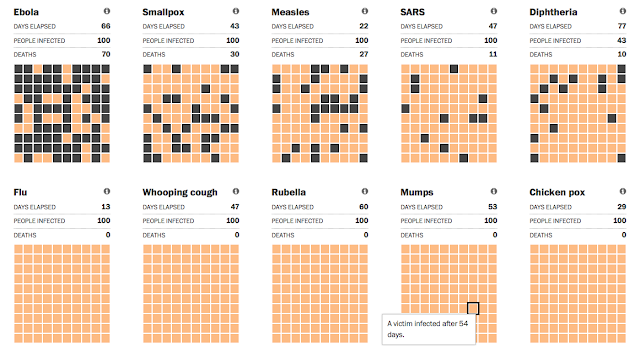
The recent Ebola panic prompted The Washington Post to create this precise simulation that compares the disease's spread to other historical pandemics. Although the original interactive graphic pre-dates 2015, the updates are important to medical students and social scientists who are trying to track contraction, infection, transmission, and vaccination.

Honorable Mention: Ecology & Forestry


This seemingly simple motion graphic by Nature Video brings into startling relief the rate of global deforestation. Researchers made 421,529 separate measurements around the world to produce an irrefutable data-driven image of the changing planet.

For more resources, take a look at last year's five best animations, or some of our other posts about animations in the classroom:


Related Posts Plugin for WordPress, Blogger...


Pin It