One of the promising truths about project-based learning (PBL) is that it's coming whether schools like it or not. Even in an age of race-to-the-top testing, children are slowly but surely doing more and more work via technology.
Even as some instructors fall back on "project-oriented" learning, rather than true PBL, the gradual spread of tablets and BYOD tasks will invariably shift classroom education toward a more hands-on model. The hope, therefore, is that personalized iPads and home tech assignments will encourage creative interactions and self-directed investigations.
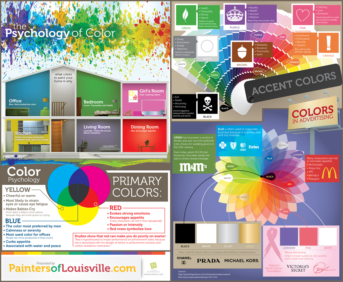
One of the most basic choices in producing a technology project is the selection of color. Students in their iMovies, Keynotes, and Tumblrs can now pick from a palate of pixelated paints. All too often they get over-excited and click on a madcap miasma of mismatched hues. Knowing a little bit about color theory can go a long way toward designing an appealing and effective project in the open-source web 3.0 world.
Many of the modern concepts around the use of color, particularly in technology or multimedia formats, spring not from classes in oil painting but from theories of branding. Crafting an alluring logo or a unique web banner both draw from evolving notions of Internet marketing. These graphic schemes can relate effectively back to the classroom, as students pair fonts and tints in their Prezis or as they select background themes for their project blogs.
The motion infographic above by Sean Ferguson gives a crisp and helpful primer in fundamental color theory. It lays out the guidelines of partnered tones, in addition to other considerations of visual design.
Choosing among styles of lettering, by the way, can often have the same positive impact on projects. Check out "A New Typography Of Language" for ideas on teaching students about fonts.
A TED talk from journalist John Hockenberry has been getting a lot of promotion on Twitter lately, and rightfully so. His TED2012 Design Studio address is called "We Are All Designers," the marrow of which reveals a vital connection between design and education. Ostensibly relating the story of his father's creative career and his own relationship with a wheelchair, Hockenberry at heart delivers advice to teachers, students, and citizens: life must be designed with intent.
"Bad design is just people not thinking," stressed Hockenberry's father, a transformative designer for IBM, Kodak, and Steelcase. "Every object
should be about something, John. It should imagine a user. It should
cast that user in a story starring the user and the object. Good design ... is about supplying intent."
With a one-word substitute, all of the same could be said for education. Bad education comes from "not thinking." It comes from just doing, with both teacher and student going through the motions. Each lesson should be "about something." It should envision the student and supply meaningful intent.
Hockenberry says that everyone should act by design, with deliberation in planning life's purpose. Acting
with intent conveys authorship. It drives communication and establishes the
progress of words and objects. Hockenberry points to Plato and other classical voices who wrestled with the question, "What would human beings do now that they were no longer
simply trying to survive?" Human life needed a newer, deeper reason to exist. Today, in the rush of the congested modern age, a tougher question has emerged: "What shall we do now in the face of the chaos that we have created?"
Education contends with this same dilemma. How can we negotiate the age of big data and the multiple tugs-of-war for our students' attention? As Hockenberry notes, "How
shall we inscribe intent on ... all the
circumstances we create, on all the places we change -- the consequences
of a planet with seven billion people and counting?"
The fundamentals of teaching with intent rely on two ingredients: purpose and care. These are the elements of edsign, the design of information for education. As we've noted before, "it is the shaping of concepts for the most successful
delivery to learners. It requires careful planning about what elements to
present, in what order, and in what lingo."
In hopscotching through our days, how often do we fall back on what is instinctive or easy? As another June arrives, do we look back on post-its of unfulfilled ideas and resources we never found time to share? Do we pull out last year's worksheets and default to what is repetitive? In the rush of meetings and evenings, do we occasionally bluff our way through half-realized lessons? What do we do when our assessments or projects have unintended outcomes?
These are the self-critiques of all well-intended teachers. In education, we put no stock in the cliche about the road to hell. Intent is a virtue. Design and desire, not perfection, are the drivers of good teaching. As Hockenberry concludes, "An object
imbued with intent -- it has power, it's treasure, we're drawn to it. An
object devoid of intent -- it's random, it's imitative, it repels us,
it's like a piece of junk mail to be thrown away. This is what we must
demand of our lives, of our objects, of our things, of our
circumstances."
For magazine subscribers and blog aficionados, infographics may seem ubiquitous these days as fads for the design intelligentsia. For our students, however, infographics are brand new. The notion of a dynamic visualization, riddled with appealing facts, is almost too-good-to-be-true for our modern learners. Infographics can dazzle children with their neon hues and wry caricatures, and when expertly constructed, they can provide an innovative glimpse at complex data.
Putting together an effective graphic is difficult, especially when the audience is under 18 years old. Crafting images and ideas to educate young learners involves a full complement of teacher skills. We call this approach "edsign."
Edsign is the design of information for education. It is the shaping of concepts for the most successful delivery to learners. Edsign involves filtering the "need to know" from the "nice to know." It requires careful planning about what elements to present, in what order, and in what lingo. Edsign applies the talents of the teacher to present details in a logical, dynamic, permanent way that grabs the student's attention and internalizes the key take-aways.
A great resource about the benefits of data visualization is this short video from Column Five. It's been making the rounds of some excellent blogs, but it's worth a look if you haven't seen it - and our students most likely haven't.
Infographics can be the epitome of edsign. Good infographics are amalgamators of charts, graphics, icons, symbols, and fonts. They are arresting ways of uniting visual and analytical tools to broadcast clear, data-driven messages.
Bad infographics, however, rely on spash over substance. They ignore the lessons of rigorous graphs and instead blur analysis in the name of pop appeal. Attention to detail is absolutely necessary in creating a quality graphic. Hastily assembled images can lead to misinformation and inaccuracies.
We try not to rely on flashy visuals without also emphasizing the analytical skills that students should be developing across every grade level. Ideally, we would be able to infuse daily lessons with examples of graphics that shed light on modern technology or popular consumerism. Teaching learners how to decode infographics is crucial to understanding facets of meaning.
Our students are accustomed to seeing percentages in their textbooks and arrows on their PowerPoints. These are the building blocks of edsign. High quality visuals provide an easy progression from children's comfort zones to more layered, analytical interactions that at once excite the eye and engage the mind. They can enlighten learners through a form of literacy that emphasizes critical thinking, communication, and creativity.


)