Showing posts sorted by relevance for query graphicacy. Sort by date Show all posts

Saturday, March 29, 2014

Graphicacy - The Key To Visual Thinking In A Differentiated Classroom


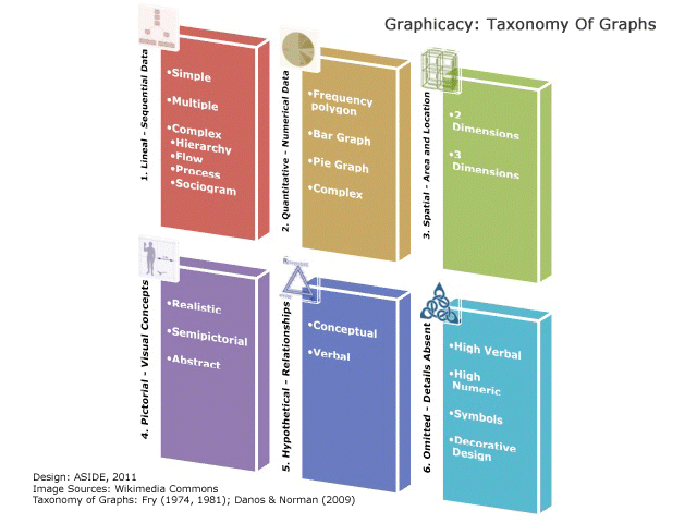
In the scholastic world's quest to pinpoint new "literacies," one of the most essential skills in a student's toolkit isn't new at all. "Graphicacy" is the vital proficiency with visual inputs that all learners must master in the modern classroom. Graphicacy refers to the encoding and decoding of images, particularly in the close examination of details that construct visual meaning. It stands with literacy, oracy, and numeracy as one of the four indispensable corners of education.

Source: Christopher G. Healey
Graphicacy dates to W.G.V. Balchin's coinage of the term in the 1960s to identify the visual-spatial aspect of human intelligence. What began as a staple of South African geography education has ballooned in importance thanks to the onslaught of learning and entertainment media that all rely on optical displays. Especially in today's 1:1 classroom, with hand-held devices and ubiquitous smartphones, the understanding of visual patterns and pictorial cognition is imperative.

Graphicacy is about more than visual thinking. It is instead a careful roster of skills to comprehend diagrams, photographs, charts, logos, icons, maps, and picture books. With today's rightful emphasis on differentiated instruction, contemporary classrooms need to incorporate coaching in graphicacy to reach students via their learning preferences.

Source: Stephen Few

One key to guiding students in understanding graphs and drawings is teaching them about preattentive attributes. These are the visual marks that the mind's iconic perception unconsciously absorbs. Preattentive attributes are quickly discerned by the eye and rationalized by the brain to distinguish size, shape, color, and alignment. Visual designers employ preattentive attributes to make tables readable and logos memorable.

Stephen Few offers a clean, expert tutelage in the keys of preattentive attributes in "Tapping The Power Of Visual Perception." His graphic (above) presents some of the core distinguishing techniques used in both creating and interpreting images.

Source: Creative Bloq, via Alberto Cairo, The Functional Art

Another valuable graphic (above), which combines single attributes into coordinated displays, is featured in Graham Odds excellent explanation, "How To Design Better Data Visualizations," at the Creative Bloq. Taken from the work of William Cleveland and Robert McGill and published in Alberto Cairo's book, The Functional Art, this illustration is terrific for teachers to use as a tool in laying out the building blocks of visual comparisons. Students can apply the techniques of the optical continuum to decipher political cartoons, historical maps, and scientific displays. Dustin Smith also highlights the value of this graphical instruction at his superb blog.


To catch students' attentions and open their eyes to the power of subtle attributes, we recommend Jason Silva's masterful video, "To Understand Is To Perceive Patterns." In zippy, dynamic narration, Silva races through a visual blitz of naturally occurring frameworks and motifs. It's fascinating and mind-boggling for any viewer.

For further information about graphicacy, we suggest:

Saturday, October 26, 2013

Graphicacy And Teaching The Art Of Seeing

Source: PBSoffbook
As we continue to explore data visualizations with our students, we are particularly aware of the importance of graphicacy to the modern learner. Tommy McCall hit the nail on the head when he called “graphicacy the neglected step child in the classroom” in his TEDx East talk on Literacy, Numeracy, And Graphicacy. In the new e-cology to design and create digital content that is transmitted, interactive, and shared, it is even more vital to incorporate graphicacy skills in our lessons.

Today, learners need to analyze information that is interconnected with society and the environment, and that is continually transmitted, remixed and shared. This comingling of content using text, images, and data in multiple formats shapes the way we interact with visual communications.

By training kids to thoroughly study what they see, we reinforce their visual acuity, attention to detail, and ability to notice conspicuous absences of information. We want them to develop a keen eye for seeing, to detect problems, and to understand the message inherent in the design. With the enormous influx of data visualizations, infographics, motion graphics, and more, educators need to build in opportunities to incorporate graphicacy skills beyond maps, charts, and diagrams in textbooks. Now more than ever, students need to practice visual decoding and encoding in an active way to articulate what is seen and not seen.

The PBSoffbook video, The Art of Data Visualization, reinforces the multifaceted aspects of content delivery and the role of design in the process. It features commentary by data visualization pioneer Edward Tufte, Julie Steele from O’Reilly Radar, Josh Smith from Hyperakt, and software artist Jer Thorp.


Each discussion describes the role of design, content, and audience. Tufte talks about the need to respect your audience and know your content. For him, no amount of style will make up for poor content. His closing comments on wanting to see to learn something and not just to confirm it, particularly hit at the heart of why we need to teach students the art of seeing. As educators, we want our students not to look at content to confirm what they see, but to see to learn.

Source: PBSoffbook
Some of the takeaways from the others are equally as validating in supporting this idea. Julie Steele talks about the relationship between the designer, the viewer, and the data that make up visualizations. For Steele, designers use visual patterns to make decisions in order to trigger emotional reactions from the reader. Josh Smith describes how data tells a story and how the visualization is a narrative around it, and Jer Thorp sees a strong connection between data and culture.

As with any other literacies, we need to make sure that the core underpinnings of graphicacy seamlessly enter our classrooms. Visual forms of communication challenge the very nature of how we look at content, because they are social, organic, interactive, and constructed. This is why it’s important for our learners to have a solid foundation in the art of seeing, and we need to teach them how.

For other posts on graphicacy, please see:


Monday, March 23, 2015

"What Is Graphicacy?" — An Essential Literacy Explained In An Animated Motion Graphic


What Is Graphicacy? from The ASIDE Blog on Vimeo.

We live in a visual world. Smartphones, television, Internet, and social media all push information in real-time, all the time. Visual media bombard us in constant streams. Learners of every age, therefore, need to understand how to analyze pictorial information. This skill of parsing images, interpreting pictures, and decoding diagrams is known as graphicacy.

The motion graphic (or explainer video) in this post describes the many reasons for graphicacy education. Maps, cartoons, and photographs all feature symbolic cues and metaphoric elements. An animated infographic itself can become a conduit for graphic instruction.

Sixty-five percent of people today identify as visual learners. In fact, the brain processes optic inputs 60,000 times faster than text. Yet schools and scholarship rarely apply the tools and time to train people how to understand all of these visual streams.

Source: ASIDE 2015


Graphicacy stands with literacy, oracy, and numeracy as one of the four indispensable corners of education. It dates to W.G.V. Balchin's coinage of the term in the 1960s to identify the visual-spatial aspect of human intelligence. What began as a staple of South African geography education has ballooned in importance, especially in today's 1:1 classroom. With today's rightful emphasis on differentiated instruction, contemporary classrooms need to incorporate coaching in graphicacy to reach students via their learning preferences. (Continue reading for more information….)


Visual literacy is about learning how to look. It involves learning how to internalize and deconstruct the images that the brain sees. It involves input. Visual thinking is about learning how to design. It involves imagining graphic representations of new or traditional concepts based on the mind's unique creation. It involves output. Graphicacy, therefore, is the union of the two acuities. It marries the essential skills of decoding and encoding to embrace a range of pictorial proficiencies. (Continue reading for more information….)


Source: ASIDE 2011

Tommy McCall hit the nail on the head when he called “graphicacy the neglected step child in the classroom” during his TEDx East talk on Literacy, Numeracy, And Graphicacy. In the new e-cology to design and create digital content that is transmitted, interactive, and shared, it is even more vital to incorporate graphicacy skills in daily lessons. By training kids to thoroughly study what they see, we reinforce their visual acuity, attention to detail, and ability to notice conspicuous absences of information. We want them to develop a keen eye for seeing, to detect problems, and to understand the message inherent in the design. (Continue reading for more information….)


Graphicacy often takes a backseat in traditional classrooms, because understanding pictures is thought to be a natural consequence of basic vision. The conventional wisdom says that if people can see, then naturally they can comprehend what they see. Parents, however, know this is untrue. They know children must learn to decode images and connect the visual parts to the cognitive whole. Mothers and fathers dedicate evenings to paging through picture books with their toddlers, pointing out clouds and jackrabbits and smiling moons. (Continue reading for more information….)


Whether graphicacy is the “fourth R” or the “third skill,” as Howard A. Spielman refers to it, the format for representing data and visuals is much more complex today. Data visualizations such as infographics and the myriad of designs used in their creation are arguably more complex in many cases. This is quite the opposite of what infographics are by definition, which is to present complex information quickly and clearly. They often combine images and data in ways very different from standard graphs, charts, and maps in most elementary textbooks, thus prompting a need for graphicacy in education. (Continue reading for more information….)

Source: ASIDE 2015


We use four steps in guiding students to interpret charts, maps, cartoons, infographics, and logos. These four steps progress from base-level identification toward more analytical and sophisticated skills. The understandings proceed from: 1) Substance, 2) Scaffold, 3) Story, and 4) So What? (Continue reading for more information….)


Amid the national emphasis on STEM programs, charts are becoming key tools to represent visual statistics. As more and more schools migrate to 1:1 tablets, therefore, students need a foundation in reading and rendering their own optic inputs. The language of apps today is printed in icons. On handheld devices, colorful squares dance across each swiped screen. Children need to recognize these badges and identify the relationships between the logos and the corresponding actions. (Continue reading for more information….)

Sunday, July 31, 2011

Graphicacy: The Neglected Fourth “R”

With all the visuals in the media today, we assume that most adults bring a certain level of graphicacy to interpret the information they see; however, what about children and their graphicacy skills? Their textbooks, magazines and much of their media world is filled with visualizations of one kind or another. Graphicacy, today more than any other period in history, is crucial to understanding and deciphering information for the 21st century and is often neglected as literacy in schools. As educators, we cannot assume that students can read images, know the language to construct meaning, and interpret visualizations without instruction. Critical thinking is no less a part of graphicacy than it is to any other literacy. It needs to be harnessed by teachers into all content areas beginning at the elementary level as an essential component for deciphering information.

If we stop and think about it, one of the first things children come across in a graphical form is a picture book. Perhaps this is why picture books are so important for children. They help them develop critical thinking skills to make connections between words and images as well as to wonder, anticipate or predict what happens next. Take the book One, by Kathryn Otoshi; it is perhaps the simplest in terms of graphics, but one of the most powerful books about bullying. It's clear, strong message about standing up for oneself and others through the use of simple colored dots for characters visually holds the reader’s attention to convey a strong message. Read this to a group of middle school students and what begins as laughter turns into a powerful WOW. Graphically, it is simple, but just like any advertisement, the carefully constructed relationship between size, shape and color are deliberate. Why is the character of Red the bully and not green, or why is Blue the bullied and not yellow?

In their work, “Graphicacy: the Fourth ‘R’” (2000), F. Aldrich and L. Sheppard point out that graphicacy is rarely taught explicitly and it is often assumed children will pick it up along the way. They make a strong case for teaching it as a learned skill, just like any other skill that needs to be taught. With the current craze in using visualizations, particularly infographics, the need to incorporate graphicacy as an important facet of learning is even more vital. Without it, students will not develop a discerning eye to interpret the flood of visualizations in the media. Infographics by definition are supposed to represent complex data and information quickly and clearly, but not without the learned skill to decode them. Moreover, they may not be able to critically analyze the data for accuracy, make connections without prior knowledge, or verbally express how the graphic is unclear or confusing. By integrating graphicacy into all content areas of the curriculum, children will acquire the skills they need to understand the ever-growing mounds of information designed to engage the eye.

See also:
Graphicacy Resources
Designing Information: The Need for Graphicacy
Other posts on graphicacy

Thursday, August 4, 2011

Graphicacy: Deciphering The Code

We try to remind ourselves that even though our students are bombarded with visual stimuli, they don’t always grasp how to parse the incoming images. We’ve cautioned before against assuming that students can intuitively “read” pictures and graphics.

If graphicacy refers to the roster of skills necessary to comprehend optical inputs, then we can communicate these skills by teaching the decoding and encoding of visual data. For us, decoding means judging, evaluating, challenging, or knowing the message underlying a cartoon, chart, or corporate brand. Encoding, on the other hand, is often the overlooked sibling in education. Encoding in many ways is the truer test of internalization, because it involves the ability to produce unique representations that reveal the layered skills of graphicacy. For us, encoding means creating, drawing, writing, or designing original and meaningful graphics.

Balchin and Coleman (1965) first introduced the term graphicacy to refer mostly to geography education. They meant to emphasize a spatial understanding that could not be conveyed solely by words or numbers. In his noteworthy paper, “Graphicacy As A Form Of Communication,” P.D. Wilmot (1999) of South Africa’s Rhodes University builds on Balchin’s, Coleman’s, and other scholars’ work to argue that an inclusive curriculum in graphicacy must be added to national standards.

Wilmot posits that graphicacy is equal to other literacies of oracy, literacy, and numeracy. Everyday encounters with pictorial representations, such as infographics, matrices, maps, logos, diagrams, word clouds, and icons, all require a “symbolic language” to translate ideas about “spatial relationships.” (p. 91)

Wilmot explains that specific mental skills are necessary to understand (decode) and to create (encode) graphic items. As he notes, “because perception involves both a physical process of ‘seeing’ and an intellectual one of interpreting, it is bound up with the development of cognitive skills.” (p. 93)

Most interesting in Wilmot’s thesis is that in scrutinizing early papers about information saturation (Fry, Gillespie, Glasgow, Van Harmelen & Boltt), he in many ways presages the modern harbingers of information overload (Palfrey & Gasser, Gleick, Weskamp, ASIDE). If the verdict is in about visual strain, then we genuinely “can no longer afford to neglect graphicacy as a form of communication.” (p. 92)

Friday, August 12, 2011

Graphicacy in the Primary Grades

Whether graphicacy is the “fourth R” or the “third skill” as Howard A. Spielman refers to it, the format for representing data and visuals is much more complex today. Data visualizations such as infographics and the myriad of designs used in their creation are arguably more complex in many cases. This is quite the opposite of what infographics are by definition, which is to present complex information quickly and clearly. They often combine images and data in ways very different from standard graphs, charts and maps in most elementary textbooks, thus prompting a need for graphicacy in education. To quote Spielman:
Appropriate skills build upon a foundation of graphic symbols and a system with rules and syntax, assuring clear graphic input and output communication, just as literacy and numeracy represent similar linguistic and quantitative skills.”
For Spielman, graphicacy should be considered a core competency just as literacy and numeracy, and  children need to formally learn these skills in the primary grades to give them competitive advantages in a world full of graphical information. Building a foundation in these skills into the curriculum will help children develop a common language for graphic communication, an understanding of design, and a way to more accurately represent data. The daily use of graphical devices and images to create visualizations will not be as readable without having learned the skills to do so.

As it was mentioned in an earlier post on graphicacy, authors F. Aldrich and L. Sheppard, like Spielman, maintain that if there are gaps in understanding the various symbols for interpretation or if they are not explicitly taught and reinforced, then gaps in knowledge, misinterpretation of data, and confusion of meaning increase. It should also not be assumed that children have the skills to construct meaning of views, forms, and commentary without being taught these skills explicitly. Things we take for granted as adults, such as cross-sections, changes in scale, or distant views, are not necessarily viewed the same way by children. At a young age, their views are much more literal, leading to misunderstandings of what they see.

Source: Aldrich and Sheppard (2000)
Commentary objects, too, such as lines and arrows, can also be misunderstood by young children to be part of a graphic, especially if they are not given prior knowledge explaining why they are included. For example, drawings showing emotion, such as trembling or excitement, often include commentary lines to help express those emotions. You cannot actually see these objects radiating from a figure expressing emotion, and children learn that early on reading in picture books. Likewise, when viewing graphical information, lines can indicate movement, sound, or light, and arrows can label, indicate direction, or show sequencing. Aldrich and Sheppard point out that without instruction to learn how commentary objects are used, young children take them to be a literal part of the graphic and do not see them as separate. We have only to look at the various types of graphic information in children’s textbooks to see the variations and inconsistencies to realize how these could cause confusion if not given graphicacy instruction.

As teachers, there are a host of resources for designing graphical information, such as ManyEyes or Chartle.Net to name a few. Our resource page has many helpful links. The most important thing, however, is to include as many possible types and variations to teach children. For Aldrich and Sheppard, it was CLEAR, their mnemonic form for remembering the criteria for selecting graphical information as a teaching aid. Looking at more examples and inviting children to think about them harder would invariably pay off in developing their graphicacy skills. Check out our other posts about graphicacy education.

Friday, July 1, 2011

Designing Information: The Need For Graphicacy

There is a burgeoning need to categorize and reshape today's information in innovative, recognizable, image-based ways. Now, with the onslaught of visual stimuli, from the Internet to infographics, there is a need to represent pictorially the multi-dimensional world of 3D and 4G information. From an educational standpoint, this means designing complex information for a range of learners. The manipulation of data through the use of images is crucial to understanding facets of meaning.


ASIDE 2011
Graphicacy represents an emerging literacy joining mathematical, textual, media, technological, and financial proficiencies. It moves beyond just being "visually literate" and instead combines mathematics, statistical analysis, geographic interpretation, and graphic design. Graphicacy is the ability to analyze and interpret information in a graphical form. It delineates clear, achievable skills that encapsulate the necessary benchmarks for today's children and tomorrow's professionals. Essentially, teachers must design information for educational use and also help their students decode the visual galaxy that encompasses their current world.

The crucial skill of graphicacy is vital to sustaining the relevance of a school's curriculum and also to sustaining the prominence of school graduates in a competitive marketplace. Students must be graphically literate to be informed, as they slice data, images, and words into layers of information and construct relational meanings. Graphicacy education, like literacy, oracy, and numeracy, completes the lines of communication necessary for learners in the 21st century.

Resources:
The Emergence of Graphicacy by Poracsky, Young, Patton
Graphicacy: The Third Skill by Spielman
Graphicacy as a Form of Communication by Wilmot

Wednesday, October 10, 2012

Graphicacy = Visual Literacy + Visual Thinking

Source: ASIDE, 2012


As schools increasingly look outside of their common cores to pinpoint skills for global competitiveness, they recognize the need to educate students beyond the written text. This curricular expansion can at times encounter uncertainty over instructional fads versus educational scholarship. For example, questions occasionally arise about where the skills of graphicacy converge with the similar sounding terms of "visual literacy" and "visual thinking."

Visual literacy is about learning how to look. It involves learning how to internalize and deconstruct the images that the brain sees. It involves input.  

Visual thinking is about learning how to design. It involves imagining graphic representations of new or traditional concepts based on the mind's unique creation. It involves output.

Graphicacy, therefore, is the union of the two acuities. It marries the essential skills of decoding and encoding to embrace a range of pictorial proficiencies. Due to technology and media, today's visual kinetics demand a firm grounding in the illustrative arts.

In "Just In Time For Big Data: Graphicacy Levels On The Rise," Anne Milley of the International Institute For Analytics reinforces the need for graphicacy skills amid the burgeoning age of "Big Data." She emphasizes that data visualizations typically require more analysis (and, therefore, more training) than information visualizations. She acknowledges, "it is good to see that we are poised to take greater advantage of our amazing visual bandwidth through more graphic encoding of data."

Source: ASIDE, 2012


The charts and graphs that Milley champions have been key mathematical tools for generations, but they have not always made their way into other disciplines. Today's infographics, for example, sometimes blur the line between "pure" data charts and what Edward Tufte derides as "chartjunk" (i.e., unnecessary ornamentation that serves no communicative purpose). A 2010 white paper out of the University of Saskatchewan, however, pushes back on this notion of visual purity.

"Useful Junk? The Effects Of Visual Embellishment On Comprehension And Memorability Of Charts" (Bateman, Mandryk, Gutwin, Genest, McDine, & Brooks) suggests that the cleanest form of data design may not always be the most useful. This thesis gently insists that elaborations to stark graphs do offer value. For example, there is a difference between a standard bar chart of corporate earnings and an infographic of McDonald's annual revenue depicted as a series of french fries sticking out of a container. The first focuses solely on the raw numbers, while the second combines the data with branding associations, visual mnemonics, color and logo cues, and even emotional connections.

This excellent slideshow from Andy Kirk of Visualising Data reminds us above all else why graphicacy matters. In "The 8 Hats of Data Visualisation," Kirk recounts the design process and the mindset of creating great graphics.
For more information, please check out our other posts on graphicacy.

Wednesday, October 12, 2011

Graphicacy: Infographics As Literacy

Graphicacy is the realization of information in a visual format. It is a literacy on par with textual, oral, and numerical skills. Graphicacy often takes a backseat in traditional classrooms, because understanding pictures is thought to be a natural consequence of basic vision. The conventional wisdom says that if people can see, then naturally they can comprehend what they see.

Parents, however, know this is untrue. They know children must learn to decode images and connect the visual parts to the cognitive whole. Mothers dedicate evenings to paging through picture books with their toddlers, pointing out clouds and jackrabbits and smiling moons. Fathers gesture at illustrations to connect colors to words, pigs to oinks, and cats to hats.

Adults know, too, that graphic interpretation is not automatic. Many times they themselves have cocked an eyebrow at a line in their Charles Schwab BAC EPS mountain graph. They've reread a GOP primary cartoon to locate the pun, or they've scanned Zimbabwe to pinpoint their safari.

Source: ASIDE

Teaching graphicacy is crucial in our schools. Infographics can offer engaging examples of graphic instruction, because they often combine data, images, symbols and lettering. Listed below are some of the resources we've found useful in approaching graphicacy in the classroom and using infographics to spur visual thinking:

Monday, July 11, 2011

A Taxonomy Of Graphs

In order to learn the skills of visual literacy, students can practice how to “read” an image. To do this, they need a “language” to understand the different types of graphic tools.

Just as students move up in grade levels, enjoy more complex literature, and solve harder math problems, they also steadily encounter more advanced graphic representations. The skill of graphicacy incorporates clear methods and tools, just as linguistics and mathematics have their own terms and structures.
In their work, “The Development Of A New Taxonomy For Graphicacy” (2009), Xenia Danos and E.W.L. Norman draw upon the work of Edward Fry to offer a new series of classifications for pictorial devices. The authors help teachers introduce graphicacy into their curricula by defining the categories of visual analytics.

For example, in the “Taxonomy of Graphs” (Figure 8), Danos groups different types of displays based on Fry’s descriptions (“Graphical Literacy,” Journal of Reading, February 1981). In the taxonomy, the visual tools become increasingly complex, moving from literal to abstract:

  1. Lineal graphs show sequential data, such as story lines, timelines, flow charts, sports playoff brackets, or genealogy charts
  2. Quantitative graphs display numerical data, such as line graphs, bar or pie charts, or supply and demand curves
  3. Spatial graphs reveal area and location, such as floor plans, road maps, or contour renderings
  4. Pictorial graphs rely on visual concepts, such as realistic paintings, cartoons, or abstract drawings
  5. Hypothetical graphs address the interrelationship of ideas, such as theoretical models or sentence diagrams
  6. Omitted graphs intentionally leave out explanatory details, such as essay outlines, corporate logos, statistical tables, religious symbols, or decorative designs
These vocabularies help teachers describe the steps of visual interpretation to our students. By using a common terminology and understanding which graphs are more or less approachable, we can better help our students use these tools. We can differentiate for each student the appropriate level in graphicacy, just as we level books into reading baskets and move systematically from pre-algebra to algebra to algebra II.

Wednesday, July 18, 2012

Info-graphicacy: Saving Visually Self-Destructive Students

Source: The Learning Web
Many students in today’s generation face an acute barrier to learning. This obstacle is going largely unaddressed, despite the following conundrum:
  1. Most information today is delivered visually.
  2. Most students self-identify as visual learners.
  3. Many students, in fact, are not visual learners.
  4. Many students, therefore, are actively working (or studying) against their own educational self-interests.
Depending on which study you believe, anywhere from 39% to 65% of people would be classified as "visual learners." Ask a roomful of children, however, what kind of learner they think they are, and almost all will claim to be visual. This is because they enjoy pictorial engagements, such as video games, television, and movies, and because image-based learning is considered to be relatively passive and thus “easier.” Two main options exist to handle this dilemma:
  1. Teachers can restrict visual inputs, such as laptops, iPads, smartphones and SMARTboards, to only a few select students, and, at the same time, they can rebuke children for visual proclivities and enforce more inherent auditory or kinesthetic learning styles.
  2. Teachers can increase instruction in visual tools.
The first choice makes little sense. It will no doubt incite insurrection, and it disregards the unavoidable future of high-retina technology. The first choice is also destructive, denying student choice, while the second option is empowering. It meets students where they are and uses the mutually acknowledged optical space as a launching pad for broader visual instruction.

Source: Visual.ly, Cragin Design
Graphicacy is the literacy of decoding and encoding pictures. We've emphasized before (here, here, and here) the benefits of increased graphicacy teaching in our classrooms. Infographics are the quintessential vehicles through which to reach a visual generation. Not only are infographics omnipresent, but also they are vivid, contemporary, and inclusive of the key elements for visual instruction. Good infographics seamlessly blend text, images, charts, and data and, therefore, present a ripe opportunity for pedagoptics, a method of teaching with optical tools.

Source: OnlineCollege.org
A recent study out of the Cornell Department of Design and Environmental Analysis used an infrared, eye-tracking system to study how people internalize infographics. Specifically, the team mapped viewers' eye movements as they scanned infographics, recording where their eyes landed first and lingered longest. The team found that combinations of images and text, rather than single, provocative icons, were the most effective in grabbing attention. This unexpected finding highlights the need to guide children in unraveling textual and optical data.

Marc Smiciklas, a digital strategist at Intersection Consulting, has a new book about The Power Of Infographics: Using Pictures To Communicate And Connect With Your Audiences. In it, he discusses the science of visual communication. In a terrific related blog post, Smiciklas notes that in order to negotiate information overload, the brain typically discards 99% of incoming sensory information, unless it is deemed novel or unfamiliar. He also cites a study from Robert Lane and Dr. Stephen Kosslyn that claims visual stimuli have value based on their "processing efficiency" and "expressive potential." Effective images, therefore, should provide detail, lay down context, clarify complexity, and reduce learning times. Infographics neatly fit these criteria for emerging learners, especially in navigating details and enhancing learning efficiency.

Source: Marc Smiciklas
The venerated image curators at Visual.ly also recently blogged about what made their top 30 most-viewed infographics so popular. They analyzed the content type, content domain, design type, and use of data visualization. Their findings offer interesting conclusions about what constitutes a potent illustration, especially in grabbing viewers' attentions.

For teaching resources, check out our library of infographics, arranged by subject. Or check out our graphicacy page, with more articles and research.

We also recommend these resources for further reading:

Tuesday, October 14, 2014

Seeing Is Believing: Visual vs. Linear Content

Source: ASIDE, 2014
In order for our learners to see how designing information changes how it is viewed, the students this year placed their visual infographics side-by-side with their linear notes to see the transformation. It was the “ah ha” moment, when they could examine how the delivery of content mattered and how the deliberate choices in font hierarchy, color selection, and placement changed the way others perceived the ideas.

Source: ASIDE, 2014
Reflecting on their own work, the students saw firsthand how media could change and enhance a message. Paralleling the visual and linear content enabled them to observe the full effect of how design could give content power. It provided context for the information.

Source: ASIDE, 2014
For more than four years, we’ve been working with our students to think about the design of information and how presentation changes its perception. This newest crop of acronym infographics exceeded our expectations, in part because we worked closely to develop a stronger understanding of both the elements and principles of design. As with any other skill, students need guidance in this area. Design literacy requires the same instruction as media and financial literacies.

To help them better understand "the tools to make art" as compared to "how to use the tools to make art," we supplied them with the charts below to clearly separate the elements and principles of design.

Source: Split Complementary

The students were given other resources and guidelines to help train their eyes to think like designers. They looked at infographics created by professionals and deconstructed what they saw. The process of learning to look at visual information is a core skill of graphicacy. The ability to decode information helps students transfer these visual thinking concepts into creating their own work.

Of course, before the students started, they researched and gathered the information from various websites as notes. This included citations for the resources. We stressed that quality infographics source the information at the bottom. Our students know we stand by our mantra, “Content First, Pretty Second.” Without strong content and the evidence to support it, the message is questionable.

Seeing the shift from linear to visual helped the students teach others about their topic. It’s the same art of persuasion we refer to in media literacy. The best way for learners to understand how to manipulate information is to do it. Attraction and appeal matter, and perhaps it’s a lesson for us as educators as well. Designing information provides context for content; the more visual it is, the stronger the retention.

For other resources, please see:

Thursday, August 18, 2011

Literacy, Numeracy and Graphicacy

Sometimes it's the simple thing that brings an idea to life. Check out this video presentation Tommy McCall gave at the TEDx East conference in May 2011 on Literacy, Numeracy and Graphicacy. He founded and operates the data visualization agency in New York City called Infographics.com. McCall sees himself as a producer, designer and data editor. In all these roles, he believes he “must understand the information, question its veracity, and convey its core message.” This is exactly what we want our students to do and is at the core of information literacy. For McCall, “graphicacy, the ability to communicate visually, will be an important skill set for future generations, just as literacy and numeracy are today.” It is clear, concise and worth the watch.

Friday, November 1, 2013

Is There A Visual Thinking App? Charts, Graphs, & The 1:1 Classroom

Source: Online-Behavior
With the advent of the iPad generation, the skills of graphicacy are taking on more importance than ever in today's classrooms. Graphicacy is the learned ability to decipher and design images, particularly around symbols, charts, and coded meanings.

Amid the national emphasis on STEM programs, charts are becoming key tools to represent visual statistics. As more and more schools migrate to 1:1 tablets, therefore, students need a foundation in reading and rendering their own optic inputs.

Source: Online-Behavior
The language of apps today is printed in icons. On handheld devices, colorful squares dance across each swiped screen. Children need to recognize these badges and identify the relationships between the logos and the corresponding actions.

With all of the nimble iPad tools, students can now efficiently create charts and graphs that represent data. In math and science classes, young learners can manipulate lines and layouts to share their findings. Historians and artists can incorporate visual blueprints for the Web 3.0 educational world.

Our own school has been implementing a 1:1 iPad program this year. We've been layering in graphs to help children understand antebellum agriculture and industrial GDP. For helpful posts about teaching with graphs, we recommend the following:
A terrific infographic that lays out traditional chart types in a kid-friendly, colorful fashion is "Nuts And Bolts Of Chart Types" from Online-Behavior. Familiar diagrams like the pie chart and line graph are explained in simple language. More sophisticated plots like the waterfall and radar charts also receive lucid billing.

The tree graph, in particular, has become wildly popular in the business world to represent customer segmentations. Recent budget graphics and current event maps have also relied on the tree graph to chunk related information.

Source: Lo's List, David McCandless, Harper Collins, The Visual Miscellaneum

New categories, however, are emerging to display contemporary data. Tropes from the digital dictionary are now readily recognizable as ways to present visual information. The concept map, matrix grid, flow chart, word cloud, and bubble graph are all now popular tools.

The terrific handout, "Types Of Information Visualization," offers these emerging illustrations in a valuable grid. Presented via Lo Martin, from her interview with graphic guru David McCandless, this table from The Visual Miscellaneum draws on Edward Tufte's work to present visual arrangements for iPad enthusiasts.

We owe a lot to our friend Lam Thuy Vo, the journalist, infographic guru, and interactive media editor at Al Jazeera America, who introduced us to the McCandless framework and who also created the superb diagnosis below of the "Anatomy Of A Chart." It is a first-rate primer for learners of any age as they begin to decode data representations.

Source: Lam Thuy Vo
For other articles on teaching with charts, please see:

Monday, October 3, 2011

Graphicacy: Lessons from Student Visualizations

Graphicacy in the early grades relies on careful steps that help children build proficiencies in reading visual inputs. Precise, learned techniques can foster confidence both in deciphering and in creating pictorial representations. Teachers and parents realize more and more that the world is increasingly visual in its inputs, with laptops, tablets, DVRs, smartphones, advertisements, logos, flash videos, and YouTube streams. Digital natives know no other world. It's no wonder that almost 80 percent of them self-identify as "visual learners."

In this vein, on the second day of school, we decided to try a new introduction to our exploration and colonization unit. Our seventh-graders were beginning a two-year study of American history with a link to their prior year's investigation of European trade and enlightenment. Before delving into details of Cabot and Pizarro, of mercantilism and triangle trade, we started with a simple visualization.

We passed out blank pieces of 8½ x 11 printer paper and asked the seventh-graders to draw the Atlantic Ocean. There were no other instructions. We did not give background information about sailing routes or settlements or parameters about what the image should include. We just said to visualize whatever image came to mind with the words, "Atlantic Ocean." After a brief discussion of what it meant to "visualize" (to create a "mental picture," volunteered one student), they began in tentative earnest.

Sources: Wikimedia Commons, ASIDE

A few students hemmed and asked clarifying questions, because they "didn't want to do it wrong." Most charged forward and began tracing lines on the page. After five or ten minutes, we regrouped and asked if anyone would like to share his or her visualization. Almost everyone raised a hand.

Several students roughly recreated the map of the Atlantic and its surrounding continents. Some used just pencil lines, and we talked about white space and borders. Others shaded the land masses, and we talked about legends and visual cues. Most inserted words or keys, and we talked about labels and captions. A few students used colors or focused on one region of the Atlantic, and we talked about perspective and choice.

One student placed the ocean and the Earth amid the Sun and planets. We talked about microgeography and macrogeography. Another student drew herself on the beach at Martha's Vineyard. Since we had never required a "map" in our instructions, we talked about visual interpretation and signs to distinguish this Atlantic beach from a Pacific coast. One girl imagined a scuba diver beside coral, dolphins, and aqua bubbles. We wondered what fish might hint at the Atlantic rather than the Indian or Arctic. A few boys scribbled wave hunches or shaded with the sides of their pencils around the word "Atlantic." These offered avenues to discuss symbols, codes, and gradations.

In all, the variety of visualizations was what we'd hoped. They were all generated in a hands-on, tactile lesson that lasted no more than 15 minutes. Without direction, the students' pictures let us to talk about longitude and latitude, icons and ideograms, scale and focus, and shadows and hues. These are all part of normal geography and graphic arts instructions, but here they incorporated the larger design of information. Giving students a chance to practice visual thinking is a prime way to segue to the core skills of graphicacy.
Related Posts Plugin for WordPress, Blogger...


Pin It