One of the challenges we run into again and again in our teaching is the "forest for the trees" pitfall. In our middle school classes, we stress both core facts and larger themes. This seemingly dual focus can sometimes puzzle our students as they try to internalize one notion or the other. Ideally, we try to show how the details and the ideas are actually the same thing. Or to borrow the words of the furniture savant
Charles Eames, "The details are not the details. They make the design."
One of the touchstones of the design world is the unity of form and function. This "big picture / small picture" harmony is an equally crucial lesson for learners of all ages. In essence, as
Wells Riley reminds us, "
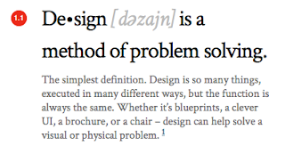
design is a method of problem solving." Figuring out how best to fashion a product or invent a logo combines all of the top-tier thinking skills, such as creativity and ingenuity. In his detailed web feature, titled "
Startups, This Is How Design Works," Riley offers a riveting tutorial in the fundamentals of design thinking.
As an interactive designer and founder of
Bionic Hippo, Riley aims to acclimate
entrepreneurs to the essential role of design in packaging and presentation. He also, however, assembles a masterful primer for school children in how to visualize information. Not only does he give young business leaders tips for marketing their ideas, but he also ends up offering advice to students in creating Prezis or PowerPoints. For example, he highlights German industrial designer
Dieter Rams' "Ten Principles of 'Good Design,'" noting that the best design "...is unobtrusive" and "...is as little design as possible." This echoes our favorite maxim of "
content first, pretty second."
Another engaging write-up for teachers trying to tackle the two sides of understanding is "
Balancing the Visual and Verbal Minds," by
Sharon Ede at
Cruxcatalyst. Rather than exploring how to present information, this post explores about how the brain receives it. Ede investigates how the mind processes ideas through the power of visual communication. Even
The Wall Street Journal recently published a feature by Holly Finn spotlighting how "
the most inspiring new art is visualized information."
When we talk about visual thinking in the classroom, we make sure to differentiate it from visual learning. A recent piece on "
Visual Thinking" from
The Multidisciplinarian makes this distinction clear by tracing the evolution of perception from classical art to engineering schematics to modern business ideation. If anyone doubts the power and profit of pictures,
Visual.ly rebuts with the infographic, "
Visuals Are Valuable." Shared by
Duarte Design (and
Diagrammer), the infographic chronicles how images have changed history and have made fortunes for visually innovative companies and individuals.
One new online tool for making cool, custom graphics is
Smore. Having just started private beta testing,
Smore advertises the opportunity to "design beautiful online flyers and publish instantly." When they say "flyers," we think "infographics." After playing around for a while, we've found the resulting graphics to be easy to create and extremely professional looking. We recommend you give it a taste.
Other valuable resources for students and teachers:


Hello, this is fastidious post I actually loved reading this.theamta.com
ReplyDeleteHi there, this is Salman. I'm from Pakistan, and my area of expertise is marketing fashion and leisure items while paying close attention to consumer preferences and industry trends. I keep up with the most recent skechers shoes price in Pakistan and have extensive knowledge of leading brands, particularly when it comes to footwear like Skechers shoes. In the constantly changing fashion business, my work assists audiences in making well-informed decisions. Presenting value, style, and quality to fashion-forward customers is something I'm very enthusiastic about.
ReplyDelete