Showing posts with label holiday. Show all posts

Sunday, October 30, 2016

Halloween Treats To Keep Learners Focused

Source: Halloween Costumes
We work in an elementary school. So if you’re like us, Halloween always makes it difficult for kids to focus, especially with a school-wide parade at the end of the day. Our attitude toward keeping their attention is to use Halloween content to design lessons that tap the spirit of the day.

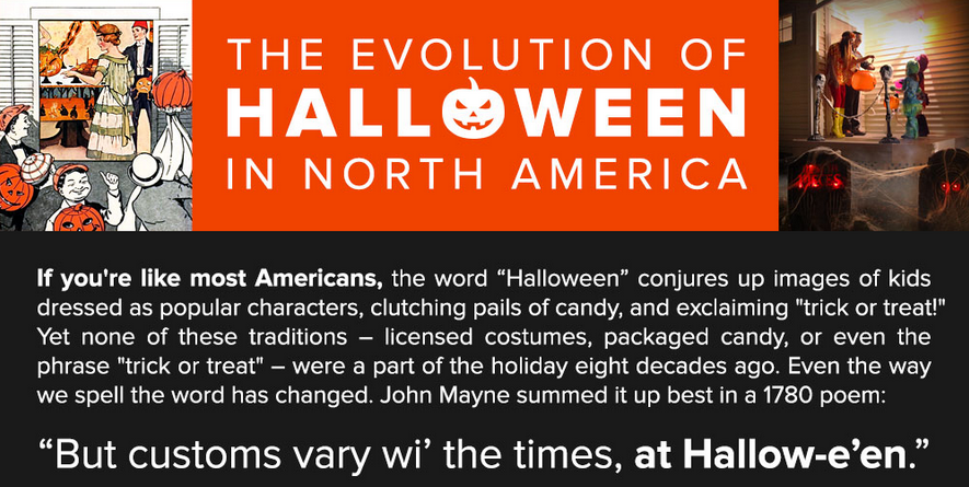
This year we found two new infographics to use with our learners. The first is The Evolution Of Halloween In North America. The timeline begins before 700 in three separate periods in history; from the 1900s to present, the timeline is arranged by decade.

Source: Halloween Costumes
The two-column layout of this infographic provides a visual connection between the history of the holiday and the literature and popular cultural aspects of the time. It’s perfect for scavenger hunts on the evolution of costumes, candy, and traditions.

Source: The Shelf
The other infographic that we thought educators would find useful is Trick Or Treat Your Way Into Halloween Sales Like A Pirate. The creator also designed "min-fographics," perfect for educators to put into any presentation software. The whimsical and colorful display to illustrate the economics behind the holiday is sure to enhance any math lesson.


The different sections of this infographic also provide ideal opportunities for data analysis of charts and graphs. They are just the right mix of visually appealing graphics with real numbers to engage students in making comparisons regarding sales, percentages, popularity, and more.

Source: The Shelf
We firmly believe a little deviation away from the routine to keep students focused pays off in the long run. Using infographics reinforces graphicacy skills, incorporates a little media literacy using Halloween hype, and celebrates learning with a little fun.

Source: The Shelf
Click here for other posts on incorporating Halloween ideas in the classroom.

Wednesday, April 1, 2015

April Fool’s Day – A Little Bit Of History

Source: History Channel

With cabin fever at an all time high in our students from what seems to be the never-ending chilly weather, we fully expect to get our fair share of practical jokes today on April Fool’s Day. We will no doubt try a few pranks ourselves on them as well.

But, as history teachers, we inevitably look for ways to give them a little bit of history about the day. The "Ask History: April Fools" video produced by the History Channel has the answers to how practical jokes became associated with April 1, complete with a little prank at the end.


For a little April Fool’s Day math, check out this graphic from Forbes on who is most likely to get fooled. By all accounts from the Harris poll survey, bosses are safe. We wonder if that will pan out for teachers, too. It might be a good opportunity to poll the students electronically using Kahoot to see whom they would put on their lists.

Source: Forbes

We hope our readers have a fun-filled day. There's no April Fools in that!

Saturday, February 14, 2015

Heart-Shaped Maps - Valentine Primary Sources

Source: Wikipedia - Oronce Fine, 1531
It wasn’t until our students started making heart-shaped worlds as part of a way to promote peace that we wondered if there were any historical references. To our surprise, there were plenty. One of the earliest heart-shaped (cordiform) map projections by Oronce Fine, a French mathematician and cartographer, was created in the sixteenth century. According to Wikipedia, this might have been his most famous illustration and one that influenced other cartographers, such as Peter Apian and Gerardus Mercator.

We love when something our learners do triggers a curiosity in us. Instead of showing our students the many infographics we’ve collected about Valentine’s Day that tabulate the amount of money spent by men and women on items such as flowers, chocolate, and jewelry, we chose to show these beautiful heart-shaped maps that so wholly connected to their designs. As expected, our students delighted in seeing the connection to their creations, especially since they had no idea of their connections to history.

We uncovered other examples of cordiform map projections that obviously take their influence from Oronce Fine's beautiful cartographic design. The maps below, illustrated by Giovanni Cimerlino and Pierre Moulart Sanson, were done more than a century apart.

Source: Rare Maps (Left) and Britain (Right)
Two more recent uses of the heart-shaped map appeared on stamps issued in the United States (1991) and Venezuela (1972). We wonder if the graphic artists knew of Oronce Fine's hand-drawn map of 1531.
Source: Dan's Topical Stamps
The "Love" stamp from the United States does not necessarily represent a cordiform projection, whereas the stamp from Venezuela celebrating World Health Day more closely resembles the heart-shaped designs from the fifteenth century.

Source: Biographile
As we probed the Internet for other examples, we discovered a heart-shaped map of Seattle from 1905 and one of the New York City subway system from 2008.

These maps clearly illustrate the change in design from one era to another. The map of Seattle represents a more typical illustration at the turn of the twentieth century, whereas the subway map, completed more than a century later, closely follows the style of a modern visual illustration or infographic.
Source: Zero Per Zero

Sometimes it's the innocence of children that triggers inquiry in adults. We attribute our curiosity to them. Finding other models based on their creativity led to the discovery of historical references. Connecting history through primary sources reinforced their global view of the world.

With the continued onslaught of violence and terrorism in the news, we could all use a little more heart.

Monday, December 22, 2014

Financial Literacy, The Economy, And Holiday Shopping

Source: NBC News
We received a lot of questions from our students about "Black Friday" this fall. It seems the play up to the annual start of the holiday shopping frenzy grows earlier with each passing year. If your students are like ours, many did not understand the hype around this day, how it affects the economy, or for that matter, why it is so important to the bottom line of so many companies.

Source: NBC News
Many students are unfamiliar with the term  “being in the red,” so the concept of “Black Friday” makes little sense when it comes to the overall economy. The video from NBC entitled “How Badly Would the Economy Suffer If Holidays Were Cancelled?” illustrates just how much the holiday shopping season has an impact on the economy even though it is a small part of the total.


Sometimes we need to stop and explain the underlying lingo to help students realize the financial implications. It’s more than just shopping for gifts. It may be a small portion of the larger economy, but many people depend on the holiday shopping season to help make ends meet. The issue is not whether it is too much hype, but more importantly, how it affects others. Either way, we cannot assume our learners understand the economic impact based on the colors of red and black unless we educate them.

Friday, November 21, 2014

Thanksgiving: Supermarkets And Fair Food

Source: Food Chains Trailer

With the Thanksgiving holiday less than a week away, many schools around the country enter into conversations with their students about being grateful for what they have, showing gratitude to others, and starting food drives for the less fortunate. The heightened awareness, while noble, should be an ongoing conversation about empathy year round, and not slotted into a month where we overindulge with too much food.

Source: Food Chain$
So this year, we chose to talk to our students about who supplies their food. We did not mean which grocery store. We posed the question: What does it mean "from farm to table"? Kids have mixed messages about farm life from rosy images in picture books, nostalgic views in commercials, or pumpkin picking during October in contrived environments for entertainment. We wanted them to know more about the people who supply fresh food to markets and manufacturers.

We showed our students the movie trailer for the new film Food Chain$, produced by Eva Longoria, that premieres around the country starting today. The full length film hopes to raise awareness about the human cost in supplying food and the plight of the farmworkers who endure the backbreaking labor to get it to us. While we may not be able to see the entire movie with our students, the trailer provides enough information for teachers to open up a discussion about the role of large supermarket chains in determining the price of food.


The power supermarkets have over revenue in the agricultural system is enormous. Supermarkets earn $4 trillion globally. Their drain on the revenue from the food supply chain has left farmworkers in poverty, while retaining huge profits for the corporations. Many farmworkers endure harsh work conditions, and in extreme cases, they have been held in debt bondage, or modern day slavery.

Many schools, including ours, participate in fundraisers for charities and causes, and we applaud all that educators and students do to help, but hopefully by raising awareness about fair food programs, we can collectively help break the chain. It's a fair trade for one of life's necessities.

For more information, please see: Food Chain$: The Revolution In America's Fields.

Sunday, November 9, 2014

Veterans Day: What We Don't See

Source: American Psychiatric Association
Veterans Day infographics provide a wide range of data to help us discuss this holiday with our students, and we've written a number of posts to remember the brave men and women who served so valiantly to protect our freedoms. But perhaps the infographic above from the American Psychiatric Association is the most powerful to cross our path. It's not about the numbers of veterans from different wars, or the history of the day; instead, it represents the staggering statistics about the wounds that plague the minds of so many of our veterans.

Source: American Psychiatric Association

It is difficult to get an official count of the number of soldiers with physical injuries who were wounded in Afghanistan and Iraq. According to the website, Costs of War, there are over 970,000 disability claims on record to the Veterans Administration as of March 2014, whereas the Department of Defense official count is just over 50,000. The DoD does not make this information easily accessible, and many of the news releases don't have direct links to the data.


Source: Takepart
When we add in the information for suicide and mental health issues for the wounds we can't readily see, the numbers go off the charts. The sad truth is there are far more injuries than what meet the eye. The infographic called Combating Military and Veteran Suicide and Supporting Mental Health Care points to an alarming statistic that one veteran commits suicide every 65 minutes.

While we don't want to dwell on such depressing facts with our students, we do want to educate them to understand that the costs of war are far greater than they may think. Just because someone is not physically hurt does not mean he or she is not hurting.

Thank you to all the veterans who sacrificed so much for us.

For other resources, please see:

Tuesday, October 28, 2014

Halloween Safety: A Worthwhile Infographic

Source: Safe Kids
With the plethora of Halloween infographics about costumes, candy, and traditions, perhaps the most important one for this year is the Halloween Safety infographic from Safe Kids. This much anticipated holiday deserves our attention, and we should make time to talk about safety with our students. This infographic is a perfect place to start. It provides some quick tips that can be used as discussion starters. It's a worthy one to share with parents, too, especially since some of the statistics are scary.

For more resources, please see:

Monday, April 21, 2014

An Animation Of Easter Chocolate - Teaching Media, Finance, & Global Trade

Source: NBC News
If you're like us, you indulged during this past week of spring vacation with some welcome sun and possibly some holiday candy. If you're also like us, you're now returning to a classroom full of restless students who can see the end of the school year in sight.

Luckily, the animation wizards at NBC News have once again offered up a timely treat to engage students' eyes (and taste buds) on their first morning back from break. The motion graphic, "The Business Behind Chocolate Easter Eggs," offers a surprisingly rich educational tour in just under a minute and a half. The video is not even really about Easter, so it is worthy of showing to any diverse classroom.

Instead, the clip is a visually gripping survey of the worldwide chocolate business. The narration touches on a wide range of useful learning points. It teaches mathematics and financial literacy in exploring the percentage growth of chocolate sales and the economics of futures markets. It pinpoints geography and global trade in highlighting the sources of cacoa beans. It touches on the devastating effects of human slavery in mentioning the ethics of forced labor. And, finally, it offers insight into media literacy and marketing in showing the spike in seasonal bunny rabbit advertising.

For another way to incorporate the Easter holiday into the classroom, check out "Everyone Loves Peeps, Easter Infographics & More."

Sunday, March 16, 2014

Not Irish, Snake Charmer, Or Saint - St. Patrick's Day Resources

Source: Visual.ly (detail)
In the spirit of St. Patrick's Day, many of us will don green even if we are not Irish. The Irish diaspora around the world makes it hard not to feel a little Irish on March 17. In fact, the Irish population in the United States is seven times larger than that of Ireland, and approximate 71 million live outside of the country.

Source: Visual.ly (detail)
Our students join in the fun, just like they do wearing red for Valentine’s Day or orange and black on Halloween. As always though, we try to look for ways to tie in the humanities. The history of St. Patrick and his role in converting the Druids to Christianity is as much a mythological tale as it is a historical event.

We gathered some resources here to use with our learners. Each of the motion graphics gives just a little insight into the day, the man, and of course the parade. One of our favorites is the video, the History of Saint Patrick – A Short Story, by Jeremiah Warren. It’s quirky, quick delivery reminds us of the entertaining videos our students love by CGP Grey.


Another short film featured on the History Channel is Bet You Didn’t Know: St. Patrick’s Day. Close to a million Irish fled to the United States in the 1840s because of the Great Potato Famine, settling in major cities along the east coast such as New York and Boston. As a result, demonstrating Irish pride grew, making New York’s St. Patrick's Day parade one of the largest in the world.


The video, Who Was St. Patrick, produced by Rose Publishing as part of its series called Christian History Made Easy provides an engaging and entertaining look at St. Patrick's place in Irish and Christian history.


As always, we continually use infographics with our learners as a way to revisit the design of information as an engaging way to break down the facts with text, images, and graphics. A new one we came across for this season is St. Patrick’s Day And How The Irish Took Over The World When No One Was Looking. It combines a blend of information on celebrations, population, customs, culture, and inventions. The content easily connects to a host of curricula areas as well.

Source: Visual.ly (detail)
For more, please see Infographics And The Luck Of The Irish

Tuesday, February 11, 2014

Valentine's Day - Hitting The Sweet Spots

Source: KarBel Multimedia
If you’re like us, you may be finding that the polar vortex has wreaked havoc on classes from the multiple snow-day closures. The looming mid-winter break isn’t making things any easier with the constant struggle to keep kids focused on learning. Add Valentine’s Day into the mix on top of everything else, and things get complicated.

Well, take heart. While we don’t typically spend too much time on Valentine’s Day as a special holiday, we know our kids enjoy it. We suppose that’s why we are always looking to find new material each year to bring them into focus during the heart of winter.

Source: Business2Community
As always, some of our favorite items to share are infographics, because of their ability to meet the sweet spots of engagement through design. How Much Will You Spend On Valentine's Day is one of the new ones for 2014 that was designed for Visual Economics by Karbel Multimedia. Its sectional approach, combined with a 3D array to portray the data, make it different from some of the more standard approaches in laying out the graphics.

Another new one for this year is Some Sweet Gifting Statistics. It has plenty of opportunities for comparative writing lessons. If you're looking to have your students make their own Valentine's infographics, check out the
U.S. Census Data for Valentine's Day 2014
for content and data.

One thing we have noticed in our learners is the growing fondness for motion graphics, sometimes called video infographics or explainer videos. Whatever the name, the power of video truly wins their hearts. So here are just a few of our favorites that we shared with our learners.

An Animated History of Valentine's Day
This video tells the story of the day's history through narrative illustration. It's perfect for younger learners to understand how the holiday evolved, and why it has turned into the card-sending frenzy that we have today.


Happy Valentine's Day 2014 - The Infographics - Andrean Perdana
This motion graphic has the more typical hallmarks of an infographic, with information, images, and data shifting and sliding across the screen.


What is love? - Brad Troeger
This animation takes a shot at the definition of love. It's geared for older students, and perfect for opening up a conversation to discuss how love is easy to compare but difficult to define.


Looking for more? Please see our earlier post: Valentine's Day: For the Love Or Money Infographics

Monday, December 30, 2013

New Year’s Resolutions: Some Visuals For Inspiration, Motivation, And Data

Source: Wikipedia
With the New Year arriving in less than 48 hours, people all over the world are thinking about making resolutions for the coming year.

According to Wikipedia, a New Year’s resolution is a secular tradition, most common in the West, when a person makes a promise to change something starting on the first of the year. It does have historical connections, and it is not uncommon to reflect on self-improvement.

To that end, we gathered some information about the topic to see what types of ideas we could use with our students during the first, short week of school. From Buzzfeed, we came across the post "14 Quotes To Inspire Your New Year’s Resolutions For 2014." This clever mix of historical figures garbed in festive holiday regalia would definitely make for a good, philosophical discussion in any history or English class.

Source: BuzzFeed
One thing that was apparent from our research was that statistically, most people don’t stick to the resolutions they make. According to the Marist Poll for 2014, the data on Americans resolving to make a change for the New Year is up slightly from the previous year by 4%. Its graph tracking the changes since 1995 of those likely and unlikely to make a New Year’s resolution would be interesting for a math lesson.

Source: Marist Poll
The Marist Poll also provides comparative statistics for prior years and a PDF of the complete tables and data sets collected for its 2014 New Year's Resolution inquiry.

Of course, there are plenty of infographics on the topic. This detail from one published by Kapitall Wire is a fitting visualization supporting many of the top ten resolutions most people make.
Source: Kapitall Wire
Lastly, for those who may have trouble sticking to their New Year's resolutions, there's always someone who wants to help. For some fun, check out this promotional motion graphic called "New Year's Resolution Ideas" by Gary Ryan Blair. It is a plug for his business, but it does give a good overview about trying to keep the goals many of us set for ourselves for the New Year. It also could be incorporated into a media literacy lesson on persuasive techniques to sell a product.


Enjoy and have a Happy New Year!

Monday, December 23, 2013

Infographic Holiday Cards As Data Visualization

Source: @GSipley
We’re sure many of our readers have received the proverbial end-of-year “holiday letter” recapping events in the lives of friends and relatives. Often these densely word-processed documents, peppered with pictures, seem more like a chore to read rather than an enjoyable update. Graphically designed they are not, and a tutorial on “less is more” would surely improve the overall layout.

Recently, our friend and colleague, Gina Sipley (@GSipley), forwarded an “infographic holiday card” she received. We then did a little digging. To our surprise, it turns out that using infographics to report on the happenings of the past year have been trendy for quite sometime. Who knew that data visualization had hit the holiday card market?

Source: Nicole's Classe
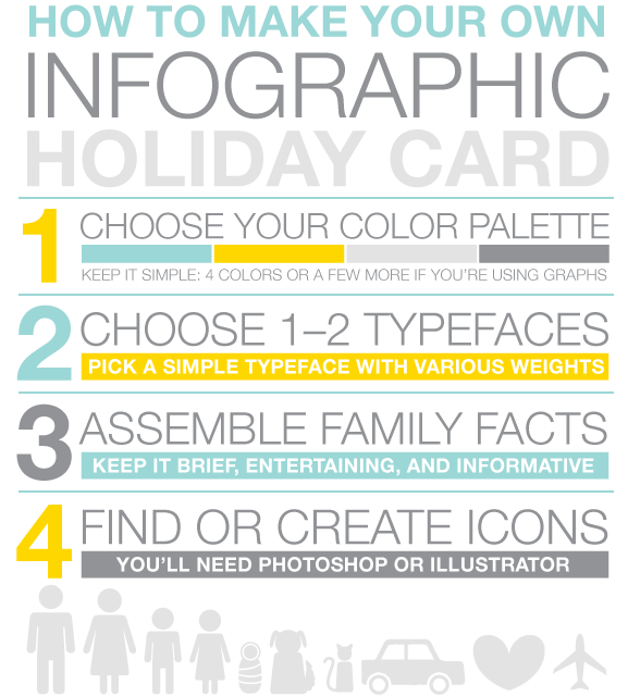
Resources abound on using this idea, and there are Pinterest boards with loads of samples. We even found a “how to make your holiday infographic card” by Alma Loveland for Nicole’s Classes.

It provides step-by-step instructions in design as an infographic, with explanatory text. The tips for laying out an infographic are useful and could be used as guidelines for any newbie wanting to try his or her hand in the process of creating one.

Source: Beautiful Fight
While we are not planning on sending out our own “infographic holiday cards,” it did get us thinking about how to use this idea in our classrooms.

Source: Nicole's Classes
It would make an excellent way for learners or teachers to graphically represent the highlights of the year using data, text, and images in a simple, well-designed infographic. By flipping the content, it's a perfect way to underscore  accomplishments, field trips, projects, and more.

Happy Holidays!

Monday, November 11, 2013

Veterans Day: Resources To Embrace, Engage, And Educate

Source: Wounded Warrior Project
We try to instill the patriotic spirit in our students for every national holiday. Many in our school community have family who served in World War II, the Korean War, and in Vietnam, and a few have family and friends who served in Iraq and Afghanistan. We’ve written about Veterans Day and service to the community; however, the following resources bring the reality of the wars in the Middle East closer to home.

Unfortunately, the wars in Iraq and Afghanistan have continued for over ten years, and it's hard to believe that every senior in high school has grown up with them since the second grade. Even though American combat operations in Iraq ended in 2010, there are approximately 48,000 troops still deployed there. For this reason, we pulled together a set of resources to show our students the lasting impact on those who serve our country.

The numbers from the The Wounded Warrior Project (WWP) for veterans returning from these two wars are staggering. As of August 2013 there are over 51,000 wounded, 320,000 with traumatic brain injuries (TBI), and 400,000 with post-traumatic-stress-disorder (PTSD). The WWP has done an amazing job of helping injured veterans, and it's worth showing its video "The WWP - Year In Review 2012" to students. From its Media Room, students can watch other first-hand accounts about the help it gives to those in need.


Source: Team Rubicon
Team Rubicon (TR) is another organization helping hundreds of United States veterans returning home after fighting in ten years of war. TR unites military men and women with first responders who rapidly deploy emergency teams to disaster areas. It gives veterans an opportunity for continued service by helping them make the transition back to civilian life through repurposing their skills and experiences to help others.
Source: Team Rubicon
Since its formation in 2010, TR has impacted thousands of lives around the world, including right here in the United States. According to the data on its website, 92% of recently returning veterans state that service to their community is important to them. Many of our students were unaware that this organization existed.

Source: Team Rubican
The Story of Team Rubicon is a powerful look at how aiding others helped heal the wounds of war, some visible and some not. The call to serve helps the veterans as well as others by giving hope to them and those they aid in times of need.


Perhaps one of the most powerful visualization resources regarding veterans is the Iraq and Afghanistan Veterans of America (IAVA) "The Wait We Carry." It is a tool designed to allow veterans, not the Veterans Administration, to tell their disability claims stories by completing a survey about their medical claims and the emotional and financial toll the process has taken on them. IAVA partnered with Periscopic, an industry-leading information visualization firm, and received a grant from the Knight Foundation to design this interactive tool.

Source: The Wait We Carry
IAVA created this to show that there is a person behind every piece of data. The numbers are staggering with regard to the wait time for medical help, and some did not make it as a result. This is one of those areas that, unless we are personally affected, gets lost. The information on "The Wait We Carry" wants to make the data personal.

Source: The Wait We Carry
Although the news continues to provide information about the military in Iraq and Afghanistan, it is often just straight reporting with little fanfare, unless it’s newsworthy such as the catastrophe in Benghazi. This is a far cry from the daily barrage of wounded soldiers shown nightly on television stations across the nation during the Vietnam War.

Perhaps it is why most adults go about their daily routines, and as a result our learners are removed as well. This disconnect is why we need to make sure our students connect. We need to take time out of the daily delivery of content to make sure that our learners appreciate and understand why it is so important to honor the men and women who serve this country. Sadly, if it were not for the private sector helping these veterans, the harm of war might be even more devastating.

Tuesday, October 29, 2013

Halloween Infographics: Treats For Any Lesson

Source: Ornament Shop
We know Halloween will distract most of our students. So it makes sense to continue our annual quest to find some new infographics to use in our lessons to keep them engaged. Here are some of our favorites for this year.

Frightful Halloween Facts is a great place to start. Kids love big numbers, such as the 87 million households that will distribute candy or the 2.8 million dollars that will be spent on costumes. Use this colorful and fact-filled infographic for a media literacy lesson on Halloween hype or for a discussion on the financial impact on household budgets.

Source: MintLIfe (detail)
Compare the information in Frightful Halloween Facts to Boo! Why Are Americans Spooked To Spend On Halloween 2013 for lessons on personal finance and financial literacy.

Source: Infographic Journal (detail


If you want to do some persuasive writing, we recommend How To Scare A Ghost. This infographic provides ample ideas for writing prompts, including what would make the scariest costume. It would be interesting to see what kids would combine to make their ultimate Halloween costumes, or to open it for a classroom debate as to whether they agree with the 10 tips in the infographic.

For a little spooky geography, check out Driving Roads Of The World: The Best, Most Dangerous, And Haunted. It’s perfect for plotting locations on a map, planning a road trip, or doing a little investigative research into the history behind these haunted roads.
Source: Infographic Journal (detail)

Lastly, for a look at how media influences Halloween, take a look at 2013 Viral Halloween Costume Ideas. It’s amazing how television shows, commercials, and videos can influence a holiday market.

While this infograhpic is more of a poster, it would be interesting to take a poll, particularly with older students, about how many of them are aware of these characters from their media habits. It has it all, from reality television's “Duck Dynasty” to Geico's “Hump Day” commercial. We don’t know what your students would say, but we know most of our kids know the video, “What Does The Fox Say.”

Source: Visual Loop (detail)


For our other posts on Halloween, please see:


Monday, September 2, 2013

Labor Day Animation & Infographics

For many, Labor Day is a sign of the end of summer, the return to school, a three-day weekend, and lots of store sales. For our students, as with many other holidays, it is a day off with no classes. We often wonder how many truly understand the meaning of labor, especially when they complain of too much homework and studying. By definition, labor is hard physical work. It is also the reason we plan this week on showing them this TED-Ed animation, "Why Do Americans and Canadians Celebrate Labor Day?" by Kenneth C. Davis.

As with all TED-Ed animations, educators can use the thinking and discussion questions that are provided to deepen the learning. This particular video not only provides an excellent overview about the holiday, but it also opens up connections to child labor today. Many of our students are sheltered from the idea that this is a major and growing problem around the world. They are also almost a century away from a time period in American history when children had to labor long hours in factories and not attend school. They can't image life any other way than what they know now.

Source: LIN@R
We've also gathered some recently published infographics for additional resource materials on the topic. The first is United States Labor Day 2013. The simple and clear layout of this design makes it easy to use with any age group. Some of the details include median earnings of males and females and the top occupations. We bet most kids today would not even think that farmers made up the largest occupation in 1910 compared to retail salespersons in 2012.

Source: Infographiclist
The other infographic Say Goodbye To Summer - Labor Day 2013 is how most kids think of the holiday. While it provides no history of the day, it does give an overview of how far families travel to celebrate, what they will spend on back-to-school items, and what we have to look forward to in the fall.

For other resources on the topic of labor see:

Thursday, July 4, 2013

Celebrating Our Independence - A 4th Of July Infographic

Source: Infographic Journal
With all the violence in the world today and the daily barrage of recent protests in Egypt and Brazil, we should count our stars and stripes that we can go about our routines this 4th of July. To be sure, there will be plenty of barbeques, shopping, and fireworks, but we should take the time to reflect on our freedom and independence.


Source: Infographic Journal
The infographic “Let Freedom Ring: Celebrating Independence Day” created by Quicken Loans is a proud look at the history of the United States using data from the U.S. Census. One of the things we like most about this particular holiday visualization is the comparison made throughout between 1776 and 2013. It’s also loaded with patriotic facts, from districts with names such as union, freedom, and liberty to who is Uncle Sam.

Source: Infographic Journal
Of course there’s a little economics regarding the amount spent on red, white, and blue décor, as well as the total value of imports and exports of fireworks. While we know that school is out for the summer, this infographic would be a nice addition to use in American history or civics classes.

For the time being, let’s just say “Happy 4th of July” and be grateful for all those who serve today to protect our freedoms.

Click here to check out some other festive holiday infographics.
Related Posts Plugin for WordPress, Blogger...


Pin It