Thursday, June 27, 2013

Virginia's Governor Race - Designing A Candidacy

Source: Wikimedia, Flickr
The 2012 presidential election was historic for many reasons, not least of which for the quixotic logos that candidates on both sides used to market themselves to the American public. Luckily, this summer offers more opportunities to examine political brands. These carefully crafted icons present avenues to study how various campaigns plan to pitch themselves to voters and define themselves through visual messaging. In May, for example, a judicial candidate in Dallas was flagged for hijacking the Brooklyn Nets logo for his own t-shirt design.

This post is part of our ongoing series in "Designing A Candidacy." We talk a lot with our students about logos and branding as components of media literacy. They become engaged during civics comparisons of television commercials and candidate bumper stickers, and they enjoy assigning adjectives to the relative strengths and weaknesses of political insignia. Even though 2013 is an off-year election, we want the future voters in our classrooms to remember that citizenship matters more than once every four years.

Only two governorships, Virginia and New Jersey, are up for election in November. The state of Virginia limits its governor to a non-consecutive four-year term, meaning current Republican governor Bob McDonnell cannot succeed himself. The principle candidates vying to replace him are Republican state Attorney General Ken Cuccinelli and Democratic businessman Terry McAuliffe. Cuccinelli is pitching himself as a jobs-focused successor to the popular (but currently under ethics investigations) incumbent. Cuccinelli is best known, though, for his attempt to sue the University of Virginia over its research into global warming and for his steadfast opposition to same-sex marriage and abortion. McAuliffe, as the former head of GreenTech Automotive, is also trumpeting his job-creating credentials. He is most remembered, however, as the former chairman of both Bill and Hillary Clinton's respective presidential campaigns and as the former chairman of the Democratic National Committee.

Source: Ken Cuccinelli For Governor,
Cuccinelli's logo is traditional and stately, with classic blue, centered, horizontal lettering in a heavy serif on a clean background. The Williamsburgian design features the state prominently in a deep red shadow to emphasize the candidate's Republican ties. The single all-caps "Governor" stands out prominently with its two side spears, avoiding any suggestion of a contest "for" governor. The colonial layout evokes patriotic tones similar to Ron Paul's blueprint. It also allows for flexibility to customize the mockup for later niche posters. The absence of any style distinction, though, makes Cuccinelli's flavorless emblem fairly forgettable. And the lack of any slogan or motto means voters won't glean a specific message from the marketing.

Source: Terry McAuliffe For Governor, Daily Kos
McAuliffe's scheme marks a stark contrast to Cuccinelli's. The stylized white, serif-free letters slant upward in a modern pitch on a bold blue canvas. Most striking is the unexpected and clearly intentional green banner. The bright spearmint shade, with no mention of the Democratic Party and no overt logo, seems to position McAuliffe as a nonpartisan choice for an environmentally friendly future. The bold slogan also unequivocally accentuates his business background, rather than his hyper-political past. It's unclear whether voters will be swayed by this attempt at rebranding, and the choice of "Andes Mint" green is somewhat jarring to the eye.

Current polls, by the way, show a tie between the two contestants. As reference points, the winning logos from the recent Virginia candidacies of 2012 Democratic Senator Tim Kaine, 2009 Republican Governor Bob McDonnell, and 2008 Democratic Senator Mark Warner are featured below.

Source: Wikipedia, Republican Express, Kaine For Virginia

Check out our other posts about design and education in elections.

Sunday, June 23, 2013

Make It, Own It, Learn It

Source: ASIDE, 2013
Like so many other teachers faced with time constraints in completing curricula, we often think of how to fit more things in that we know will make a difference in the learning. We strive to provide our students with creative opportunities to show what they know. To this end, the best advice we can give is to collaborate with other teachers.

By taking an interdisciplinary approach to a particular topic and partnering with others, it's easier to accomplish this objective. Straightforward projects are equally beneficial to student understanding, and the educational looping of material allows students to make stronger connections. Our Sumerian ziggurat project is one example of this.

Source: ASIDE, 2013
The fifth graders learn about ancient Mesopotamia and in particular how farming gave rise to the first civilizations. They make sketchnotes about the eight basic features of a civilization to understand the transformation from a hunter and gatherer society to that of settling down in permanent locations. Two of these features that the ziggurat project addresses are organized religion and the development of art and architecture.

Source: ASIDE, 2013
We keep it simple, but we thread in the history throughout the process. Before beginning, the students complete a short research assignment in their history class using the British Museum website on ziggurats.

In art class, they work in small groups to construct, paint, and build ziggurats by transforming boxes to look like stone, stepped structures. The students have a blast spackling pizza boxes, too. In addition, our art teacher gives them a history lesson about the different types of art the Sumerians made that adds to their knowledge about Sumerian culture.

Each group personalizes their ziggurat with offerings, people, and a dedication to a god or goddess. This makes for an incredible show of creativity. The kids get so into it that they made clay figures praying on their knees. The temples at the top are equally as elaborate.

Source: ASIDE, 2013
They also write a dedication to the deity based on their selection from the list of gods on the British Museum site. They have fun developing this written piece as a tribute to their god or goddess, and each dedication is displayed next to the ziggurat in the school library.

Once everything is completed, the math teacher uses the ziggurats to teach the students about area and perimeter. The students enjoy using their own work to measure and figure out math problems.

As we stated earlier, we keep the project simple, but allow for the students to take ownership of what they make and use it to further their learning. It makes a difference in how they retain the content, because they are engaged throughout the process.

While we all wish we had more time to make things with our students, collaborating with other teachers not only helps bring the learning to life, but also makes it fun.

Source: ASIDE, 2013

Wednesday, June 19, 2013

4th Grade Sketchnotes, Visual Mapping, And Primary Sources

Source: 4th Grade Sketchnotes, ASIDE, 2013
Using sketchnotes with our students this year exceeded our expectations. Whether it was with second graders studying communities, or third graders sketchnoting about the rainforest, the results were the same. With our fourth grade, we used sketchnotes to categorize the types of primary sources. The students displayed the same excitement in collecting notes in a different way that included images as visual clues.
 
We started with an introduction to the three basics of sketchnoting, which are to create an organizational structure for the content, to use a font hierarchy to elevate the importance of text, and to draw simple sketches to connect to the notes. We stressed that each person's sketchnotes would be different, because it had to do with an individual's point of view. It was a personal approach to their way of making the information memorable. They loved the idea of choice in designing the content that best suited them.

Source: 4th Grade Sketchnotes, ASIDE, 2013
It was no surprise to see them jump right into the sketchnote process. It was equally amazing to see how this method once again reinforced the learning. The students' recall about primary sources was evident throughout the semester, long after their sketchnotes were completed.

They not only remembered the various categories that primary sources fall into, such as published, unpublished, oral, and visual, but they also understood the wide range of places to find information. It opened their eyes to over 70 types of primary sources that can help with historical research.

Source: 4th Grade Sketchnotes, ASIDE, 2013
As a culminating piece to this lesson, the students bring to class their own primary sources from home. Again, it's their choice, and the types of items include birth certificates, library cards, trophies, diaries, photographs, movie tickets, and more.

For fun, we make believe we are at a conference of historians, 100 years later, who are trying to figure out what these items actually tell us. The kids get a kick out of it. At the same time, it makes them realize how difficult it can be to decipher information depending on the type of primary source.

Since we have a school archive, we also take the students to see some of the older artifacts and documents about the school. They are fascinated by the memorabilia and try to use the skills they learned to decode what they are seeing. It makes it real.

Source: 4th Grade Sketchnotes, ASIDE, 2013
For other examples of sketchnoting, please see our other posts.

Sunday, June 16, 2013

The Truth About Brainstorming And The Proof About Learning

Source: Mindjet
It's a shame that Jonah Lehrer's book Imagine - How Creativity Works was soundly discredited by the author's sloppy scholarship. By fabricating quotations in his opening chapter, Lehrer threw into question all of the research and revelations throughout his book. As with James Frey's A Million Little Pieces, this broad-brush tarnish is regrettable, because many of Lehrer's (and Frey's) truthful anecdotes are actually quite helpful. Lehrer introduces new ways of conceptualizing education and teamwork that could affect group learning.

In our classes, we've begun planning for next fall, when our school will implement an expanded one-to-one iPad program. The opportunities for collaboration will be rife, and yet many of the time-honored theories of group learning turn out to be based on relatively thin evidence.

Source: Mavenlink
Brainstorming, for example, which has been practiced for decades in every boardroom and classroom across America, has been shown almost never to work. Brainstorming relies on the conceit that any idea is a good idea, and that feedback is the same as criticism which kills spontaneity. Both of these notions are completely false, and taken as the underpinnings of creativity, they yield surprisingly few and alarmingly thin suggestions in response to any group-think exercise.

Source: Mavenlink
The infographic video below, entitled "Does Brainstorming Work?," presents the findings from Lehrer's book in a visually gripping, stop-motion style. Designed by freelance editor Marija Jacimovic (who also created a clever motion video about "Michael Pollan's Food Rules"), the film highlights the reasons why collaboration needs argument, and why an individual working alone is often more inspired than a hesitant team in a circle. The craftsmanship of the video is stunning, with vibrant textured paper and physical animations.


RSA Shorts - Does Brainstorming Work? from Marija Jacimovic on Vimeo.

Some suggestions for more effective group work come from the infographic "Move Beyond Brainstorming" by Matchstick. This new approach, which stresses structure and focus, is called "Lateral Thinking." A Mavenlink graphic, called "Are We Brainstorming The Wrong Way?," includes other productive ways of generating ideas through interpersonal learning. Some of these include preparing independently ahead of time and emphasizing direct, unvarnished feedback. Finally, the team at Mindjet has assembled a targeted strategy for cooperative dynamics via digital tools.

Source: Matchstick
Ironically, a quote from Lehrer's book sums up both the difficulty of group brainstorms and the elegance of Jacimovic's artistry:
"[The] perfect visual was more than a picture: it was a summary of associations, a map of thought. It was a picture honed by human attention." (p.70)
And by the way, the specious nature of Lehrer's citations is all the more reason to instill faithful research skills in our students. His book is even more proof that readers and learners need critical eyes in separating fact from fiction among at-large media.

Thursday, June 13, 2013

2013 Global Peace Index - Building Pillars of Peace

Source: Vision of Humanity
In our world of everyday activity here in the United States, we are protected from the more violent outbursts that occur around the world. We have our share of atrocities such as the massacre at Newtown, Connecticut, but compared to the levels of protests, violence, and deaths in other places, we are fairly removed from the day-to-day death and destruction facing civilians in countries such as Syria, Pakistan, and Afghanistan.

Source: Vision of Humanity
Our push to talk to our students about peace-building, peace-making, and peace-keeping is ongoing, and we have written about it here, here, and here. The world has definitely changed since our first post about visualizing the effects of peace in 2011. Perhaps it is why we think it is so important to annually share the Global Peace Index (GPI) with our students. Sadly, the 2013 GPI is not as optimistic as it was for 2012, and there's been a gradual decline in the peace index over the past several years.

We know that we are winding down at the end of the school year, but perhaps we could encourage our students one last time to look at the GPI interactive map and watch the video highlighting the latest results. It's worth having an open discussion with our students to encourage them to be the forces of change for a more peaceful world. The interactive map and short video are well worth the time. They need to know it's not just a disruption to society, but also an enormous strain on the global economy. It's important to help students understand the financial impact behind the rise in violence.

According to the 2013 Global Peace Index, the world is a less peaceful place in part due to the sharp rise in the number of homicides. Take a minute to watch the following video, which highlights the most recent findings, with students. It's worth it.


We want our students to build "Pillars Of Peace" to push for change that promotes a more harmonious world. It needs to be long-lasting, but to do so it must be front and center.
"For humanity to prosper in a resource constraint world, a paradigm shift in managing international affairs is required to curtail global warfare."
- Steve Killelea, June 10, 2013

Monday, June 10, 2013

News Literacy: It's Essential For Today's Learners

Source: Newseum Videos
Just how many times did the news media make mistakes in reporting the tragic events at the Boston Marathon or the ricin-laced letters to government officials? The answer is: too many. Between the implicit bias repeatedly stated on CNN that law enforcement officials were looking for a "dark skinned man, possibly African American" in a dark hooded sweatshirt, to the misinformation about the certainty of the letters testing positive for ricin, it is no wonder that our students were confused about the facts.

Source: Newseum
The Huffington Post reported Al Sharpton calling John King's comments on CNN about a "dark-skinned male" shameful, and Politico described it as "the media's marathon meltdown." The implicit bias in reporting the Boston teen, Salah Eddin Barhoum, as a bombing suspect on the Internet and the front page of the New York Post was front and center. This young man was afraid to leave his house. All of this harkens back to the Richard Jewell case at the summer 1996 Olympic games in Atlanta, Georgia. Jewell went from heroic security guard to suspect and then back to hero. The media was ruthless in its pursuit of Jewell, who was innocent all along.

Given all of these scenarios, we decided to make a concerted effort to help our students better understand the news. To do this, we used several videos from the Newseum Digital Classroom. Each of the dozen video lessons available for education is an excellent starter for an open and frank discussion about problems in reporting. The site also provides a list of essential questions for each video to use as a guide.

The first video we showed was "Getting It Right." It documents many of the errors in fact that have occurred over the last several decades. The kids were in awe over the number of mistakes made by the media, and perhaps the most impressionable was the error about the assassination attempt on President Ronald Reagan. They were equally receptive to the video on "Bias" and the often lack of objectivity in reporting the news.

Source: FastCoDesign
Most students, and perhaps adults, don't realize that the news media is controlled by a small group of companies. The competition for top ratings, for being first, or for getting exclusives can push the need to rush a story onto the air without due diligence in checking the facts.

The infographic from FastCoDesign shows that 90% of media is produced by a handful of "Mega Companies," making the competition for viewership fierce. The consolidation of the news industry went from 50 companies in 1983 to just 6 in 2011. Perhaps more outstanding is the statistic that roughly 232 media executives control the media for approximately 277 million Americans. That's power, and it's all the more reason that we need to have our students question the news for accuracy and integrity.

Today, these news agencies are not only competing against each other, but also against individuals using social media. We don't have to wait for the evening news to get the scoop. Most often, someone has already tweeted it out in real time. Take a look at the infographic "Social Media and News Consumption for 2012" from State of the Media, from the Pew Research Center's Project For Excellence in Journalism.

 
Source: State Of The Media
There's no denying that mobile devices and the social media factor have changed the way we get the news. Additionally, our students could easily be apart of the "news-making." The idea that information can surface from anywhere is all the more reason to constantly encourage our students to be vigilant about the source of the stories. This is no different from the skills we teach them when they're researching for our classes, and we should build these same skills into their learning to decipher the news for fact and fiction.

Interestingly enough, within one year, the outlook regarding the news has changed again. In the updated study, it's apparent that economics is a major player in the news industry. Have the students compare the "2013 The State of the News Media: The Challenges Intensify" infographic with that of 2012.

Lastly, the video "Why the News Isn't Really the News" is a thought-provoking look at how news agencies, or the "mega companies," get the latest information. It's a cynical look at the news-making from Ryan Holiday, the author of Trust Me, I'm Lying: Confessions of a Media Manipulator. In the video he "shares a bit about how he has manipulated media to get bogus, anonymous stories to the front-page of news media outlets." He questions whether news stories can be trusted since the way news outlets get their stories is flawed. Holiday leaves us with the thought that "the news may not really be the news at all."


One thing is certain, if we want our students to contribute to the news or challenge its validity, we need to make it an active part of our classroom instruction on all grade levels. Questioning the news is current events at its core.

Other resources on news literacy:

Tuesday, June 4, 2013

D-LIT: Transliteracy And Web 3.0

In order for students to be competitive in today's world, schools need to look beyond their common cores to pinpoint emerging skills. It is important to recognize the need to educate students beyond the written text using multiple literacies that often put the teacher at a disadvantage in terms of skill. According to Wikipedia, the ability to move fluidly across a range of platforms, tools, and media to read, write, and interact is transliteracy.

Digital technologies have changed literacy as we know it, and design will change the way it is received. As teachers, we cannot avoid the change taking place much faster outside of our classrooms. Kids know what is available to them, and we should embrace our students' ability to do more. Transliteracy is inextricably linked to Web 3.0. While definitions for Web 3.0 vary, the Web is changing. Web 3.0 is often referred to as the semantic web, with personalization, intelligent searches, and a seamless diffusion across devices to deliver information.

Transliteracy is multidimensional and creates a level of communication that transcends the status quo. We have long advocated for teaching students to think like a designer to transform the way they learn. While expanding the curriculum can sometimes lead to bells and whistles taking over scholarship, it is important to place emphasis on content first, and savor the pretty for second.

For today's learners, understanding transliteracy is essential. It is about integrating the design of information using a variety of technologies for the best possible result to convey meaning. It is the process of taking an idea and adding layers of information to take it to its final stage well beyond the traditional approach. Transliteracy will become the underpinning of good educational design, because it is driven by the ability to read, write, and interact to communicate ideas to a variety of audiences.

Now more than ever, there is a need to categorize and reshape information in innovative ways. Transliteracy is just that. The onslaught of stimuli resulting from digital technologies in different formats, on platforms, and through social media almost demands a multisensory approach. It is a world of 3D and 4G information. The non-static nature of learning on a variety of devices allows for this.

From an educational standpoint, this means that learning to design information in different ways is necessary. Transliteracy changes the process of how we see, and it conveys facets of meaning for a digital age. It uses D-LIT, design, literacies, information, and technology, in a multifaceted way to build content. The better trained our students are in understanding what it means to be transliterate, the more they will be ready for Web 3.0.

For more information, please check out the following:

Saturday, June 1, 2013

We Love Our Devices, But Need To Look Up

Source: Matthew Cordell
It goes without saying that just like most of the students we teach, we are dependent on our devices. From our social media connections, blog feeds, and our constant desire to keep up with our PLNs, we have the same tendency to check for updates.

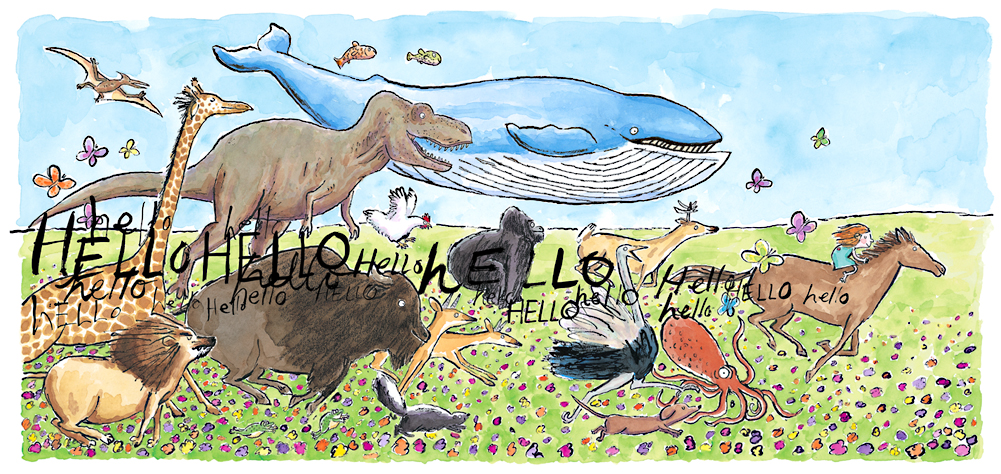
The picture book Hello, Hello, by Matthew Cordell, was a real eye-opener when we read it to our students this year. So many of them could relate to it. The main character, Lydia, tries to talk to her mom, but she’s on a laptop. Then she goes to her dad; he’s on his cell phone. Lastly, she tries to say hello to her brother, but he’s too busy on his tablet. So many kids commented, “That looks like my mom and dad.” For others it reminded them of their homes where everyone has electronics in their hands, and sometimes in the same room. No one is talking, and they're all staring down.
Source: Matthew Cordell
So what does Lydia do? She leaves the house and shouts hello to everything that crosses her path. Her journey climaxes with an imaginary stampede on the back of a horse. You sense she’s gone a long time and that no one missed her. In a nice twist, the horse stops short as her cell phone goes off, her parents wondering where she is. When she returns home, she gives them things she’s found. The family puts down their devices to go outside together. The message is clear.

As we approach the end of the school year, it’s important to encourage kids to take advantage of the world around them, the one moving in slower motion than a click, tap, or swipe. What better time than summer? We need to model it as adults, too, because they need to know it's okay to disconnect. We want them to take the time to interact personally with others, go outside to explore, or create something with their hands.  

Having time to develop an idea without interruption rarely happens today, but it is important that it does. Constant interruptions kill the flow of learning, the ability to focus, and the opportunity to get immersed in ideas. Like the book, Hello, Hello, the video "What the Internet Is Doing To Our Brains" has the same message. It’s okay to unplug; everything will be there when we get back. There is a lot more than information on a screen. We just need to look up from our smart phones, tablets, and laptops to see it.


For more on how interruptions affect what we do, check out the post the "Secret to Creativity: Learning How to Say 'No'."
Related Posts Plugin for WordPress, Blogger...


Pin It