Monday, December 30, 2013

New Year’s Resolutions: Some Visuals For Inspiration, Motivation, And Data

Source: Wikipedia
With the New Year arriving in less than 48 hours, people all over the world are thinking about making resolutions for the coming year.

According to Wikipedia, a New Year’s resolution is a secular tradition, most common in the West, when a person makes a promise to change something starting on the first of the year. It does have historical connections, and it is not uncommon to reflect on self-improvement.

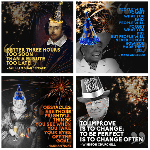
To that end, we gathered some information about the topic to see what types of ideas we could use with our students during the first, short week of school. From Buzzfeed, we came across the post "14 Quotes To Inspire Your New Year’s Resolutions For 2014." This clever mix of historical figures garbed in festive holiday regalia would definitely make for a good, philosophical discussion in any history or English class.

Source: BuzzFeed
One thing that was apparent from our research was that statistically, most people don’t stick to the resolutions they make. According to the Marist Poll for 2014, the data on Americans resolving to make a change for the New Year is up slightly from the previous year by 4%. Its graph tracking the changes since 1995 of those likely and unlikely to make a New Year’s resolution would be interesting for a math lesson.

Source: Marist Poll
The Marist Poll also provides comparative statistics for prior years and a PDF of the complete tables and data sets collected for its 2014 New Year's Resolution inquiry.

Of course, there are plenty of infographics on the topic. This detail from one published by Kapitall Wire is a fitting visualization supporting many of the top ten resolutions most people make.
Source: Kapitall Wire
Lastly, for those who may have trouble sticking to their New Year's resolutions, there's always someone who wants to help. For some fun, check out this promotional motion graphic called "New Year's Resolution Ideas" by Gary Ryan Blair. It is a plug for his business, but it does give a good overview about trying to keep the goals many of us set for ourselves for the New Year. It also could be incorporated into a media literacy lesson on persuasive techniques to sell a product.


Enjoy and have a Happy New Year!

Monday, December 23, 2013

Infographic Holiday Cards As Data Visualization

Source: @GSipley
We’re sure many of our readers have received the proverbial end-of-year “holiday letter” recapping events in the lives of friends and relatives. Often these densely word-processed documents, peppered with pictures, seem more like a chore to read rather than an enjoyable update. Graphically designed they are not, and a tutorial on “less is more” would surely improve the overall layout.

Recently, our friend and colleague, Gina Sipley (@GSipley), forwarded an “infographic holiday card” she received. We then did a little digging. To our surprise, it turns out that using infographics to report on the happenings of the past year have been trendy for quite sometime. Who knew that data visualization had hit the holiday card market?

Source: Nicole's Classe
Resources abound on using this idea, and there are Pinterest boards with loads of samples. We even found a “how to make your holiday infographic card” by Alma Loveland for Nicole’s Classes.

It provides step-by-step instructions in design as an infographic, with explanatory text. The tips for laying out an infographic are useful and could be used as guidelines for any newbie wanting to try his or her hand in the process of creating one.

Source: Beautiful Fight
While we are not planning on sending out our own “infographic holiday cards,” it did get us thinking about how to use this idea in our classrooms.

Source: Nicole's Classes
It would make an excellent way for learners or teachers to graphically represent the highlights of the year using data, text, and images in a simple, well-designed infographic. By flipping the content, it's a perfect way to underscore  accomplishments, field trips, projects, and more.

Happy Holidays!

Thursday, December 19, 2013

Visualizing The Winter Olympics - Mapping The 2014 Torch Relay

Source: Sochi Olympic Torch Relay
The 2014 Winter Olympics is only a month and a half away, and the recent news has been disheartening. Controversies over jaw-dropping cost overruns and horribly discriminatory laws have focused a light on the United States' decision to send a snubbingly slimmed-down delegation to Sochi, Russia.

For students and teachers, however, the build-up to the Games of the 22nd Winter Olympiad should be full of exciting cultural discoveries and hands-on interactions. The ceremonial path of the Olympic torch, for example, offers a terrific chance to explore interactive visualizations and trace the geography of the largest country on the planet.

Source: Sochi Olympic Torch Relay
The official site of the torch relay features a responsive map where students can click on each point of the flame's exchange and learn more about local cities. The keenly designed page also offers a history of the Olympic torch and includes fascinating trivia about past journeys in the lead-up to Sochi's opening ceremonies on February 7, 2014.

This year's torch expedition highlights a host of historic moments, including the first space voyage, the first underwater swim, and the longest odyssey ever. The saga of the fire, however, has encountered some well-publicized mishaps along the way, including the extinguishing of the flame on numerous occasions and three people being burned by haphazard handling. For a more detailed Keystone Cops chronicle of the torch's misadventures, check out "Got A Light? Olympic Torch Relay Seems Cursed To The End Of The Earth" from the New York Times.

Source: Sochi Olympic Torch Relay
The Sochi webpage presents a day-by-day video diary of each celebratory moment along the route. It also spotlights an infographic of key nationalistic facts, as well as a media gallery of photographs and quotations. For a more objective view of the torch's narrative, the Maps Of The World page sketches a similar geographic trail.

For more information about the torch relay, check out these articles from the Bleacher Report:
For other tools and resources about using the Olympics in education, we recommend:
By the way, thanks to Cosby Hall and Eric Wilson for suggesting the idea for this post.

Tuesday, December 10, 2013

Visualizing Apartheid - Teaching Students About Nelson Mandela

Source: "The Life And Times Of Nelson Mandela," from the Nelson Mandela Centre Of Memory
With dignitaries and patriots converging in Johannesburg to honor Nelson Mandela, the hero's funeral has presented an intriguing educational opportunity for school children around the world. The media coverage devoted to Mandela's life as a civil rights champion and a global statesman has refocused attention on the horrors of Apartheid. This system of institutionalized racism, which gave Mandela such a bitter struggle and an enduring triumph, had previously been relegated to somewhat of an afterthought in many pages of contemporary history.


Children of the 1980s grew up with Apartheid in their daily consciousness. They heard news reports about protests and crackdowns, and they regularly reminded each other which collusive corporations to boycott. Children today, however, even at the Advanced Placement and collegiate ranks, often spend no more than a few minutes of one class period noting the sorrows of the Apartheid era before moving on to the next test topic.

It can be particularly difficult for teachers of younger learners to encapsulate these decades of discrimination and violence in an age-appropriate way. It can be equally as challenging to summarize Mandela's life, with its exuberant achievements and its occasional contradictions, in a clear manner.

Source: The Nelson Mandela Centre Of Memory
Fortunately, a few key visual resources exist to help broach this important legacy. One of the best videos is the animated series called "The Life And Times Of Nelson Mandela," from the Nelson Mandela Centre Of Memory. These brief clips offer understandable, dynamic avenues toward understanding the complicated history of the Apartheid generation. If you only have a few minutes, Part 3 documents the principle acts surrounding Mandela's imprisonment. If you can spare more time, though, be sure to watch Parts 1, 2, and 4.

Source: Know More, from The Washington Post
Source: ABS-CBN
(click for detail)
Another terrific tool from the Nelson Mandela Centre Of Memory is the Interactive Timeline tracing his life and accomplishments through text boxes and captivating photos. The smooth interface allows for quiet reflection and independent exploration of the events and culture.

For statistical data, an unambiguous graph from the Washington Post's Know More blog reveals "How Nelson Mandela Transformed South Africa In One Chart." The rise in national pride tracks closely with Mandela's own return to the citizenry.

For other educational resources in teaching about Mandela, we highly recommend:
Regarding background information about the decrees of Apartheid itself, the infographic from Anatomy Of Data lays out core facts and figures about this long span of segregation. The video "Cry Freedom - South Africa Under Apartheid, 1948 - 1991" also chronicles a rich photographic history of Apartheid through primary images and news snapshots. As a mild warning, a few of the photos could be somewhat jarring for younger viewers.


By the way, many thanks to our colleague Stefani Rosenthal (@StefRosenthal) for suggesting the idea for this post.

Source: Anatomy Of Data

Monday, December 9, 2013

Digital Citizenship: Metadata Made Simple

Source: The Guardian
Talking to our learners about digital citizenship requires us continually to revise and update our messages. We tell our students constantly that we are not cops here at school to block their access online, but rather we are here to educate them about using it.

We want them to know just how easy it is to collect everything about them on the Web with very little effort. For most learners, the concept of metadata is abstract. They don’t realize that social networks, online shopping companies, websites, and countless other places are routinely collecting it.

Source: The Guardian
Recently, The Guardian published its video animation, The NSA and Surveillance Made Simple, to help explain how massive amounts of information are collected by tapping cable lines, sifting through databases, or obtaining data straight through company servers. It simplifies the world of metadata and reinforces our constant reminders to our students about privacy.


For many in their innocence, they would never think that spies were trolling Facebook and Gmail; however, we are all being watched online. Granted, what we try to educate our learners about regarding good digital citizenship is different than what the NSA gathers. Nonetheless, this simple animation makes it clear just how much metadata is collected on who you are, when you send, and what you say.

Source: The Guardian
This balance between privacy and security could also expand into lessons on civics and the rights of individuals. It opens up opportunities for debates and essay writing to answer a host of questions, including: Does the government have a right to collect information on its citizens, or other countries? How does this affect your behavior online? Does privacy have a future online at all?

Source: IMDb
Lastly, kids love pop culture. There are plenty of television shows that deal with gathering data. For example, could individuals such as the enigmatic billionaire in Person of Interest really recruit a former CIA operative to prevent violent crimes on his own? It’s a good question, and one that would surely spark a classroom conversation.

We’ve moved beyond what Connect Safely describes as Online Safety 2.0, or “stranger danger," to Online Safety 3.0 that is designed to empower and protect youth. In the fast-paced terrain of digital technologies, "stranger danger" is the least threatening when compared to privacy and security. In their world, Web 3.0 is no longer about pushing and sharing information; it’s live. 

Saturday, December 7, 2013

A Student's Voice For Change

As educators of middle school students, we continue to be inspired by their passion to have a voice in making a difference. This week one of our sixth-grade students did just that. Jack was touched by the motion graphic Sold and the video Youth For Human Rights – No Slavery that he watched on the class blog. He went home and on his own made a Tellagami to help raise awareness about modern slavery and the plight of children. We are pleased to present it here.


Our interdisciplinary unit on immigration just finished. It recounted the full story of immigrants who came to this country, including those who came by choice and others who came by chains. It just so happened to coincide with the United Nations International Day To Abolish Slavery on December 2.

Like so many, our students had no idea of the extent of modern day human trafficking. As a result of the exposure to this issue, many of our kids want to take this on as a mission to help. Learning about this problem transformed their thinking and their drive to do something about it. We could not ask for more as educators.

For more resources on modern slavery, click here.

Sunday, December 1, 2013

Teaching The "S" Word: Modern Slavery Resources

Source: Free the Slaves
It’s that time of year when we delight in the spirit of merry-making with family and friends, and when young children anticipate gifts for Hanukkah and Christmas. Like most others, we tend to get caught up in the spirit of the season.

Heading home for the holidays seems a natural part of the winter break from school, and it should be. Yet for many, this is not the case. Today, there are more slaves than in any other period in history, and many of them are children. Modern slavery is the most important human rights issue of our time.

Human trafficking is the third largest criminal industry behind illegal drugs and arms trafficking. The estimated number of modern slaves across the globe is 21 - 30 million. The following video on the Top 10 Facts About The "S" Word produced by Free the Slaves is a powerful motion graphic highlighting the key issues about slavery today.


As educators, we continually look for resources to help our learners realize that slavery is not a thing of the past. Many of the websites featured in this post provide ample material for teachers to use in their classrooms. For example, Free the Slaves also has an interactive map with statistics on slavery by regions around the world. Our students were surprised to see that there are over 14,000 incidents of modern slavery in the United States. It was a real eye-opener for them.

Source: Free the Slaves

Sold is another motion graphic produced by RockPaperInk. It's another excellent resource to use with younger students. Kids know what products are, but when this film makes the point that children are the fastest growing "product" over corn and oil, it hits home. It's hard for them to fathom that not only are these children considered products, but also that many of them are sold more than once.


Each year over 2 million children disappear; that's equivalent to the population of Chicago disappearing. Kids get that. This video is a powerful reminder of the plight of so many, but it gives us hope. This movie is the trailer for the full-length feature film, Sold, adapted from the novel of the same name by Patricia McCormick and scheduled for release in 2014. It's the story of one little girl who makes it out of bondage.

Human trafficking continues to grow at alarming rates across the globe. This brings us to our last resource on modern slavery from Youth for Human Rights, and it is perhaps the most poignant. In it a teacher walks through a museum describing the horrors of slavery in American history, but as she does, pulsating images of modern slavery flash in between as she talks. The ultimate moment is when a young student asks, "Does this still happen today?" The teacher remains speechless. The answer, unfortunately, is yes.


As difficult as it is to talk about the "S" word, it is a necessity. Slavery of Africans to the Americas is part of our history that ended with the Emancipation Proclamation. Sadly, slavery continues today. Let's not make the mistake of thinking it's over, or that it's happening someplace else in the world. As educators, we need to keep the topic of slavery on the front burner. Shining a light on the issue will empower our students to be outspoken about it. The more we develop empathy and concern, the more likely we can help prevent one more silent, invisible child from disappearing in the dark world of human trafficking.
Source: Sold
For other posts on this topic, please see:
For more resources, please see:

Tuesday, November 26, 2013

Transforming Learning: NYSCATE 2013

Source: NYSCATE 2013
We just finished attending three days at the NYSCATE 2013 Transforming Learning conference in Rochester. The New York State Association for Computers and Technologies in Education (NYSCATE) assembled another terrific roster of speakers sharing their ideas and best practices for teaching and learning.

Once again, we met a host of impressive educators who emphasized the importance of the learning environment. It was refreshing to hear again and again that it wasn't the app, website, or device that defines the learning, but the opposite. The focus should be on the learning objective. Define the target goal, and use technology to change the process of how it's accomplished.

We'd like to thank the educators who attended our session on Projects In Web 3.0: Privacy Is The New Predator. In addition to our prior post listing the resources we referred to in our talk, here is the SlideShare for our presentation.


We look forward to tweeting with our new friends and our expanding PLN of collaborators.

Projects In Web 3.0: Privacy Is The New Predator

Source: ASIDE Square Face Icon
Student digital privacy is a critical currency, to be safeguarded by schools and pillaged by predators. Interactive, social Web 3.0 resources demand proactive ways to access tech tools and still preserve learners’ anonymity.

In the changing edtech landscape, student safety is taking on new dimensions and new gravity. When every online resource now is interactive and linked to social media, Web 3.0 often requires clever ways to give students access to the learning tools they need and still preserve their innocence.


What is facehawk? (overview) from Rajeev Basu on Vimeo.

Most projects and social networks encourage users to upload a personal ID or photograph. Student safety, however, is paramount to shelter identities. Clever and quirky avatars, therefore, can help students distinguish their profiles and still remain incognito. An avatar is a customized online icon that represents a user's virtual self. A signature avatar can give a child great pride in his or her masterpiece. Among the many cartoony or creative avatar generators available on the web, many require accounts or email addresses or are not safe for school.

To take advantage of all that the Web affords, workarounds can be used to protect privacy but still allow for a personalized identity. A few ways to do this include generating avatars, setting-up username conventions, creating email shortcuts, and screencapping of content.


Avatar Resources


Post your original avatars to this collaborative Padlet page to share your unique, protected identity with the group: padlet.com/wall/web30avatars

Digital Citizenship and Modern Internet Safety

Source: Common Sense Media

  Web 3.0


New Media Literacy


Saturday, November 23, 2013

Our Nominees For The 2013 Edublog Awards

Source: Edublog Awards
It’s time to nominate outstanding educators for the 2013 Edublog Awards. This 10th-annual honor roll recognizes leaders who offer insights and resources to the teaching community.

We’ve learned an enormous amount from previous Edublog winners. In highlighting this year’s nominees, we don’t mean to leave out all of the generous mentors and coaches who are part of our daily inspiration. We feel privileged to count all of them among our PLN.

Be sure to make your own nominations, and tweet your choices at #eddies13.

Here are our picks. If you haven’t already, we hope you get to know these amazing thinkers and educators:

Best individual blog - Larry Ferlazzo
The range, depth, and frequency of Larry Ferlazzo's posts are unmatched. His "Best Of..." lists are an educator's dream.

Best group blog - MindShift
It seems like we read and want to tweet every post from the MindShift team. Sometimes we refrain, just so we don't seem like obsessive fans.

Best new blog - Maptia 
Crowdsourced geography, what could be better?

Best ed tech / resource sharing blog - Edudemic
Edudemic consistently is at the leading edge of ideas and tools that resonate with contemporary teachers.

Best teacher blog - Web 2.0 Classroom
Steven Anderson's site is a perfect blend of expert resources and down-to-earth dialogue.

Best library / librarian blog - Connect The Pop
Peter Gutierrez's blog on media literacy at the School Library Journal is one of our favorites -- a scholarly, teacher-focused investigation with terrific analysis.

Best administrator blog - Brendan Schneider
Brendan Schneider urges schools to embrace social media as competitive marketing tools.

Most influential blog post of the year - Okay, we have two: Teacher’s Resignation Letter: ‘My Profession … No Longer Exists' and My Son’s Grades Are Too High

Best individual tweeter - Nancy Blair
We first met Nancy Blair in the airport back in November 2011, on our way to the NMSA conference (now AMLE). She was enormously helpful then, and she's been an invaluable chat partner since. She's at the top of anyone's must-follow list.

Best twitter hashtag - #lrnchat
This chat begins each Thursday at 8:30 p.m. (EST) with participants volunteering what they learned that week. It's a great tone setter for a great chat.

Best free web tool - Padlet
Padlet has expanded from its early germination as Wallwisher into an enormously flexible collaborative whiteboard on which to share posts, pictures, media, and embeddable ideas for class learning.

Best educational use of audio / video / visual / podcast - EdChat Radio
Every week EdChat Radio offers free podcasts via iTunes and the Bam! Radio Network on a variety of forward-thinking topics from that week's illuminating #EdChat session.

Best educational use of a social network - #tlap
Dave Burgess has attracted a motivated band of school scalawags with his masterful book, Teach Like A Pirate.

Best mobile app - Pinterest
Pinterest is not only a dominant visual sharing site for educational resources, but its app is elegant and efficient in allowing users to repin items in a quick and appealing swipe.

Lifetime achievement - Tom Whitby
Tom Whitby is not only a co-founder of #EdChat and EdChat radio, but he is an open-hearted presence at conferences and a skilled practitioner in education. His blog, My Island View, consistently explores the nuances of modern pedagogy.

If you are wondering where to start with your own nominations, check out EdTech Magazine's list of 2013 Must-Read K-12 IT Blogs.

Monday, November 18, 2013

Viz And Pic Collage: Infographic Apps For the 1:1 Classroom

Source: ASIDE
We’ve been building infographics into our lessons for the last couple of years, and we continue to try to use them in different ways to help our students see how they can be used as media. In the past, we’ve used Easel.ly to create infographics for study tools and acronyms.

This year we started a 1:1 program, so we looked to incorporate apps that would aid our students in designing infographics on the iPad. Two that worked for their projects were Viz and Pic Collage. The kids used the free version of Viz. It helped to tame their tendency to over do it by limiting their selections to ten objects. For others, they liked using Pic Collage to create visualizations for their acronyms. Their use did not stop there.

Source: Mrs. Wisnewski
It was fun to see how they used infographics for a charity event with their math teacher, Francine Wisnewski (@FWisnewski). The students designed infographics to raise funds for the St. Jude’s Children’s Research Hospital in Memphis, Tennessee. We could see their design skills build with each new approach to creating infographics.

To help them understand design concepts, the students followed certain guidelines, including the philosophy “less is more.” We know that our students love to experiment, but they don’t always get that design is an art that should not get in the way of content. Design literacy, like other literacy skills, needs to be taught, and they need to learn that there is a level of sophistication in selecting fonts, colors, and images. It's a perfect way to build in media literacy connections as well.

Source: Mrs. Wisnewski
The students looked at lots of examples to help them understand. We talked with them about the color wheel, and we analyzed print advertisements. Here are a few of the guidelines we asked them to think about before they began their creations:

  • Limit the font selection to two
  • Create a hierarchy in font size
  • Select images to highlight the message
  • Limit color to give focus to the content
  • Create a strong contrast between text and background
  • Source all resources used for content

Practice doesn’t necessarily make perfect, but with each new infographic they created, they got better at designing information.


Source: ASIDE
For other posts on student-created infographics, please see:


Saturday, November 16, 2013

Haven’t We Gone Too Far With Data – A High School Senior's View Of The Common Core

On November 6, 2013, Ethan Young, a Farragut High School senior, delivered a scathing review of the Common Core point by point at the Knox Country School Board meeting in Tennessee. His rebuke of it was powerful and passionate.

This is one amazing kid who values education and, more importantly, supports his teachers with incredible sincerity. For him, “the task of teaching is never quantifiable.” Ethan’s eloquent, poised, and sound address is a testament to what educators read and contribute daily on social media regarding the effects of test-based education on learning.


This articulate young man is standing up for what he believes is ruining education and the way students learn. He is not alone either. Around the country, this fight is continuing to grow as more and more educators, parents, and students speak out against the current education system. It's happening in town meetings about the Common Core, and the Opt Out movement is gaining ground with more parents refusing to let their children participate in standardized tests.

For other resources, please see:


Monday, November 11, 2013

Veterans Day: Resources To Embrace, Engage, And Educate

Source: Wounded Warrior Project
We try to instill the patriotic spirit in our students for every national holiday. Many in our school community have family who served in World War II, the Korean War, and in Vietnam, and a few have family and friends who served in Iraq and Afghanistan. We’ve written about Veterans Day and service to the community; however, the following resources bring the reality of the wars in the Middle East closer to home.

Unfortunately, the wars in Iraq and Afghanistan have continued for over ten years, and it's hard to believe that every senior in high school has grown up with them since the second grade. Even though American combat operations in Iraq ended in 2010, there are approximately 48,000 troops still deployed there. For this reason, we pulled together a set of resources to show our students the lasting impact on those who serve our country.

The numbers from the The Wounded Warrior Project (WWP) for veterans returning from these two wars are staggering. As of August 2013 there are over 51,000 wounded, 320,000 with traumatic brain injuries (TBI), and 400,000 with post-traumatic-stress-disorder (PTSD). The WWP has done an amazing job of helping injured veterans, and it's worth showing its video "The WWP - Year In Review 2012" to students. From its Media Room, students can watch other first-hand accounts about the help it gives to those in need.


Source: Team Rubicon
Team Rubicon (TR) is another organization helping hundreds of United States veterans returning home after fighting in ten years of war. TR unites military men and women with first responders who rapidly deploy emergency teams to disaster areas. It gives veterans an opportunity for continued service by helping them make the transition back to civilian life through repurposing their skills and experiences to help others.
Source: Team Rubicon
Since its formation in 2010, TR has impacted thousands of lives around the world, including right here in the United States. According to the data on its website, 92% of recently returning veterans state that service to their community is important to them. Many of our students were unaware that this organization existed.

Source: Team Rubican
The Story of Team Rubicon is a powerful look at how aiding others helped heal the wounds of war, some visible and some not. The call to serve helps the veterans as well as others by giving hope to them and those they aid in times of need.


Perhaps one of the most powerful visualization resources regarding veterans is the Iraq and Afghanistan Veterans of America (IAVA) "The Wait We Carry." It is a tool designed to allow veterans, not the Veterans Administration, to tell their disability claims stories by completing a survey about their medical claims and the emotional and financial toll the process has taken on them. IAVA partnered with Periscopic, an industry-leading information visualization firm, and received a grant from the Knight Foundation to design this interactive tool.

Source: The Wait We Carry
IAVA created this to show that there is a person behind every piece of data. The numbers are staggering with regard to the wait time for medical help, and some did not make it as a result. This is one of those areas that, unless we are personally affected, gets lost. The information on "The Wait We Carry" wants to make the data personal.

Source: The Wait We Carry
Although the news continues to provide information about the military in Iraq and Afghanistan, it is often just straight reporting with little fanfare, unless it’s newsworthy such as the catastrophe in Benghazi. This is a far cry from the daily barrage of wounded soldiers shown nightly on television stations across the nation during the Vietnam War.

Perhaps it is why most adults go about their daily routines, and as a result our learners are removed as well. This disconnect is why we need to make sure our students connect. We need to take time out of the daily delivery of content to make sure that our learners appreciate and understand why it is so important to honor the men and women who serve this country. Sadly, if it were not for the private sector helping these veterans, the harm of war might be even more devastating.

Friday, November 8, 2013

Visualizing The Universal Declaration Of Human Rights

Source: HRAC
We recently stumbled upon this motion graphic on The Universal Declaration Of Human Rights, produced by the Human Rights Action Center (HRAC). We showed it to our students who are currently working on an interdisciplinary project-based learning immigration study. Our approach to the topic of immigration is more than the nostalgic view of Europeans coming through Ellis Island. It is much broader than that. We talk about the painful legacy of Angel Island and the harsh discrimination against the Chinese coming to this country.

The students study immigrant groups from all parts of the world, including the Caribbean and Middle East. We also want our learners to understand the prejudices that different nationalities encountered and that not everyone came by choice.

This video is a powerful reminder of the importance of human rights for all people, and that we all share a role in protecting these rights.


The students' PBL study culminates with a presentation at our annual heritage day assembly in a few weeks, and this year the focus is on the immigrant experience of African Americans in what promises to be a compelling performance of By Choice and By Chains. It's our hope that the passion of these young learners for the rights of others continues to grow as a result of their rich understanding of the topic. The more children become ambassadors to promote peace-making, peace-building, and peace-keeping, the better.

For other related posts, please see:

Friday, November 1, 2013

Is There A Visual Thinking App? Charts, Graphs, & The 1:1 Classroom

Source: Online-Behavior
With the advent of the iPad generation, the skills of graphicacy are taking on more importance than ever in today's classrooms. Graphicacy is the learned ability to decipher and design images, particularly around symbols, charts, and coded meanings.

Amid the national emphasis on STEM programs, charts are becoming key tools to represent visual statistics. As more and more schools migrate to 1:1 tablets, therefore, students need a foundation in reading and rendering their own optic inputs.

Source: Online-Behavior
The language of apps today is printed in icons. On handheld devices, colorful squares dance across each swiped screen. Children need to recognize these badges and identify the relationships between the logos and the corresponding actions.

With all of the nimble iPad tools, students can now efficiently create charts and graphs that represent data. In math and science classes, young learners can manipulate lines and layouts to share their findings. Historians and artists can incorporate visual blueprints for the Web 3.0 educational world.

Our own school has been implementing a 1:1 iPad program this year. We've been layering in graphs to help children understand antebellum agriculture and industrial GDP. For helpful posts about teaching with graphs, we recommend the following:
A terrific infographic that lays out traditional chart types in a kid-friendly, colorful fashion is "Nuts And Bolts Of Chart Types" from Online-Behavior. Familiar diagrams like the pie chart and line graph are explained in simple language. More sophisticated plots like the waterfall and radar charts also receive lucid billing.

The tree graph, in particular, has become wildly popular in the business world to represent customer segmentations. Recent budget graphics and current event maps have also relied on the tree graph to chunk related information.

Source: Lo's List, David McCandless, Harper Collins, The Visual Miscellaneum

New categories, however, are emerging to display contemporary data. Tropes from the digital dictionary are now readily recognizable as ways to present visual information. The concept map, matrix grid, flow chart, word cloud, and bubble graph are all now popular tools.

The terrific handout, "Types Of Information Visualization," offers these emerging illustrations in a valuable grid. Presented via Lo Martin, from her interview with graphic guru David McCandless, this table from The Visual Miscellaneum draws on Edward Tufte's work to present visual arrangements for iPad enthusiasts.

We owe a lot to our friend Lam Thuy Vo, the journalist, infographic guru, and interactive media editor at Al Jazeera America, who introduced us to the McCandless framework and who also created the superb diagnosis below of the "Anatomy Of A Chart." It is a first-rate primer for learners of any age as they begin to decode data representations.

Source: Lam Thuy Vo
For other articles on teaching with charts, please see:
Related Posts Plugin for WordPress, Blogger...


Pin It