Showing posts with label science. Show all posts

Friday, July 29, 2016

What Is The Corpse Flower Sensation? And Why Is Viral Science A Learning Opportunity?

Source: National Geographic

It's rare that a single flower becomes a viral, stakeout sensation. We admit that we've been fixated. While YouTube eyes are currently obsessed with a grotesque and freakish bloom, educators may be missing an opportunity.

Yesterday the New York Botanical Garden (NYBG) announced that after a decade of cultivation, the Amorphophallus titanum finally began to bloom. Commonly known as the "corpse flower," this plant from Sumatra in Indonesia exudes the smell of rotting meat as it opens. The putrid odor and the otherworldly shape are keys to its appeal, as its startling height. The flower has notched the Guinness World Record for the tallest bloom in cultivation at over 10 feet (and even larger in its natural habitat).


The New York Botanical Garden first hosted a successful bloom of the corpse flower in 1937. A second emerged in in 1939, but generations have past to witness the third revelation of this dreamy, rancid blossom. Visitors have been lining up, and online watchers have been glued to the YouTube livestream, mostly because the scare appearance lasts for only 24 - 36 hours.

Why is this floral oddity relevant for teachers and students? On a basic level, this quirky natural artifact offers countless avenues for science learners to explore biology, botany, morphology, behavior, pollination, inflorescence, germination, dormancy, regionality, and cultivation. For example, the bloom is not actually one large flower. Instead it comprises a leaf-like ring of outbursts surrounding a central column.


On a higher level, the fascination with this shy and fetid flower speaks to every teacher's desire (and angst): how can we make make learning relevant? How can we pinpoint the moving target of our contemporary kids' attention spans? If they are attracted by a weird plant, what can we learn from this momentary buzz to inform our curricula?

Is it too much to ask that a daily lesson is unexpected? Is it pandering to give students something to anticipate, to look forward to? The allure of the NYBG "Corpse Flower Cam" lies in the waiting. It rests in the charisma of the macabre. Why does a flower smell so bad? What is the evolutionary attraction for carrion creatures that will come and spread the pollen?

Source: NYBG; Chicago Botanic Garden

Source: University Of Wisconsin-Madison
In other words, all classes should unfold like a mystery. Children ought to be rapt in the one-in-a-million stories: the collapse of the Spanish armada, the elegance of Euler's identity, the chance of penicillin's discovery, or the lightning of a boy's forehead.

For locals, the occasion to visit a monstrous plant that reeks of spoiled flesh is priceless. Would that all of our classes were as exhilarating. For the rest of us, this is a neat moment that we should remember in September, to excite STEM learners and to wake up the drowsy kids who don't think our "Do Now" exercise lives up to their Snapchat feed.

Thursday, July 28, 2016

Visualizing The National Parks - Celebrating 100 Years Of America's Wonder

Source: National Geographic

On August 25, 2016, the National Park Service (NPS) turns 100. After a century of shepherding America's splendor, the Park Service and its personnel will rightfully be feted as dedicated, humble stewards of our country's most precious landscapes.

Personally, we have been lucky enough to visit many of the nation's 59 parks on all points of the compass. Each site has never failed to live up to its consecration as a place of American rarity, pride, and beauty. From the unspoiled trails to the popular overlooks, every curated destination within the wilderness is a testament to the work and vision of the Parks Service.

Source: National Park Service

This august anniversary introduces many opportunities to weave the Parks into authentic classroom lessons. For example, the "Every Kid In A Park" initiative seeks to connect our nation's youth to its most treasured spaces. Additionally, a wide range of visualizations now provide easy ways to incorporate the centennial into state standards and skill-based curricula. At their least, these videos and graphics offer terrific kick-offs to a morning's discussion. At their best, these charts and illustrations support critical student proficiencies. They also bring to life the gorgeous panoply of natural wonder that would make any Disney confection blush.


To start, the "Find Your Park" website gathers videos and social media interactions of everyday first-person testimonials about the grandeur of America's vistas. As a companion, the NPS has opened its Geographic Information Systems (GIS) data to the public, for educators and graphic artists to tap in building models of terrains and visitations.

Some of the best renderings of the National Parks come from the Works Project Administration during the 1930s New Deal. These art deco posters from the Federal Arts Project capture the majesty of the otherworldly settings in colorful and appealing travel enticements. National Geographic has assembled a nice collection of these posters from the Library Of Congress.

Source: National Park Service

In a video homage, the outdoor outfitter O.A.R.S. has put together a stunning tribute to the Parks, told through the stirring words of Theodore Roosevelt. As befitting its founder, the NPS takes seriously its safeguarding of America's geology. It invites students of energy, minerals, and paleontology to explore the singular contours and cliffs through open online access and badging of restoration and geoscience. These resources are terrific for earth science and environmentally minded teachers to investigate with their students.

Source: FiveThirtyEight

In math and statistics, the minds at FiveThirtyEight (who usually spend their time worrying about political polls and baseball ERAs) have analyzed the popularity of each park. They crafted crisp graphs and charts for STEM educators to draw from in ranking the visitors to each venerated location. As they note, "the U.S. national parks have never been so popular," and the Great Smoky Mountains continues its reign as the most-visited National Park, due to its location and exquisiteness.

Source: FiveThirtyEight

In probing the specifics beneath the Great Smoky Mountains' charm, researcher John Farrell raked the Instagram API to determine where in the Park photographs were most frequently snapped. His visualization layers social media atop traditional coordinate geography to present a new picture of the Park's usage. He includes similar map mash-ups for other coast-to-coast sites.

Source: John Farrell

For its part, the NPS has put together its own retro advertisement, in the classic style of antique movie reels or 1950s television ads. This wry film is a perfect nod to the 100-year heritage of the organization. It also displays a warm embrace of every citizen who passes through the Parks' gates.


Digging deeper into the soil and flora, Luke Easterwood, Michael Gelon, Hadar Scharff, and Matt Soave have analyzed the Parks' Vegetation Inventory. They built a visualization series to "encourage insightful discoveries" through the Tableau interface. These charts and graphs drill down to specific physiognomic classes and leaf phenology details.

Source: mattsoave.com

In order to help navigate the Parks, the Sierra Club has designed a System Map based on the urban subway template. This seemingly humorous rendering actually gives travelers a valuable guide in planning their vacations and in connecting the dots between regional marvels.

Source: Fast Company

Source: David Hockney
Finally, the purest representations of America's National Parks have always come from the minds of the country's painters. Beginning with the light portraits of Thomas Moran, many artists have sought to capture the glory of glaciers and geysers. Most recently, David Hockney scratched a series of brilliant sweeps on his iPad in his "Yosemite Suite." These personal, stylized views prove to any viewer that the nation's Parks are love letters to its wilderness. They are the last vestige against urbanity and a hallmark of global distinction.

Sunday, July 24, 2016

Visualizing The Science Of Summer Sports - STEM Animations And Motion Graphics

Source: Tim McGarvey

Both STEM and sports get a bad rap. In the corridors of learning, science is sometimes seen as esoteric or irrelevant, while sports are seen as base or quotidian. Kids are often repelled by the former and drawn by the latter, mostly due to a misunderstanding about the intersection between math and athletics, between technology and physicality.

Fortunately, the possibilities of animations and motion graphics have helped visualize sports in riveting, educational ways. On both the professional and personal levels, data-driven graphics can bring to life the genuine learning benefits of athletics in STEM (Science, Technology, Engineering, and Math) courses.

Source: Spov Design + Moving Image

In digitally nuanced videos, physics meets the real-world. Body kinesthesia moves from the static textbook page to vibrant video overlay. The visualizations can layer equations and statistics atop everyday pastimes. Sports heroes become humanized in analyzing the biology and chemistry that make them great. Familiar backyard games become elevated by realizing the arcs and velocities necessary to score a goal.

Furthermore, these stunning artistic creations validate the requisite addition of the "A" to STEM. A complete "STEAM" approach, including the Arts, proves the value of imagination, design, and narration in producing such compelling animations.

Source: Tim McGarvey

We've explored before the benefits of sports science in the classroom:

The following motion graphics and animations take the discussion even further, looking for fresh avenues to incorporate the personal interests of students into their science and math educations. These videos are great kick-offs to a morning's discussion, and they are valuable context-builders for putting formulas, trajectories, and graphs in their rightful, real-world contexts.

Source: Vit Zemcik

Stunt Junkies: Extreme Sports: TMBA, Inc


Stunt Junkies: Extreme Sports: TMBA, Inc from Tim McGarvey on Vimeo.

Sports Animation Sequence


Sports Animation Sequence from Spov Design + Moving Image on Vimeo.

Wimbledon: Tennis In An English Garden


Wimbledon: Tennis in an English Garden from Vít Zemčík on Vimeo.

Going Outside: The Physics Of A Curveball


Going Outside: The Physics Of A Curveball from DIY on Vimeo.

Sports Science: Calvin Johnson Edition


Sports Science: Calvin Johnson Edition from Ryan Fuller on Vimeo.

The Physics Of Surfing - Trailer


The Physics of Surfing - TRAILER [720] from K2 Communications on Vimeo.

Saturday, December 19, 2015

The 5 Best STEM Animations For 2016

Source: scenes.https://vimeo.com/126733859, WWF Brazil - Marine Program

2015 was a banner year for animations to engage students. These dynamic explainer videos proved definitively that print textbooks cannot keep up with educational, up-to-date motion graphics, especially in the sciences.

The sphere of subjects that fall into STEM's orbit keeps expanding. For better or for worse, K-12 courses are now binarly split into either "STEM" or "Humanities" categories. We would argue that this bifurcation is harmful, erasing the natural overlaps between the sciences and the liberal arts.

The effect, however, is that more and more designers and educators are creating brilliant interactive companions to traditional learning. Here are five favorite animations from the past year that will allow science and math teachers (as well as those in the Humanities) to kick off 2016 with a bang:

1. Math


This lively explainer video from Vox offers a primer in chart theory, as well as a caveat for undiscerning viewers of graphs. Entitled "Shut Up About The Y-Axis. It Shouldn't Always Start At Zero," the clip reminds math students that context is key in both reading and creating data graphics.

2. Environmental & Marine Science


WWF Brazil - Marine Program from scenes. on Vimeo.

This beautiful stop-motion animation offers a moving case study about the effects of urbanization on pollution. The "WWF Brazil - Marine Program" video, made in collaboration between scenes. and Wildgroeiers, highlights critical issues of conservation and biodiversity for any age group.

3. Astronomy


BBC Earth has designed a clear and compelling motion graphic to emphasize the size of the universe and the speed of earth's galactic travels. The 3D visualization employs time and scale to bring astrophysics to life.

4. Oceanography & Earth Science


Source: Cameron Beccario

Software engineer Cameron Beccario (@cambecc) has programmed a stunning representation of the earth's weather conditions. With regularly updated ocean currents, waves, temperatures, and anomalies, this interactive globe allows students to zoom in and rotate a la Google Earth. The educational opportunities range from oceanographers analyzing climate change to historians studying ancient trade routes.

5. Medicine


Source: The Washington Post

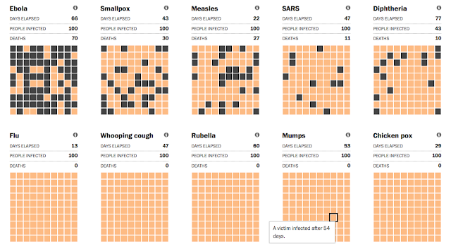
The recent Ebola panic prompted The Washington Post to create this precise simulation that compares the disease's spread to other historical pandemics. Although the original interactive graphic pre-dates 2015, the updates are important to medical students and social scientists who are trying to track contraction, infection, transmission, and vaccination.

Honorable Mention: Ecology & Forestry


This seemingly simple motion graphic by Nature Video brings into startling relief the rate of global deforestation. Researchers made 421,529 separate measurements around the world to produce an irrefutable data-driven image of the changing planet.

For more resources, take a look at last year's five best animations, or some of our other posts about animations in the classroom:


Thursday, July 2, 2015

In Pieces: A Beautiful Interactive Exhibit Of Endangered Species

Source: In Pieces
Every once in a while, an interactive website comes along that is as beautiful as it is instructive. In Pieces is just that site. The interactive exhibition turns 30 of the world's most interesting endangered species facing a fragmented survival into captivating images of complex, paper folding using 30 pieces. Bryan James is the creative designer who built the project using CSS polygons that morph and move. He provides an extensive list of sources for his content as well as a host of links for other organizations that would be helpful for student research.

Source: In Pieces
The site is thought-provoking and guaranteed to engage learners about the beauty of nature and the need to protect species under the threat of extinction. With melodic music playing in the background, users can chose to have the exhibition cycle through all the species, or select one at a time to explore.

Source: In Pieces
Artistically, it fascinates the eye, but on a deeper level, it provides extensions for learning and discovery. Teachers can easily use the tools and links for students to explore the risk to each one by selecting, "What's the threat?" A brief summary appears describing the dangers, predators, and organizations trying to help. They can also watch a short video showing the animal in its natural habit.

Source: In Pieces
In addition, In Pieces supplies a range of statistical information using an interactive graph. Each one, like each threat, is slightly different. The information includes topics such as population, recovery plan, re-introduction into the wild, and captivity. Using the statistics, students could plot their own charts to compare the rates of decline or the efforts to recover. Whether in a science or a math lesson, the possibilities are endless.

Source: In Pieces
In Pieces hopes to inspire and educate others about the sensitive need to protect the diversity of species. The intriguing way the designer brings fragmented pieces together makes a powerful connection.

If people come together, we can save the species the world is on the verge of losing.

Thursday, March 13, 2014

Flipping The Flipped Classroom - Motion Infographics For STEM Learning

Source: Kurzgesagt
The conceit of the flipped classroom is rapidly becoming mainstream. The idea of using audio and visual content to pre-teach a lesson has resonated with educators nationwide. Teachers across a range of financial and technological considerations are inventing ways to rethink their students' engagement with homework. Maybe this is because the "new" idea of homework is really an old idea.

On one hand, "flipped" learning is really just good teaching; it makes productive use of children's time at home, rather than wasting their personal hours with rote worksheets. On the other hand, flipping the classroom means letting students sort through essential content at their own pace and time. The ultimate goal is to make fruitful use of shared class hours. As a result, this communal time can elevate basic material to richer discussions of cause-and-effect, sequencing, hypothesizing, and producing.

Source: Al Boardman

At its simplest, a flipped format can involve a teacher inviting students to view YouTube videos at home as a preview to the day's topic. At its most rigorous, a flipped curriculum involves teachers writing, producing, directing, editing, and posting their own original lessons -- complete with custom narrations and visualizations -- via third-party applications.

Source: Royal Observatory Greenwich
Luckily, for the everyday educator who walks a practical balance between innovative learning and daily time constraints, there is a middle ground. Many designers and progressive thinkers have created dynamic videos to use as teaching tools. Motion graphics can be superb resources to lure students into new topics with riveting artistry and clean animations.

STEM subjects (Science, Technology, Engineering, and Math) can at times feel unapproachable to a cohort of learners reared on paper textbooks and lecture notes. Motion graphics, or explainer videos, however, can alleviate this disconnected feeling. They can serve as invaluable inroads to the imaginative worlds of coding, chemistry, forests, and formulae. The following visualizations make us want to be science teachers:

The Solar System


"The Solar System - Our Home In Space" may be the most elegant use of simple motifs and effective graphics that we've ever seen. Described as "an infographic trip through the wonders of the solar system," this creation by design team Kurzgesagt leads viewers through a lucid and visually graceful narrative of earth's neighbors. Even though we're not science teachers, we've shown this to our advisory groups, our enrichment kids, and anyone else who had a spare moment.

Measuring The Universe


"Measuring The Universe," by the Royal Observatory Greenwich, sounds like another space video. But really it's about the fascinating world of mathematics and scale. It offers up the cosmos as a fitting subject for analyzing the intricacies of measurement and distance. It's a carefully constructed visual piece, but even more, it's a boon for math teachers trying to reel in the imaginations of sky gazers.

For The Love Of Mountains


For the Love of Mountains from Al Boardman on Vimeo.

"For The Love Of Mountains" sounds like a nature walk through North America's fondest trails. Instead, it's a tribute to both geography and geology. Created by Al Boardman in collaboration with Visual.ly, this video is a lyrical study of the extremes of earth's mountains. It compares facts and figures about earth science and human conquest in an appealing flat design. It blends clear labels, fascinating details, and sensitive music to captivate students of any age.

Forest (English Version)


forest - english ver. from DESIGNERS APARTMENT on Vimeo.

The "Forest" video from Designers Apartment is as much a study in ecology and environmental science as it is a testament to original artwork. The angular visualizations present a landscape of woodlands and species. The 2D planes render a striking portrait of 3D biology. With the layer of soft musical notes and the fine attention to detail, it's a terrific set-piece for classroom discussion.

Thursday, February 27, 2014

Cross-Curricular Motion Graphics - Digital Technology To Bridge The Sciences & Humanities

Source: The Creators Project;
Matt Pyke
Modern pedagogy speaks frequently about interdisciplinary learning. A student's ability to make cross-curricular connections is one of the surest signs of understanding. Interactive tablets and project-based learning put a priority on these unions of product and skill, but often the attempts at collaborative exploration remain within comfortable sphere's of academic neighbors.

In other words, it's easy for English and history teachers to work together. They can read historical fiction and poetry, or conduct research into famous cultural movements. Similarly, math and science educators often overlap in their lessons on significant digits and spacial reasoning.

Source: NBC News
A truer test of authentic learning is to bridge the sciences and the humanities. This marrying of the analytical and the verbal can allow students to internalize the full scope of their creative insights. Humanities activities are, of course, highly analytical, just as science courses are highly linguistic. Still, easy tools to unite the often-divided disciplines can be welcome resources all the way from K to 12 classrooms.

Motion graphics, sometimes called video infographics or explainer videos, offer ideal ways to approach interdisciplinary learning. Many accomplished digital artists have designed extraordinary graphics for teachers to use in their classrooms. Here are a few of our favorite examples, from the most literal to the most expansive, from the informative to the sublime:

Civics And The Environment


Currently, arguments before the nation's highest court could determine the future of greenhouse emissions in the United States. The Supreme Court is in the position to judge both the nature of atmospheric impacts and the role of the Environmental Protection Agency. In the excellent NBC News video, "Global Warming Limits Head To The Supreme Court," the ideas of both civics and the environment are presented in a lively, kid-friendly, crayon design. Similar to NBC's motion graphic on figure skating math, this clip combines terrific threads of executive authority, courts, politics, pollution, earth science, and chemistry. 

Religion And Physics


DUELITY from Boca Ceravolo on Vimeo.

The tension between spirituality and science has been felt for centuries. In American schools, the debate persists between creationism and evolution. The award-winning video "Duelity" from Boca Ceravolo puts a new spin on religion and physics. In a masterful style and an academic narrative, this motion graphic combines the origin stories of the Big Bang and Genesis. Aside from the keen graphics, however, the clip cleverly flips the two disciplines on their heads. Religion is told in the grammar of science and the visuals of analytics, while science is narrated through the intonations of oratory and the stained glass of faith.


Language And Biology


Humanizing Motion Graphics from The Creators Project on Vimeo.

The most lyrical of the clips is "Humanizing Motion Graphics" from The Creators Project. The video features the graphics of Matt Pyke, who combines language with human kinesthesia. As an artist and designer, Pyke employs visual technology to give a heartbeat to every object. His shapes combine anthropomorphism and empathy. The examples of his work provide a perfect pairing of biology and choreography, organisms and origami, mathematics and mankind.

For more ideas about using motion graphics in the classroom, check out:

Friday, February 7, 2014

Figuring The Skating Math - Watching & Teaching The Sochi Olympics

Source: NBC News
Figure skating quadrennially ranks as the most popular winter Olympic event. Especially on this 20th anniversary of the Lillehammer foofaraw between Kancy Kerrigan and Tonya Harding, skating has taken on a renewed prominence thanks to the addition of the team medal competition. Despite the athleticism and grace of the Sochi 2014 skaters, the sport itself has alienated some viewers with its rejiggered scoring system. The familiar 6.0 perfect result has been replaced with a complex calculus involving stylistic interpretations in the hundreds.

Source: NBC News
In figure skating, the revised formula offers terrific avenues for math, science, and humanities classes to use problem-solving quickness in trying to calculate the winning scores in tandem with the judges. Essentially, the scoring puzzle creates a lively opportunity for kids in STEM courses to divine the result based on artistry and athleticism.

A motion graphic from NBC News presents a lucid and gratifying explanation of the new scoring system in a visually riveting style. The excellent clip, "How To Grab Skating Gold: It's All About Math," parades the nuances of the current ratings in a catchy, textured animation. This stylized video choreographs a paper-cutout, stop-motion vignette to articulate the complexity of the skating rubric. On a design level, it is masterful. On a teaching level, it is eye-catching and appealing to kids of all ages. It would be great to share in a class or to post on a communal blog to let children become more informed and media literate consumers of February's season of sport.


Fortunately, the Olympics offers invaluable outlets for teaching and learning. To incorporate the 2014 Sochi Games into the classroom, you might consider these helpful posts of resources and ideas:

Thursday, January 30, 2014

The Olympics In The Classroom - Videos And Motion Graphics

Source: NBC Learn
We are huge fans of the Olympics. We are actively counting down the days to the first Sochi events on February 6, 2014, and the opening ceremonies on February 7, 2014. We recently asked our students if it was appropriate to discuss the Winter Games in the classroom. They replied with a resounding, "Yes!" They immediately launched into a lively argument, pointing out the crosscurrents of geography, culture, sport, history, science, mathematics, media, finance, and current events.

Faced with such a convincing chorus, we began a daily "Olympic Moment" to open each day's lesson and to highlight a unique aspect of the Games' social impact. Some of our favorite teaching points are featured in these helpful posts:
Source: YouTube
A reliable first source for classroom videos is the The Olympic Channel on YouTube, which each day broadcasts a different marquee moment from the pantheon of historic feats. In companion with these official updates are the terrific resources from NBC Learn.

As the official partner of the Games, NBC has amassed a library of valuable tools and videos to bring the contests to life. We are personally fortunate to know some of the leaders behind the NBC Learn site, and we can attest to the integrity and educational values that are applied to each film and to each learning resource. It is a teacher-friendly database of creative exploration.

Source: NBC Learn
Our current favorite module of the NBC Learn universe is the series on the "Science And Engineering Of The 2014 Olympic Winter Games." This rigorous, investigative collection of videos, hosted in conjunction with Science 360, offers a data-driven companion to in-class learning. Particularly relevant to STEM curricula, these films layer informational graphics on top of athlete clips to illuminate the physics and kinesthetics beneath the movements.

Our students' favorite was the video on "Figure Skating Physics." This motion graphic superimposes the arcs of axles and the tempos of toe-loops on top of real-time footage of champion skaters.


Another favorite was the intriguing clip on "Olympic Movement And Robotic Design." This video reveals the learning capacity of airborne robots to work in collaboration and to navigate obstacles, all in mimicry of Olympic athletes. Aside from its sportive value, this film points to the future of multidimensional, self-instructive artificial intelligence.


If you are interested in exploring the Olympics in your classroom, NBC Learn is hosting a Google+ Connected Classrooms Hangout about the "The Science Of Snow" on Thursday, January 30, from 3:00 - 3:00 p.m. EST. This social engagement will be led by Dr. Sarah Konrad, a former Winter Olympian and current professor at the University of Wyoming.

In other video news, if you haven't yet seen Proctor & Gamble's advertising series on the benefits of failure and the love of families, you are in for a real treat. Check out "P&G Thank You, Mom | Pick Them Back Up | Sochi 2014 Olympic Winter Games" for an emotional, inspiring look at what it takes to be a champion. All Olympians take comfort and support in the years of sacrifice from parents and loved ones. This video reminds us what winning, losing, and loving are all about.

Friday, September 27, 2013

The America's Cup - A Victory For Visualizations

The once-in-a-life-time, come-from-behind victory of Larry Ellison's Oracle team over the New Zealand Emirates boat in the 2013 America's Cup was a riveting piece of sports theater from start to finish. This stunning win ranks in the sailing world alongside the Red Sox's ALCS baseball triumph over the 2004 Yankees and the United States Olympic hockey coup over the 1980 Russians.

Source: TechCrunch
What really made this year's showcase mesmerizing, however, was the dynamic graphic overlay on the television screen. The real-time, superimposed lines and labels brought a somewhat esoteric sport into the mind-blowing mainstream. These visualizations of sail routes, course boundaries, wind speeds, wave directions, and boat IDs all did exactly what visual aids are supposed to do -- they added information and clarity to teach viewers about the nuances of the race.


The TechCrunch video above features a fascinating interview with Stan Honey, the genius behind this year's viewer experience. Honey is the godfather of interactive sports visualizations. Known previously for football's yellow first-down line, baseball's pitch zone highlights, hockey's glowing puck tracker, and auto racing's car callouts, Honey wanted to elevate sailing to similar, technological ranks.

Visual thinking is the use of graphic elements to organize and understand an issue. Here, in the high-stakes world of million-dollar racing, new animations made the race thrilling for worldwide spectators. Unlike in prior, deep ocean snooze-fests, this year's Cup witnessed a head-to-head contest of vessels skimming the shifty coastal waters of San Francisco Bay at over 40 knots.

Source: America's Cup
The video interview emphasizes the benefits of high-quality visualizations to teach an audience. These skills of graphicacy, in encoding and decoding images, are more vital than ever in our multimedia world. Using these techniques in the classroom can help expand understanding in any subject, in any genre.

Take a look, too, at this news clip from Bloomberg, which emphasizes the physical design and innovations behind the beautiful catamarans. The boats in this year's race, with their twin-hulled, carbon-fiber construction, embody the cutting edge of high-octane sailing. For all the young tinkerers and makers in our classrooms, this behind-the-scenes look at engineering could inspire the next generation of champions to hoist the Auld Mug.


For other insights into the union of sports and visualizations, check out:

Saturday, August 24, 2013

Learning Environment - The Graphic Nature Of Animation

Source: The Forest
Even though we don't teach science, we find ourselves returning again and again to motion graphics that tell stories about the natural world. Maybe it's because our students' curiosity unfailingly becomes piqued by issues of earth fairness.

Children are the first to recycle and the first to insist on preserving the environment. They feel close to the outdoors, the grass, and the innocence of animals. They haven't yet been converted to the germaphobic paranoia of Purell. For kids, taking care of the earth is not a progressive versus conservative debate. It's a natural reaction to seeing litter in the garden or oil on the pond.

We've collected below a few of the best educational videos about world studies and environmental science. These infographics attest to the power of animation and computer models, as well as the need for coding and design training in our schools. More than anything, they speak to the effectiveness of visual communication over aural or literal.

Earth science courses could obviously make great hay of these clips. But any homeroom or social studies class could show them as Monday morning waker-uppers. They highlight urgent current events and speak to the role of the United States in the global community.

These films also reinforce the tools of graphicacy. They combine statistical data with arresting visual facts. They employ geography, too, in their representations of oceans, continents, and countries.

"The Forest," by Sasha Milic, reveals the impact of deforestation in Indonesia. The clip is stunning in its beauty and its narrative quality. It's a captivating feat of animation and storytelling. On the surface, it highlights a critical issue in a specific country, but more deeply, it offers an invitation to use eye-catching motion graphics in sharing revelations about science and the environment.


The Forest from Sasha Milic on Vimeo.

If teachers want students to create their own animated movies, we like the Easy Studio iPad app for producing quick, cute videos. It's not free, but it offers a host of features and shapes to generate surprisingly fluid clips. Check out this video for a preview of its functions.

If you're skeptical about the nonverbal communication power of graphics, check out the Water Saving Campaign clip posted on YouTube and Video Infographics. The narration is entirely in Arabic, but a viewer of any language can easily understand its message.

Take a look at these other masterful animations about the environment, all available from YouTube, Vimeo, or Video Infographics. They are as much works of art as works of science:

Ending Overfishing


Ending Overfishing from OCEAN2012 on Vimeo.


Bill McKibben's Thought Bubble: The Fight Of Our Time


Bill McKibben's Thought Bubble: The Fight of Our Time from Thought Café on Vimeo.


Let's Talk About Soil


Let's Talk About Soil - English from IASS Vimeo Channel on Vimeo.
Related Posts Plugin for WordPress, Blogger...


Pin It