It's been over ten years since we first started using infographics with our students to make learning visible. They have certainly come a long way! Not only is this due to our ability to redesign aspects of our lessons to promote visual thinking and design, but also because the design tools are so much better. Our go-to creative tool now is Canva. It allows for so many options and templates. This flexibility enables students to make selections and modify their designs to look professional.
Since we use Canva it at multiple grade levels, they continue to perfect their visual literacy skills. The early "linear to visual" infographics using iPads and PicCollage seem so primitive now compared to the variety of selections in Canva. We do still use PicCollage for our Kindergarten through second grade students; it's a perfect tool for introducing our younger students to the art of learning and designing infographics.
We work in an elementary school. So if you’re like us, Halloween always makes it difficult for kids to focus, especially with a school-wide parade at the end of the day. Our attitude toward keeping their attention is to use Halloween content to design lessons that tap the spirit of the day.
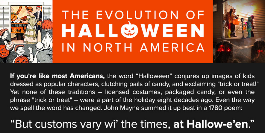
This year we found two new infographics to use with our learners. The first is The Evolution Of Halloween In North America. The timeline begins before 700 in three separate periods in history; from the 1900s to present, the timeline is arranged by decade.
The two-column layout of this infographic provides a visual connection between the history of the holiday and the literature and popular cultural aspects of the time. It’s perfect for scavenger hunts on the evolution of costumes, candy, and traditions.
The other infographic that we thought educators would find useful is Trick Or Treat Your Way Into Halloween Sales Like A Pirate. The creator also designed "min-fographics," perfect for educators to put into any presentation software. The whimsical and colorful display to illustrate the economics behind the holiday is sure to enhance any math lesson.
The different sections of this infographic also provide ideal opportunities for data analysis of charts and graphs. They are just the right mix of visually appealing graphics with real numbers to engage students in making comparisons regarding sales, percentages, popularity, and more.
We firmly believe a little deviation away from the routine to keep students focused pays off in the long run. Using infographics reinforces graphicacy skills, incorporates a little media literacy using Halloween hype, and celebrates learning with a little fun.
The torch relay, in particular, inaugurates the Games as the flame travels from its Greek origins to then crisscross Brazil in an escalating parade of famous athletes and historic sites. Mapping this journey through graphics and animations offers valuable chances to learn about geography and culture.
For better or worse, current events also feature prominently in the torch's travelogue (much like the 2014 Sochi controversies). At various stops, the Rio carriers have so far been attacked with a fire extinguisher, beset by an unruly jaguar, and accused of carrying a "cursed" flame.
In essence, the torch relay is a fitting cavalcade to the heroic spirit of the competition. It builds anticipation for the contests to come, and it shines a spotlight on the country's locales and heritage. It also welcomes the world into a terrain that may be unfamiliar. This widening of the learning lens is crucial in pushing students to look outside themselves. Sydney's 2000 triumph and Beijing's 2008 spectacle both prove the worth of these quadrennial jamborees.
For more ideas about exploring the Olympics or using the Games in education, check out:
It's rare that a single flower becomes a viral, stakeout sensation. We admit that we've been fixated. While YouTube eyes are currently obsessed with a grotesque and freakish bloom, educators may be missing an opportunity.
Yesterday the New York Botanical Garden (NYBG) announced that after a decade of cultivation, the Amorphophallus titanum finally began to bloom. Commonly known as the "corpse flower," this plant from Sumatra in Indonesia exudes the smell of rotting meat as it opens. The putrid odor and the otherworldly shape are keys to its appeal, as its startling height. The flower has notched the Guinness World Record for the tallest bloom in cultivation at over 10 feet (and even larger in its natural habitat).
The New York Botanical Garden first hosted a successful bloom of the corpse flower in 1937. A second emerged in in 1939, but generations have past to witness the third revelation of this dreamy, rancid blossom. Visitors have been lining up, and online watchers have been glued to the YouTube livestream, mostly because the scare appearance lasts for only 24 - 36 hours.
Why is this floral oddity relevant for teachers and students? On a basic level, this quirky natural artifact offers countless avenues for science learners to explore biology, botany, morphology, behavior, pollination, inflorescence, germination, dormancy, regionality, and cultivation. For example, the bloom is not actually one large flower. Instead it comprises a leaf-like ring of outbursts surrounding a central column.
On a higher level, the fascination with this shy and fetid flower speaks to every teacher's desire (and angst): how can we make make learning relevant? How can we pinpoint the moving target of our contemporary kids' attention spans? If they are attracted by a weird plant, what can we learn from this momentary buzz to inform our curricula?
Is it too much to ask that a daily lesson is unexpected? Is it pandering to give students something to anticipate, to look forward to? The allure of the NYBG "Corpse Flower Cam" lies in the waiting. It rests in the charisma of the macabre. Why does a flower smell so bad? What is the evolutionary attraction for carrion creatures that will come and spread the pollen?
In other words, all classes should unfold like a mystery. Children ought to be rapt in the one-in-a-million stories: the collapse of the Spanish armada, the elegance of Euler's identity, the chance of penicillin's discovery, or the lightning of a boy's forehead.
For locals, the occasion to visit a monstrous plant that reeks of spoiled flesh is priceless. Would that all of our classes were as exhilarating. For the rest of us, this is a neat moment that we should remember in September, to excite STEM learners and to wake up the drowsy kids who don't think our "Do Now" exercise lives up to their Snapchat feed.
Both STEM and sports get a bad rap. In the corridors of learning, science is sometimes seen as esoteric or irrelevant, while sports are seen as base or quotidian. Kids are often repelled by the former and drawn by the latter, mostly due to a misunderstanding about the intersection between math and athletics, between technology and physicality.
Fortunately, the possibilities of animations and motion graphics have helped visualize sports in riveting, educational ways. On both the professional and personal levels, data-driven graphics can bring to life the genuine learning benefits of athletics in STEM (Science, Technology, Engineering, and Math) courses.
In digitally nuanced videos, physics meets the real-world. Body kinesthesia moves from the static textbook page to vibrant video overlay. The visualizations can layer equations and statistics atop everyday pastimes. Sports heroes become humanized in analyzing the biology and chemistry that make them great. Familiar backyard games become elevated by realizing the arcs and velocities necessary to score a goal.
Furthermore, these stunning artistic creations validate the requisite addition of the "A" to STEM. A complete "STEAM" approach, including the Arts, proves the value of imagination, design, and narration in producing such compelling animations.
The following motion graphics and animations take the discussion even further, looking for fresh avenues to incorporate the personal interests of students into their science and math educations. These videos are great kick-offs to a morning's discussion, and they are valuable context-builders for putting formulas, trajectories, and graphs in their rightful, real-world contexts.
Since we began working with students to create infographics several years ago, we’ve witness tremendous growth in their ability to give context to their content. They’ve become accustomed to keeping font choices simple, careful about not typing in all caps for easier readability, and selective with color and images.
Source: ASIDE 2016 - 3rd Grade Infographics
They think about placement of text, simplify the information, and see the connections that each part plays in the overall design. It’s no longer a battle to compile the content and type the copy first, and then make it POP! There is no doubt in our minds that our continued integration of design as a method to transform information so that it can be easily understood at a glance is becoming second nature for our students. We spend less and less time instructing them to go back to rework problem areas.
Source: ASIDE 2016 - 4th Grade Infographics
Their mastery of the elements and principles of design show a natural progression with each advance in grade level. We’ve built a vocabulary of terms and expressions such as “1 + 1 = 3” that roll off their tongues as they help others around them. They understand that it’s not about the math, but the spatial adjacency of items that are side by side; they get that the middle counts. They love putting the infographic side-by-side with their research notes. The visual vs. linear comparison really hits home, and the sense of pride in their work is huge.
Source: ASIDE 2016 - 4th Grade Infographic
We firmly believe in the benefits of pushing the design of information within the curricula as a way of helping students internalize their research as well as create a context for it. With each year that we do this, the process becomes easier.
Financial literacy takes many forms. News headlines and candidate campaigns highlight the disparities of wealth between the "one percent" and the everyday Americans. In schools, traditional financial literacy classes teach older students about balancing their checkbooks and paying off their credit cards. These are noble messages, yet fundamental shifts are changing how young people spend and consume, from Bitcoin to online bill-pay.
Furthermore, financial literacy encompasses a much broader net of core fiscal issues, including stock investing, inflationary tendencies, surplus and deficit budgeting, bond and mutual fund accounts, and renting versus home ownership. Our youngest students need to be a part of this conversation, rather than waiting until high school or college, when it may be too late.
Luckily, a host of digital resources exist to welcome all learners into the money discussion. A terrific explainer video from Chris Curtis, entitled "Wealth In America," tracks how life-long earnings vary for each generation. Moving from the proven past to the predicted future, this animated infographic addresses how collective wealth matters in determining future savings. The gauzy collage of photographs and stamps unites with compelling narration to inform today's students about their relative futures. This motion graphic of statistics and charts neatly blends STEM skills with the social sciences to prove that financial literacy is more than a single silo of curriculum.
The video's creator, Chris Curtis, created this clip as part of his work with Deloitte University Press. As a director at Not To Scale in London, he has designed numerous short films that synthesize illustration with live action. He blogs at I'm Your Boss and shares visual and financial literacy ideas on Twitter via @imyourboss.
As a whole, this video projects the dollar value of future household assets. It nods to the outsized influence of the Baby Boomers, and it highlights the fallout from the "Great Recession" of 2007. In particular, it teaches young people about earnings versus debt. The Millennials are sharers, non-idealogues, and social entrepreneurs. The salaries of these price-conscious, tech-nimble workers may rise steadily, yet their per capita wealth will lag prior generations. They will, however, force changes in the traditional marketplace that will realign how workers accumulate wealth.
It may seem counterintuitive, but homework doesn’t get nearly the attention it deserves. For all the well-intentioned noise, the Great Homework Debate is still one of the least publicized (and most internalized) consternations for today's students and families.
Yes, there is a deep Lexus Nexus catalogue of articles about the pros and cons of homework in American education. And yes, Alfie Kohn has a quotable list of jeremiads against the ills of busy-work. But the real tug-of-war takes place at dinner tables each night, when school children have not yet completed their hours of worksheets.
This same push-and-pull continues in faculty meetings where educators wrestle with “how much is too much.” The rebranding of homework as “flipping the classroom” has only muddied the waters. Now instead of reading 20 pages of the textbook, kids watch 20 minutes of instructional videos. At bedtime, though, the question still lingers: where do authentic practice and independent learning meet redundant worksheets and desultory assignments?
Many institutions that have investigated the homework issue report increased learning when nightly burdens are lessened. Especially when it comes to ”studying,” the shifting of emphasis away from teacher-prescribed tasks to student-initiated review makes a world of difference in mastery and understanding.
We’ve offered ideas before about ways to teach without worksheets. This concept can hopefully apply to homework, too. Some terrific ideas come from this Jo Townsend “60 Minutes” video from Australia. It addresses the decline in time spent with friends and hobbies. It also mentions that 71 percent of parents feel they aren’t spending enough quality time with their children. They are instead worrying with homework and running the household. The video ends by referencing Finland, where students have no homework at all, and which consistently outranks other nations in its literacy achievements.
2015 was a banner year for animations to engage students. These dynamic explainer videos proved definitively that print textbooks cannot keep up with educational, up-to-date motion graphics, especially in the sciences.
The sphere of subjects that fall into STEM's orbit keeps expanding. For better or for worse, K-12 courses are now binarly split into either "STEM" or "Humanities" categories. We would argue that this bifurcation is harmful, erasing the natural overlaps between the sciences and the liberal arts.
The effect, however, is that more and more designers and educators are creating brilliant interactive companions to traditional learning. Here are five favorite animations from the past year that will allow science and math teachers (as well as those in the Humanities) to kick off 2016 with a bang:
This beautiful stop-motion animation offers a moving case study about the effects of urbanization on pollution. The "WWF Brazil - Marine Program" video, made in collaboration between scenes. and Wildgroeiers, highlights critical issues of conservation and biodiversity for any age group.
3. Astronomy
BBC Earth has designed a clear and compelling motion graphic to emphasize the size of the universe and the speed of earth's galactic travels. The 3D visualization employs time and scale to bring astrophysics to life.
Software engineer Cameron Beccario (@cambecc) has programmed a stunning representation of the earth's weather conditions. With regularly updated ocean currents, waves, temperatures, and anomalies, this interactive globe allows students to zoom in and rotate a la Google Earth. The educational opportunities range from oceanographers analyzing climate change to historians studying ancient trade routes.
The recent Ebola panic prompted The Washington Postto create this precise simulation that compares the disease's spread to other historical pandemics. Although the original interactive graphic pre-dates 2015, the updates are important to medical students and social scientists who are trying to track contraction, infection, transmission, and vaccination.
Honorable Mention: Ecology & Forestry
This seemingly simple motion graphic by Nature Video brings into startling relief the rate of global deforestation. Researchers made 421,529 separate measurements around the world to produce an irrefutable data-driven image of the changing planet.
For more resources, take a look at last year's five best animations, or some of our other posts about animations in the classroom:
Motion graphics are some of the most effective learning tools today. Sometimes called explainer videos or animated infographics, these multi-sensory clips deliver information in a high-octane fashion that appeals to all of the learning modalities.
These colorful, spirited videos combine voice, images, and kinetic typography to employ all of the brain's receptors in internalizing ideas. They elevate static infographics to a whole other plane. Here are some of the best motion graphics for classroom and individual learning:
Even more powerful than watching an explainer video is creating one's own animation. We recently produced our first, professional-quality motion graphic, called "What Is Graphicacy?" These types of films can teach a lesson or bring a project to life or demonstrate mastery of a concept. Until recently, complex videos like these were the sole purview of trained graphic artists. Now, teachers and students alike can design and publish their own motion infographics with simple, elegant, free interfaces. Adobe Voice has long been one of our favorite apps for making videos, but Renderforest kicks the options and energy up to a higher level.
Renderforest is a web tool that offers a range of easy yet powerful templates for producing videos. Signing up for an account is free. Within minutes, you can be publishing your own content. The templates walk a perfect balance between customized choice and preset parameters. You have a range of selections in style and length of video, and you can then select a color theme to unite the presentation. Each slide has text elements that you can personalize, and the magic of Renderforest turns everything into a lively animation.
Originally intended for business users, Renderforest has enormous potential for education. Its subtle options in are its best. You can pick from its list of background musical tracks, all of which are nice. Or you can upload your own tunes and voiceover. In other words, any recording you have produced can be added to their frames. You can invite students to record podcasts or narrations, or use Garageband to layer original music with audio tracks. The app-smashing potential is tremendous.
When you export your finished product, you can easily go back and edit any element. The free option features a basic video quality with a company watermark in the corner. You can, therefore, show student or teacher videos in class for no charge. If you would like to choose from the HD playbacks, or download your film, there are modest pricing options available.
We had no trouble designing our video, recording the audio in one take, converting it to HD, downloading it, and then uploading it to Vimeo in a surprisingly brief period of time.
This act of creating motion graphics nudges both students and teachers to blend a host of proficiencies. It involves visual design in colors and templates, just as it requires language skills of narration and storytelling. It supports key technological skills in manipulating online media, and it reinforces the importance of publishing in sharing child creations with peers and parents. Kids teaching kids is the purest model of learning. Renderforest allows them to produce permanent instructional videos that can reach global audiences and live on after their own school years have ended.
Students are producing more projects than ever before. The proliferation of visual apps and the access to easy tech tools have allowed learners to create all sorts of digital stories and custom graphics. Yet, as Marvel Comics teaches us, with great power comes great responsibility.
It is tempting to assume that because children are growing up in a visual world, they automatically know how to decode and encode optical inputs. This proficiency is known as graphicacy, which is the key to visual thinking in a differentiated classroom. If educators are going to ask students to design posters and slideshows, then they also need to guide young learners in the skills of effective design. Any teacher who has seen children layer neon pink fonts on top of vertiginous purple backgrounds knows that kids don't innately grasp the keys to clean layouts.
The logo design firm DesignMantic has published a series of extremely helpful infographics to help budding artists generate successful visuals. Even though these placards are intended for marketing and business purposes, they perfectly suit the needs of teachers looking for classroom resources.
"Visual hierarchy ... offers to your eyes visual assistance, suggesting to them, what information to linger on to, as your vision glides through it. It lays down a path for the data to flow in, to get absorbed into the brain smoothly. It guides the human eye from one element of the data to the next, like an invisible pointer moving through the data, to keep the reader free of any visual fatigue."
In our previous post, we wrote about the infographics that second grade students created for their social studies unit. We’ve created infographics this year with a number of our elementary grades, and through trial and error, we’ve perfected the process to help them gather their data facts for the topics they researched.
Source, ASIDE, 2015
For younger learners, a clearly defined way of collecting the information is key. To do this, we designed the simple graphic organizer in this post to help them. The purpose of separating the number from the description is twofold. It not only clearly delineates the data from the facts, but it also aids in designing the actual infographic.
In order for the number to stand apart, it needs to be in its own textbox. This allows the data to be sized differently from the text in the infographic. The data piece is important. It should be more pronounced, in order to highlight each key fact in the overall design. We found that using this method with younger students also helped guide them through the editing process in writing the descriptions without repeating the number within the text.
Empowering kids to be their own content creators helps them visually look at ways to encode the design of information. We firmly believe that building the skills of design literacy develops a keen sense of how to manipulate content for maximum impact. It develops visual literacy and visual thinking, the key components of graphicacy. The process of shifting from linear to visual information aids the learning process by providing context for content individually and by educating others about their topics.
The earlier students learn to do this, the savvier they become at scrutinizing other information they see on a daily basis in the media. Understanding that design and media play a huge role in content creation can only help them as they go through the continual bombardment of advertising by infographics in the future.
For the past four years, we’ve been using infographics with our students at different grade levels. This year, our second graders were studying New York City to make comparisons between its historical past at the turn of the last century with today. Instead of the typical presentation poster, they made infographics using the Easelly app.
Source: ASIDE, 2014
We worked with our colleagues Stefani Rosenthal (@StefRosenthal) and Jessica Raffaele (@miss_raffaele) to help the students gather the data facts they needed. With an array of examples from other students displayed in and around the library, these young learners easily picked up the basic elements and principles of design to create the examples in this post.
The synchronicity of words, pictures, and numbers found in infographics enables students to visualize what they have learned and share it with an audience of their peers and others. Moving the content from writing journals or note-taking apps, where no one else sees it, to a place for others to interact with it changes the engagement with the information. A teacher alone does not make an audience.
Source: ASIDE, 2014
Students worked out the details of learning the simple principles of contrast, and color for the best arrangement of their facts and figures. Knowing that their work would be on view during a presentation and printed for the infographics wall in the library provided that extra incentive to make it their best.
While we digitally show our students work, there is something different about having it on view around the building. Kids notice and love to see their creations exhibited live. The content reach also expands through the visual presentation on display. We constantly see others looking and discovering. As in advertising, the visual design of information solicits the viewer’s attention.
The participation by an audience provides learners with an opportunity to demonstrate their understanding collectively to groups of spectators, whether peers, parents, or teachers. For kids, that encounter makes a difference.
Source: ASIDE, 2014
This collective consumption of content broadens the learning environment far beyond a simple grade level or subject area. The power of audience changes the dynamic from static, self-contained learning to one of organic assimilation of knowledge.
Even though Pinterest and One Kings Lane may have catapulted "curated" into popular jargon, we respectfully disagree with the lexicographers at LSSU. Rather than being over-used or hackneyed, far too few students today are being properly schooled in the skill of curation. Curation is a key proficiency in face of today's instantaneous access to information. Sifting through a sea of sources and aggregating the most relevant research are critical expertises in the world of big data. Alan November actually recommends that on the very first day of school, teachers should train children in proper online searching.
In this vein, we have curated five fascinating interactives to help inspire learners for the year ahead. For the humanities, these animated videos and infographics encapsulate a wide range of explorations into history, geography, sociology, and globalization. Although they may have originated in 2014 or earlier, they paint a riveting potential for the year ahead in literacy and the social studies.
The Infographic History Of The World reminds us of an earlier, mesmerizing Solar System video from the Kurzgesagt design team. With art by Valentina D'Efilippo, this motion graphic pops with swirling images of the globe from the Big Bang to civilization's beginnings to nation building to the modern world. It pairs well with her infographic book, co-authored with James Ball, but also serves as a tantalizing teaser to excite young learners about world evolution.
In Charted Waters - Mapping A Brave New World allows users to swipe through a riveting visual timeline of oceanic exploration. Created by MSC Cruises, this interactive website invites students to trace the history of human civilization through maps and indeed to explore the transformation of mapmaking itself.
Michael Porath, a Data Visualization Consultant and Information Scientist, has generated a clever tool to explore the territorial expansion of the United States. His interactive page, Manifest Destiny - The Story Of The U.S. Told In 141 Maps, takes existing map data and reimagines it as a scrolling, clickable, and hoverable series of images for students to investigate at their own paces and tangents.
The Kids Aren't All Right is an interactive infographic that highlights key metrics of childhood development across the globe. Sponsored by Healthcare Administration Degree Programs, this site allows students to click on factors such as infant mortality, child labor, and primary school enrollment to see the real data about which conditions put children most at risk in world countries.
For further information about teaching with interactive graphics, we recommend:


)