One thing we quickly learned during remote and hybrid learning involved the lack of understanding of screen iconology. We realized that our students needed to navigate the changing landscape of communication, not only for this unusual situation in pandemic learning, but also to understand the language of symbols on any digital device. It was one of those moments when adjustments to our instruction required a closer look at ensuring digital literacy to read and process crucial technology skills.
Source: ASIDE 2021
The pandemic emphasized just how much we took for granted our students' visual literacy of the icons that appear regularly in front of them. As with so much of visual literacy and thinking, graphicacy is the underpinning skill that our students require, and the need to educate learners beyond the written text in the illustrative and technological arts is essential.
The adjustments we made in the curriculum to build in skills for students to develop a range of pictorial proficiencies for decoding icons and their functionality paid off, particularly with our remote learners.
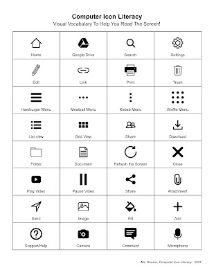
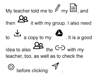
Visual fluency requires training and practice much the same as it does for reading; visual comprehension does as well. Today, students need to master multiple fluencies just as they do multiple literacies. Both require nurture and development to acquire these skills. We turned the learning process into a spy game for students to decipher the coded message using the icons. We provided a mentor text for them to grasp the idea and a one-page list of 32 icons to create their messages. Click here for a PDF version.
Source: Student Work
To save time, we set up a folder with small icons that we downloaded from the Noun Project in Google Drive that we shared with the students so that they could write their own coded messages. Click here for access to our icon folder. The students loved it.
This not only reinforced their learning of the icons, but it also allowed us to build in a variety of technology skills for retrieving the resources they needed from a shared folder, importing images into a Google Doc, and adjusting image size and text for readability. The students had a ball sharing their coded messages with each other, and we had the results we were looking for in developing the their digital device iconology.
It's been over ten years since we first started using infographics with our students to make learning visible. They have certainly come a long way! Not only is this due to our ability to redesign aspects of our lessons to promote visual thinking and design, but also because the design tools are so much better. Our go-to creative tool now is Canva. It allows for so many options and templates. This flexibility enables students to make selections and modify their designs to look professional.
Since we use Canva it at multiple grade levels, they continue to perfect their visual literacy skills. The early "linear to visual" infographics using iPads and PicCollage seem so primitive now compared to the variety of selections in Canva. We do still use PicCollage for our Kindergarten through second grade students; it's a perfect tool for introducing our younger students to the art of learning and designing infographics.
Teacher videos are terrific learning tools, but student-created videos are even richer. Creating videos, motion graphics, and animations nudge students to blend a host of proficiencies. It involves visual design using colors and templates, just as it requires language skills of narration and storytelling.
The process of using a storyboard to stitch together a narrative enables students to combine logical reasoning, cause-and-effect, and content mastery. These compelling presentations provide opportunities for students to learn, share, and teach others. It reinforces the graphicacy skills they need to learn, design, and communicate a message as journalists.
Kids teaching kids is the purest model of learning where they become the educators of
their peers. The examples below are just some the different types of videos, motion graphics, and animations made by our students.
In light of our recent post, we thought it worth sharing one of the latest TED Ed videos released this summer. It is entitled “How To Stop A Misleading Graph,” by Lea Gaslowitz. We haven’t used this with our students yet, but we plan to this fall. Graphs can aid us in grasping complex data; that does not mean they always tell the correct story. With the so many visible software resources available today, it’s easy to design graphs, charts and tables for all types of media.
This video makes for a perfect mini-lesson to reinforce visual literacy, one of the core skills of graphicacy. Just because a graph looks good doesn’t mean it’s accurate. We want our students to look beyond the sleekness of design and not be swayed by colors, shapes, lines, and curves. Instead, they should question the labels, numbers, scale, and content. In other words, ask what the graph is trying to convey and not take it at face value.
Graphs should represent data, not an opinion. By distorting the scale on either axis, they can be intentionally manipulated. The video provides straightforward examples of “cherry picking” the data points to skew the scale for the purposes of persuasion or bias. As we’ve stated in our previous post, our students are growing up in a data-rich world that increasing relies on the design of information. It’s for this reason that they need to be more discerning about misleading content. Visually literacy is a necessity now more than ever.
We’ve built our mission on the idea that making learning visible through design
changes they way learners view content. The examples in this post by our first
graders illustrate just how important design was in providing a context for their
Arctic animal research. This was our youngest group to tackle creating
infographics, and boy, did they do a great job.
This crop of little designers followed a set of guidelines set up by our colleague
Stephanie Temple (@stemple3) to organize the information. The process allowed them to
follow step-by-step instructions regarding font selection, number of
pictures, and factual information. Of course, choice meant that the students
could personalize their work once they completed the basic criteria. Several
capable students also took it upon themselves to do more; this provided an
added level of differentiation.
Source: ASIDE 2017
Using infographics offers students an opportunity to display their research in a visual
representation that can be easily understood. Students from second through eighth grade know this process, and we’re happy to say that we’ve added first
grade into the mix. In fact, by the time they hit middle school, it becomes
routine. They learn to critique each other for contrast, layout, typography, and more.
Source: ASIDE 2017
We keep the elements and principles of design posted in our classrooms and also electronically on their student portal. As a result, we frequently hear students
helping others on different projects using what they’ve learned. It’s just what
we want; thinking visibly becomes second nature.
The National Association Of Independent Schools (NAIS) 2017 Annual Conference just wrapped up in Baltimore, Maryland. The two days of sessions, speakers, and confabs all highlighted the evolving roles of schools and school leaders within the ever-competitive learning landscape.
We want to express our sincere thanks to the room full of educators who came to our Friday session, “Where Learning Meets Design: Taking Control Of The Visual Classroom.” The questions and ideas made for a terrific conversation about graphicacy and the importance of visual proficiency in both a student’s and a teacher’s toolkit.
All of the links, resources, and videos from our workshop are posted on our “Visual Classroom” website. The PowerPoint from our presentation is also now live on the page. If you happen to take a look at the slides and graphics, please feel free to get in touch with your feedback and additions.
We also appreciate the enormous encouragement from our school’s Headmaster and Director of Communications in supporting our trip. It was a real treat as well to see our former head from 15 years ago pop into the back of the session room.
The highlight of this year's conference was without a doubt the lively and thought-provoking talk by Sir Ken Robinson. With characteristic wit and insight, Robinson reminded us that children are learning organisms. They love the internalization of language and ideas, but they don’t always love “education.” This is because the nation's school systems operate on efficiency, not talent. They prioritize shared cultural knowledge, rather than the inner yearning for discovery.
Other speakers included Susan Cain and her ruminations about the power of introverts to change the world, as well as intriguing sessions that focused on data-driven assessments and alumni engagement. The most fun, however, came from the accidental hallway encounters with long-time friends and colleagues from across the country. These sorts of run-ins are what make this gathering so meaningful.
Obviously, we didn’t make it out of Baltimore without sampling some crab cakes. We recommend The Oceanaire for their super-fresh, super-local seafood. Also, BricknFire Pizza Co. in the Baltimore Marriott Inner Harbor makes the best caramelized onion and mushroom pizza we’ve ever had.
Thanks to all of the NAIS organizers for staging such a smooth conference. And if you weren’t able to attend this year’s symposium, follow the #NAISAC tag on Twitter for great on-sight reporting and resources.
We just finished attending the New York College Learning Skills Association (NYCLSA) Symposium in Saratoga. We met impressive educators who shared their expertise and resources, and we presented “Design Gives Context To Content To Engage Learners.” The following is an excerpt of why we feel so passionate about this topic.
The harmony between form and function not only applies to design, but it also relates to the synergy between educator and learner. It supports both. Good design of information guides the attention of our students, creating a relationship between context and content. It allows for engagement without distraction.
Design Matters, because it can:
Steer the eye of the viewer
Remove the noise and congestion
Separate ideas into succinct areas
Create a consistency across materials
Align information for clarity
Establish a hierarchy of content
Make information easier to navigate
Design plays an integral part in the skills of graphicacy, visual literacy, and visual thinking. If companies spend billions of dollars on advertising to grab our attention, it would make sense for educators to think about information design as well. With the growing industry of online learning, how we incorporate visual information makes a difference not only in the way a student engages with the content, but also how he or she comprehends the information over the long run.
Source: ASIDE 2016
Attention, comprehension, and retention, or “ARC,” are inextricably linked when the visual information is included in the overall design of content. It’s why people and kids remember commercial, jingles, logos, and brands. The connection increases engagement with the material, making it memorable. The more we incorporate these aspects into our teacher toolkit, as well as in the options that students have to deliver content, the deeper the link to the material.
Source: ASIDE 2016
Design can influence the perception of information, the visual communication, and the engagement with text. It enables learners to make associations, and it provides opportunities for greater understanding.
The influence of visual media on how content is communicated and consumed plays an enormous role in how we synthesize information. So it is no surprise that A&E History partnered with the design firm Column Five to produce Little Bits Of Big History. We’ve been big fans of Column Five as one of the leaders in developing visual communication that educates, engages, and inspires – all core parts of its mission. These mini-infographics, along with their accompanying short animations, illustrate a selection of history facts on a variety of subjects from a "just because it’s interesting" approach.
Each of these little gems is colorful, engaging, and informative. They’re not only ideal to use in any classroom, but they also provide clear stylistic approaches as guides for learners to follow in designing their own bits of information. They fall into the “ARC” of visual thinking – Appeal, Retention, and Comprehension.
The images catch viewers' attention, help retain what they see, and assist with comprehension. Take a look at Column Five’s infographic on “Why Your Brain Loves Visual Content” to view how making content more visual increases its impact and effectiveness because of ARC.
The wide variety of tech savvy tools to make one's own infographics and animations provides a great way for students to present content. The research does not require a huge amount of time, and leaving the topics open to student choice could yield some interesting facts. It is an interesting and effective way to share information for any discipline. We can easily see these used for historical tidbits, scientific morsels, mathematical crumbs, and more.
Who knows, maybe we can start our own in-house trivia channel? We’re sure our kids would love that, and for them, audience definitely matters.
Community college students everyday interact with a range of materials: handouts, worksheets, outlines, templates, PowerPoints, etc. From the simplest to the most complex, these resources are sometimes the primary conduits for information and training. The design of these materials, therefore, matters. The visual presentation of instructional tools can make the difference between detachment and engagement, between reticence and retention.
One of the touchstones of the design world is the unity of form and function. This “big picture / small picture” harmony is an equally crucial lesson for teachers and learners of all ages. Whereas art is something we look at, design is something we use everyday. It gives context to content and supports the relationship between the two. Good design of information delivers content that is engaging to the eye without becoming a distraction. It guides the attention through carefully controlled and selected visual components; it retreats to the background, enabling the purpose of the finished product to come forward.
In creating both tangible and digital presentations for college learners, educators can ask themselves about the desired purpose, audience, and format of their materials. Similarly, considerations of layout, font, color, and alignment can make positive differences in conveying crucial concepts. A few notions to keep in mind include:
Visual media bombard the modern eye
Images increase the level of engagement and retention
Design creates meaning and relationships
The eye reads many types of "texts"
Simple tools and techniques can aid understanding
Emphasis, typography, hue, layout, and balance are key
Many thanks to the warm and welcoming educators at NCC for inviting us and for being such gracious hosts. It was a pleasure sharing ideas and exploring the potential of visuals to make a difference in the lives of learners. We look forward to staying in touch and continuing the dialogue about design!
The misconceptions about visual thinking are alarming. On one hand, this critical skill seems integral for contemporary learning, since almost every modern input is visual in nature. Yet this key proficiency seems almost entirely absent from state standards and daily classroom lessons.
Is visual thinking just a polite nod to Howard Gardner's quaint modalities? Or is it a genuine habit of learning that unites the external codes of pictorial metaphor and digital imagery into a seasoned curriculum of higher-level interpretation?
Source: ASIDE, 2015
Visual thinking is a close partner to graphicacy, which is a spectrum of analytical tools to decode and encode pictures. Luckily, many educators on the web have shared strategies for reaching children via optical data.
Here are five terrific presentations about the power of visuals to craft a layered approach toward teaching with creative design. Each of these slideshows offers a specialized take on graphic learning. They would all be valuable resources for educator professional development or for regular practice with children.
We live in a visual world. Smartphones, television, Internet, and social media all push information in real-time, all the time. Visual media bombard us in constant streams. Learners of every age, therefore, need to understand how to analyze pictorial information. This skill of parsing images, interpreting pictures, and decoding diagrams is known as graphicacy.
The motion graphic (or explainer video) in this post describes the many reasons for graphicacy education. Maps, cartoons, and photographs all feature symbolic cues and metaphoric elements. An animated infographic itself can become a conduit for graphic instruction.
Sixty-five percent of people today identify as visual learners. In fact, the brain processes optic inputs 60,000 times faster than text. Yet schools and scholarship rarely apply the tools and time to train people how to understand all of these visual streams.
Graphicacy stands with literacy, oracy, and numeracy as one of the four indispensable corners of education. It dates to W.G.V. Balchin's coinage of the term in the 1960s to identify the visual-spatial aspect of human intelligence. What began as a staple of South African geography education has ballooned in importance, especially in today's 1:1 classroom. With today's rightful emphasis on differentiated instruction, contemporary classrooms need to incorporate coaching in graphicacy to reach students via their learning preferences. (Continue reading for more information….)
Visual literacy is about learning how to look. It involves learning how to internalize and deconstruct the images that the brain sees. It involves input. Visual thinking is about learning how to design. It involves imagining graphic representations of new or traditional concepts based on the mind's unique creation. It involves output. Graphicacy, therefore, is the union of the two acuities. It marries the essential skills of decoding and encoding to embrace a range of pictorial proficiencies. (Continue reading for more information….)
Tommy McCall hit the nail on the head when he called “graphicacy the neglected step child in the classroom” during his TEDx East talk on Literacy, Numeracy, And Graphicacy. In the new e-cology to design and create digital content that is transmitted, interactive, and shared, it is even more vital to incorporate graphicacy skills in daily lessons. By training kids to thoroughly study what they see, we reinforce their visual acuity, attention to detail, and ability to notice conspicuous absences of information. We want them to develop a keen eye for seeing, to detect problems, and to understand the message inherent in the design. (Continue reading for more information….)
Graphicacy often takes a backseat in traditional classrooms, because understanding pictures is thought to be a natural consequence of basic vision. The conventional wisdom says that if people can see, then naturally they can comprehend what they see. Parents, however, know this is untrue. They know children must learn to decode images and connect the visual parts to the cognitive whole. Mothers and fathers dedicate evenings to paging through picture books with their toddlers, pointing out clouds and jackrabbits and smiling moons. (Continue reading for more information….)
Whether graphicacy is the “fourth R” or the “third skill,” as Howard A. Spielmanrefers to it, the format for representing data and visuals is much more complex today. Data visualizations such as infographics and the myriad of designs used in their creation are arguably more complex in many cases. This is quite the opposite of what infographics are by definition, which is to present complex information quickly and clearly. They often combine images and data in ways very different from standard graphs, charts, and maps in most elementary textbooks, thus prompting a need for graphicacy in education. (Continue reading for more information….)
We use four steps in guiding students to interpret charts, maps, cartoons, infographics, and logos. These four steps progress from base-level identification toward more analytical and sophisticated skills. The understandings proceed from: 1) Substance, 2) Scaffold, 3) Story, and 4) So What? (Continue reading for more information….)
Amid the national emphasis on STEM programs, charts are becoming key tools to represent visual statistics. As more and more schools migrate to 1:1 tablets, therefore, students need a foundation in reading and rendering their own optic inputs. The language of apps today is printed in icons. On handheld devices, colorful squares dance across each swiped screen. Children need to recognize these badges and identify the relationships between the logos and the corresponding actions. (Continue reading for more information….)
Now in its fifth year, the 2015 SXSWEdu rally in the Texas midland is more inclusive than ever. The panelpicker judges eschewed trendy topics like flipped learning and Big Data in favor of deeper discussions about Social Emotional Learning and Gamification. Major themes that ran through the first day included programming in schools, authentic PBL, and contemporary professional development.
A major highlight of the day was hearing about the impressive Coded Curriculum implemented by Beaver Country Day School in Chestnut Hill, Massachusetts. The school has embraced a "launch / test / refine" approach to incorporate coding into every academic discipline. The faculty actively seeks to "make excellent mistakes" as they teach children the "New Basics" of open-ended problem solving, non-linear thinking, and collaboration.
Another centerpiece of the sessions was Sunni Brown's mesmerizing workshop about "how to stay curious." A guru of visual thinking and a doctor of doodling, Brown reminded the crowd that visual language is a river native to cultures across the world that instills a powerful cognitive awareness.
The spirit of sharing was genuine today at SXSWEdu. Every attendee was universally open and eager to connect. Yet a question kept trickling through the meandering hallways like the incessant drip of Austin’s rain: How many actual classroom teachers were present at the conference? When Brown asked how many classroom educators were in the room, fewer than ten percent among the hundreds raised their hands.
Source: ASIDE 2015
Throughout the day, we met: an online charter school principal, a start-up edupreneur, an NAACP coordinator, a not-for-profit founder, an NEA staffer, a Museum and Library Services researcher, a corporate communications director, a Learning Sciences professor, a former math instructor in Ethiopia, and a doctoral candidate who moonlights at Khan Academy. We met other interesting people, too, but we did not meet one classroom teacher.
We know they were there. But they seemed few and far between. Maybe this is a good thing. Maybe it signals that SXSWEdu is not for everyday teachers. Maybe the passionate attendees perceive a sea change in education that is more galvanizing than "regular" teachers can see. Or maybe not.
Either way, it speaks to a road diverging in a not-yet-understood wood. If start-ups and online outlets are careening onto their own edtech on-ramp, what happens to the students and teachers driving in the HOV lane?
For example, after participating in one session about a full-scale coding curriculum pushed across all disciplines, we attended a completely different panel about whether edtech really offers any solution at all. It feels strange that this question is still being asked: Is edtech a panacea or a distraction?
The nuanced nature of this tacit tech tug-of-war reminded us of a General Electric ad from September 2014 called "The Boy Who Beeps." The touching ad follows the birth of a baby who can speak the language of technology. The commercial intends to tout GE's omnipresence in electronics, but to us it highlighted the children today who are always plugged in, always wired.
Kids are born who can seemingly speak to machines, communicate with the digital world, control their own access to e-learning. What happens, though, when their days become disconnected? Can they muster the skills to navigate a tangible, interpersonal world? Or better yet, can they make things, create their own machines? Are they controlled by the very machines they rely on? And what about children who don’t have machines?
In the edtech learning space, are there start-ups who talk only to machines – and not to educators? And what about the teachers who cannot (or will not) talk to machines, who can’t negotiate the apps and iPads filling their classes?
By the end of today, we were encouraged. We decided that educators are indeed emerging as a potent force in the digital economy. American Federation Of Teachers President Randi Weingarten noted a change since last year's SXSWEdu. She now hears tech companies asking, “How can we get teachers involved in the process?” She emphasized that with the onslaught of shiny edtech tools, the best advice is to know how to teach first, and to learn to use technology second. Brown echoed the same, saying that digital tools are great, but they're not worth much if we can't use them. The learning is the key.
Logos are short-hand, visual cues that companies use to evoke their brands. Effective logos represent automatic associations between a corporation and a customer. They connect a unique icon with an emotional reaction.
This type of tidy pictorial design can also be employed to winning effect in the classroom. Students can use logos to study visual metaphors and symbolic meanings. They can experiment with thesis and synthesis, in boiling down a range of meanings into a concise, original image.
Source: ASIDE 2015
History students, for example, can sketch logos to embody specific presidents or time periods. We had our U.S. history classes brainstorm logos for the era of the Great Depression. The designs featured in this post range from a juxtaposition of the Empire State Building going up while the stock market goes down, to a financial Dust Bowl of lost dollars.
In studying literature, learners can similarly design logos to accompany a book or a character. It's no surprise that the Hunger Gamesmockingjay pin became so popular among fans. Science students can draft logos for key principles or elements, or global thinkers can draw emblems to capture current events.
Source: ASIDE 2015
By translating their understanding into self-created icons, students can climb a level in their comprehension, from decoding to encoding. They can capture the essential significance or recurring tropes via clever designs that will in turn help educate their peers.
Steps for creating logos with students:
Begin by having learners identify logos and brands from current media. We use these sheets of letters and symbols as games to get students excited and to introduce the range of possibilities.
Invite students to rank their favorite logos and explain why some stand out in their minds. For example, we had children rate the logos of presidential candidates in 2012.
Above all, a logo should present a clear, somewhat unexpected relationship between picture and subject. The video below, "49 Years Of Super Bowl Logos," reveals how images can evolve with the times to add layers of significance.
In our previous post, we wrote about the infographics that second grade students created for their social studies unit. We’ve created infographics this year with a number of our elementary grades, and through trial and error, we’ve perfected the process to help them gather their data facts for the topics they researched.
Source, ASIDE, 2015
For younger learners, a clearly defined way of collecting the information is key. To do this, we designed the simple graphic organizer in this post to help them. The purpose of separating the number from the description is twofold. It not only clearly delineates the data from the facts, but it also aids in designing the actual infographic.
In order for the number to stand apart, it needs to be in its own textbox. This allows the data to be sized differently from the text in the infographic. The data piece is important. It should be more pronounced, in order to highlight each key fact in the overall design. We found that using this method with younger students also helped guide them through the editing process in writing the descriptions without repeating the number within the text.
Empowering kids to be their own content creators helps them visually look at ways to encode the design of information. We firmly believe that building the skills of design literacy develops a keen sense of how to manipulate content for maximum impact. It develops visual literacy and visual thinking, the key components of graphicacy. The process of shifting from linear to visual information aids the learning process by providing context for content individually and by educating others about their topics.
The earlier students learn to do this, the savvier they become at scrutinizing other information they see on a daily basis in the media. Understanding that design and media play a huge role in content creation can only help them as they go through the continual bombardment of advertising by infographics in the future.


)