Showing posts with label sports. Show all posts

Wednesday, August 3, 2016

Designing The Iconic Flame - A Visual History Of The Olympic Torch

Source: Rio 2016

Design is the marriage of message and motif. It is the intersection of identity and icon. In crafting a logo or a slogan or a character, the end symbol is the summation of both the shape and the story.

That’s why the images of the Olympic Games have reached such exalted status. The five rings are a beacon of continental unity. The posters and medals and mascots have linked arms through the years to provide an intriguing portrait of episodic design trends and nationalistic pride.
Source: Rio 2016

Looking back at the summer and winter Games, we have offered reviews of: 

The Olympic torch is an often-overlooked aspect of sports history. Many viewers might remember the televised cauldron lightings, but few can recall the specifics of each particular torch style. This is a shame, because the Rio 2016 cresset is a testament to careful design and deeply embedded meaning.


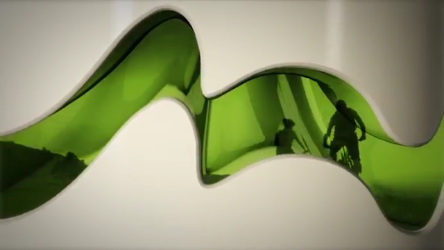
The Rio torch, as always, represents “peace, unity, and friendship.” This particular beacon, however, features many other subtle elements to personify the flair and landscape of Brazil. For example, this torch is the first to extend and grow. From the official Olympics site:

Source: Rio 2016
The hues and textures of the expanded torch pay tribute to the gold Brazilian sun, the green mountain curves, the blue ocean ripples, and the grounded Copacabana promenade. The winning design from Chelles & Hayashi was chosen unanimously from 76 nationwide submissions. Additionally, “each torch – crafted from recycled aluminum and resin with a satin finish – weighs between 1kg and 1.5kg and stands 63.5cm high when contracted and 69cm when expanded.”

For a look back at past Olympic torches, this wiki outlines a complete list of manufacturers and designers. For a visual gallery, the Olympic site includes icons going back to the 1936 Berlin Games.

Personally, our historic favorites are the art deco Innsbruck 1976, the knifed Sydney 2000, and this year’s evocative Rio 2016:

Source: Olympic.org

Our least favorites are the spatulaed Montreal 1976, the cucumbered Albertville 1992, and the twizzlered Sochi 2014

Source: Olympic.org

For other ideas about teaching with the Olympics, we recommend:

Tuesday, August 2, 2016

Visualizing The Summer Olympics - Mapping The 2016 Rio Torch Relay

Source: Rio 2016 Olympics Wiki

On Friday, August 5, 2016, the eyes of the world will be fixated on Rio de Janeiro for the opening ceremonies of the Games of the XXXI Olympiad. The #RoadToRio has notoriously been potholed by damaging news stories about Zika mosquitos, water pollution, construction delays, financial collapse, and rampant crime. Still, the tenacity of the tireless athletes and the nobility of the Olympic quest will unite the globe for two weeks and will present terrific opportunities for visualizations and education.

Source: Rio 2016

The torch relay, in particular, inaugurates the Games as the flame travels from its Greek origins to then crisscross Brazil in an escalating parade of famous athletes and historic sites. Mapping this journey through graphics and animations offers valuable chances to learn about geography and culture.


The official Rio 2016 site offers dynamic options for tracking the path of the torch, via calendar photos, city routes, and regional celebrations. The video highlights include both an animated map of each destination and a behind-the-scenes tribute to the nation's citizens. Across 95 days, the torch will pass through 12,500 road miles, 10,000 air miles, and 12,000 people.

Source: Rio 2016

For better or worse, current events also feature prominently in the torch's travelogue (much like the 2014 Sochi controversies). At various stops, the Rio carriers have so far been attacked with a fire extinguisher, beset by an unruly jaguar, and accused of carrying a "cursed" flame.


In essence, the torch relay is a fitting cavalcade to the heroic spirit of the competition. It builds anticipation for the contests to come, and it shines a spotlight on the country's locales and heritage. It also welcomes the world into a terrain that may be unfamiliar. This widening of the learning lens is crucial in pushing students to look outside themselves. Sydney's 2000 triumph and Beijing's 2008 spectacle both prove the worth of these quadrennial jamborees.

For more ideas about exploring the Olympics or using the Games in education, check out:

Sunday, July 24, 2016

Visualizing The Science Of Summer Sports - STEM Animations And Motion Graphics

Source: Tim McGarvey

Both STEM and sports get a bad rap. In the corridors of learning, science is sometimes seen as esoteric or irrelevant, while sports are seen as base or quotidian. Kids are often repelled by the former and drawn by the latter, mostly due to a misunderstanding about the intersection between math and athletics, between technology and physicality.

Fortunately, the possibilities of animations and motion graphics have helped visualize sports in riveting, educational ways. On both the professional and personal levels, data-driven graphics can bring to life the genuine learning benefits of athletics in STEM (Science, Technology, Engineering, and Math) courses.

Source: Spov Design + Moving Image

In digitally nuanced videos, physics meets the real-world. Body kinesthesia moves from the static textbook page to vibrant video overlay. The visualizations can layer equations and statistics atop everyday pastimes. Sports heroes become humanized in analyzing the biology and chemistry that make them great. Familiar backyard games become elevated by realizing the arcs and velocities necessary to score a goal.

Furthermore, these stunning artistic creations validate the requisite addition of the "A" to STEM. A complete "STEAM" approach, including the Arts, proves the value of imagination, design, and narration in producing such compelling animations.

Source: Tim McGarvey

We've explored before the benefits of sports science in the classroom:

The following motion graphics and animations take the discussion even further, looking for fresh avenues to incorporate the personal interests of students into their science and math educations. These videos are great kick-offs to a morning's discussion, and they are valuable context-builders for putting formulas, trajectories, and graphs in their rightful, real-world contexts.

Source: Vit Zemcik

Stunt Junkies: Extreme Sports: TMBA, Inc


Stunt Junkies: Extreme Sports: TMBA, Inc from Tim McGarvey on Vimeo.

Sports Animation Sequence


Sports Animation Sequence from Spov Design + Moving Image on Vimeo.

Wimbledon: Tennis In An English Garden


Wimbledon: Tennis in an English Garden from Vít Zemčík on Vimeo.

Going Outside: The Physics Of A Curveball


Going Outside: The Physics Of A Curveball from DIY on Vimeo.

Sports Science: Calvin Johnson Edition


Sports Science: Calvin Johnson Edition from Ryan Fuller on Vimeo.

The Physics Of Surfing - Trailer


The Physics of Surfing - TRAILER [720] from K2 Communications on Vimeo.

Friday, March 20, 2015

Most College Athletes Are Failures — Learning From March Madness

Source: NCAA

Cheer for the stumbles
The he-shoulda-had-thats
And the tears that linger

For in those moments
Greatness lies

There you will find 
The provoked
The determined
The unified

It’s in those moments 
That champions are born

Most NCAA athletes are failures. They don't win the championship. They don't enter the pros. They don't take home a trophy at the end of the season. Only a handful of elite programs reap the acclaim and hardware that accompanies major spectacles like the men's NCAA basketball tournament. Most Division I, II, and III competitors are well-rounded college students giving a tremendous amount of effort for the love of their sport and their college.

Just watching one game of the March Madness media blitz is enough to make even a non-fan sympathetic to the kids with their heads hung low after a devastating loss. Anyone in an office pool knows that their bracket will be busted after the first weekend. There are no trophies for participation.

Yet these are the moments that turn kids into adults, that enforce life lessons of diligence and duty, grit and grace. That's why the March Madness tournament offers a great chance to talk to students about failure, about perseverance, and about process over product.

Ad agency Leo Burnett produced an award-winning TV spot for the NCAA last year called "Cheer." Since then, its aired over 850 times, and it's in heavy rotation again this week. It's easy to see why.

The ad is a brief masterpiece of narration and language to encourage everyone — athletes, kids, and adults — to relish the stumbles of life and the tears of as-yet-unmet goals. As the transcript reads, these moments turn disappointed players into "the provoked, the determined, the unified."

Source: NCAA
Teachers talk a lot about failure with their students, about the unreachable expectation of perfection and the inescapable necessity of hard work. This ad is a perfect companion for homeroom discussions, circle time, advisory conferences, or recess pick-me-ups.

For more ideas about teaching with the NCAA tournament, check out: "March Madness In The Classroom — Teaching With Tournament Graphics."

Friday, June 13, 2014

Visualizing The World Cup - Interactive Infographics Of Tournament Math & History

Source: Bloomberg
The World Cup soccer tournament has enthralled and bedeviled fans since 1930. This year's contest, however, emerges in the age of big visual data, in the era of user-customized digital technology. Partnering with the real-time ebb and flow of each match are a host of new interactive apps that allow viewers and students to visualize each nuance of the sport. Soccer zealots can make statistical predictions, and curious students can play with the clickable interfaces.


To explore all of the tournament information for every game and group, the Rasenball visualization (above) is unmatched. Created by Mondula to capture the results and venues in a tidy display, this HTML5 creation features both a desktop and mobile version. Featured on the Visualizing.org site, Rasenball is likely to earn a lot more publicity as the tournament progresses.


via ChartsBin

In charting the "FIFA World Cup Countries Best Results, 1930 to Present," a terrific map (above) from ChartsBin allows students and patriots to hover over nations and see the history of their greatest triumphs. The options include views of the raw data tables, as well as the rare choice of geographic projections, such as Robinson, Gall-Peters, Mercator, and others.

Source: Robert Ivan

To explore a similar win-loss history, the clean interactive from Robert Ivan allows users to click on each year and see a flag-coded banner highlighting the outcome. From the same creator as the Fake Heatmap Generator, the "Visualizing The World Cup Final" design updates the traditional table of results with photographic appeal.

Source: MatchStory; Mirror

Quirky but sometimes revelatory statistics of each competing squad come to life in the MatchStory matrix (above) that allows users to shuffle teams according to soccer superlatives. Researchers can sort the sides by average age, most capped, Champions League players, and other criteria.


Finally, to pick a winner of the quadrennial joust, Andrew Yuan has developed a comprehensive tool (above) that combines geographic webs and circular synapses. Eager pupils can move through the intricate but intuitive interface to gauge the probability of their team claiming the championship.

For other ideas about teaching with the tournament, check out "The World Cup In The Classroom - Visualizations Of FIFA 2014 As Teaching Tools."

Wednesday, June 11, 2014

The World Cup In The Classroom - Visualizations Of FIFA 2014 As Teaching Tools

Source: FIFA
The 2014 FIFA World Cup begins tomorrow with the host nation (and tournament favorite) Brazil taking on Croatia in Group A. Even as the home country fights off negative press and clambers to complete its infrastructure, the quadrennial contest is shaping up to be the most watched sporting event in history. While soccer has long remained the most popular global sport, even the United States is now getting amped up about the potential of this year's gritty squad.

In the classroom, potential abounds for incorporating this worldwide phenomenon into a host of different lessons, including geography, math, culture, science, foreign languages, physiology, and economics. Animations, motion graphics, and visualizations are keen avenues to catch students' attentions and lure them into learning.


For non-soccer fanatics, a brief introduction to the World Cup can be found in two snappy ESPN FC and Vox articles. An even better primer is the explainer video above from Square Pixel Studios. This clean animation offers a comprehensive overview of the tournament geography and the marquee cultural figures.

Another top-tier classroom resource is the interactive infographic below, "FIFA World Cup Brazil - Then And Now." As students scroll through the chromatic design, facts and figures swoop onto the screen, emphasizing the different phases of tournament history and highlighting both the economics and mathematics of the competition.

Source: Chapman-Freeborn (click for full graphic)
One of the best and most creative motion graphics comes from James Richardson and Damn Fine Media. The video below, "USA: A World Cup History," arranges mock paper cutouts on a white canvas to tell the story of soccer, as well as America's (few) successes and (many) failures. The Guardian features a full gallery of similar films tracing the "Animated Histories" of other World Cup stalwarts.


Finally, a terrific animation from Wyzowl helps explain one of the trickiest and most controversial of soccer statues -- the offsides rule. The video, "2014 FIFA World Cup - The Offside Rule Explained," furnishes an eye-catching way to keep kids occupied during a rainy recess when they can't actually go outside and boot the ball themselves.


For other ideas about incorporating the tournament into the classroom, we recommend The Guardian's article on "How To Teach ... The World Cup 2014." For similar resources on teaching with sports visualizations, check out:

Friday, September 27, 2013

The America's Cup - A Victory For Visualizations

The once-in-a-life-time, come-from-behind victory of Larry Ellison's Oracle team over the New Zealand Emirates boat in the 2013 America's Cup was a riveting piece of sports theater from start to finish. This stunning win ranks in the sailing world alongside the Red Sox's ALCS baseball triumph over the 2004 Yankees and the United States Olympic hockey coup over the 1980 Russians.

Source: TechCrunch
What really made this year's showcase mesmerizing, however, was the dynamic graphic overlay on the television screen. The real-time, superimposed lines and labels brought a somewhat esoteric sport into the mind-blowing mainstream. These visualizations of sail routes, course boundaries, wind speeds, wave directions, and boat IDs all did exactly what visual aids are supposed to do -- they added information and clarity to teach viewers about the nuances of the race.


The TechCrunch video above features a fascinating interview with Stan Honey, the genius behind this year's viewer experience. Honey is the godfather of interactive sports visualizations. Known previously for football's yellow first-down line, baseball's pitch zone highlights, hockey's glowing puck tracker, and auto racing's car callouts, Honey wanted to elevate sailing to similar, technological ranks.

Visual thinking is the use of graphic elements to organize and understand an issue. Here, in the high-stakes world of million-dollar racing, new animations made the race thrilling for worldwide spectators. Unlike in prior, deep ocean snooze-fests, this year's Cup witnessed a head-to-head contest of vessels skimming the shifty coastal waters of San Francisco Bay at over 40 knots.

Source: America's Cup
The video interview emphasizes the benefits of high-quality visualizations to teach an audience. These skills of graphicacy, in encoding and decoding images, are more vital than ever in our multimedia world. Using these techniques in the classroom can help expand understanding in any subject, in any genre.

Take a look, too, at this news clip from Bloomberg, which emphasizes the physical design and innovations behind the beautiful catamarans. The boats in this year's race, with their twin-hulled, carbon-fiber construction, embody the cutting edge of high-octane sailing. For all the young tinkerers and makers in our classrooms, this behind-the-scenes look at engineering could inspire the next generation of champions to hoist the Auld Mug.


For other insights into the union of sports and visualizations, check out:

Saturday, April 27, 2013

Motion Infographics - The Science Of Sports

We've been using motion infographics more and more in our classrooms. These animated visuals can help explain the complicated world of economics, the effects of adolescent stress, the inequality of wealth, and the fluidity of language. Mesmerizing, computer-generated videos can grab our students' attentions and, as a result, can illuminate relevant teaching points in colorful, appealing ways.

One of the emerging uses of motion graphics is in the joint world of sports and science. Coaches and athletes are looking for ways to capture their teams' performances and gain a leg up on the competition through technology. Kinesthetic and physiognomic sciences are revealing dynamic representations of the human form.


Forms (process) from Memo Akten on Vimeo.

The visually arresting video above is a prime example of graphics' viral appeal (h/t @Storybird). Created by Memo Akten and Quayola, it renders the movements of elite athletes into digital reverberations and, in doing so, creates fascinating abstract art.

The clip reminds us of ESPN's groundbreaking series about Sports Science. These popular segments overlay live action shots of professional athletes with data, figures, angles, and calculations. The physics and biomechanics of gymnastics, for example, come to life in the classroom through the video below. It would be a prime opener to a biology or health lesson.


The Coach's Eye app for tablets seeks to document similar feats through slow motion recordings and editing tools. Also, the Graphics Mafia site serves as a clearing house for creators of sports motion graphics. One of the vanguards of interactive graphics, The New York Times, features a slightly different but highly engaging animation of the entire history of the Olympics 100-Meter sprint. Even if you are not a fan of international sports, the craftsmanship of this video tells an enthralling story about running history and human evolution.


For more examples of well-designed image films, check out Video Infographics.
Related Posts Plugin for WordPress, Blogger...


Pin It