Showing posts with label population. Show all posts

Sunday, March 18, 2012

Eye-Catching Views of Population

Source: The Miniature Earth Project
As is often the case, we go back through resources we've collected before with a different lens, not realizing the power of data visualizations such as The Miniature Earth Project, Who is the World's Most Typical Person?, and Breathing Earth. Each of these is not new, yet they are eye-catching presentations of images, data, and design. The clarity and the simplicity in the use of information mixed with sound, be it music or sizzling emissions, coalesce into an effective message. Their delivery engages the viewer to think and ask questions, and our students are fascinated by each one.


The Miniature Earth Project video breaks down what the earth's population would look like if it were reduced in size to a community of 100 people. The clarity of the data presentation, along with the images and music, mesmerize the students in such a way that they want to watch it several times. They are amazed by the distribution of numbers from religion to income. The Miniature Earth Project uses infographic storytelling to create a fluid delivery of information.

Source: David Smith
A nice complement to this visualization is the children's book If the World Were a Village by David J. Smith. The book, like the video, aims to help kids picture the planet based on 100 people. Both stimulate discussions and stimulate kids' thinking about the world as a small village using a more manageable number. Smith's other book If America Were a Village applies the same distribution to an American village of 100 people.

National Geographic's "Who Is the World's Most Typical Person?" uses the infographic storytelling technique as well. It is full of statistics that bounce along to playful music to paint the world's most typical person. According to National Geographic, that person is a 28-year-old, right-handed, cell-phone-owning Han Chinese man. Before showing the clip to students, we ask them to make predictions. 


Pairing this video with The Miniature Earth Project allows for media literacy tie-ins, because the music has an effect on the way the message is perceived. The somber music of the The Miniature Earth Project is different from the melodious tune of the other. This streaming infographic is not unlike others we've mentioned, such as the NPR video Visualizing How a Population Grows to 7 Billion by Adam Cole, or How to Feed the World by Denis van Waerebeke. In all of these multimedia presentations, the visual simplification is highly effective for learners. Kids can wrap their heads around numbers they can relate to, and the design reinforces what might otherwise be abstract concepts.
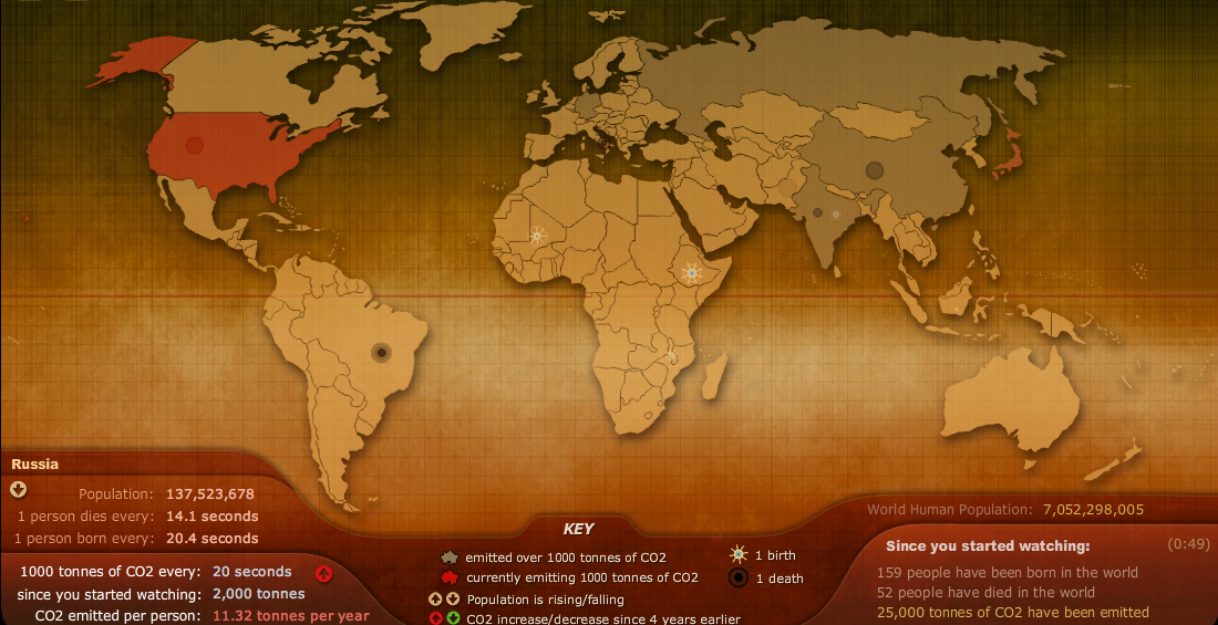
Source: Breathing Earth
One of our student's favorite websites is Breathing Earth. This simulation of global emissions, alongside birth and death rates in real time, fascinates them. The sizzling sound of CO2 emissions bursting across the map has a lingering effect. It holds their view on what otherwise would be just a running population tally. Combined, they keep the students looking at more. Like the others we mentioned above, it is one more way to view population. The students often ask us to keep it running in the background of a lesson so they can check it at the end of class to see the change.

Any one of these resources adds to the delivery of information and clearly represents how the design can stimulate visual thinking and reinforce the skills of graphicacy for learners.

Friday, November 18, 2011

Visualizing How to Feed the World

As we approach the Thanksgiving holiday and begin to collect food for the less fortunate in many of our schools, it would be a good idea to talk to kids about feeding the world’s population and the problems in doing it. The How to Feed the World film by Denis van Waerebeke helps explain this concept in a simple, clear way using infographics. It begins with the globe filled with humans and explains how the majority of the world contains 850 million people who are undernourished.


How to feed the world ? from Denis van Waerebeke on Vimeo.

Visually, it does an excellent job of using graphics to explain the relationship between supply and demand, imports and exports, and food pricing and production. As for economics, it’s simple. There are plenty of mini-lessons in this resource from how food distribution affects price to why yield doesn’t always mean lower costs. This short visual representation is packed with information, much the same as the Visualizing the World at 7 Billion produced by NPR. Perhaps the most important point is about sustainability and fixing the problem. Its straightforward message just might help kids to make a difference in trying to figure out a solution, too.
Related Posts Plugin for WordPress, Blogger...


Pin It