
Showing posts with label design literacy. Show all posts

Wednesday, March 11, 2015

SXSWEdu 2015: Education For All - How Far Have We Come?

Source: TES Global

An important and undeniable thrust of the 2015 SXSWEdu conference has been the attempt to reconcile the nation's educational inequalities. Marquee panels and sofa conversations alike have centered on this notion of access – access to college, to technology, to careers, to mentors, to professional development, to contemporary learning tools.

Last night's reception at the Lyndon Baines Johnson Presidential Library made this theme immediate in bringing together historians and educators to commemorate the 50th anniversary of the Voting Rights Act.

Source: LBJ Presidential Library, ASIDE 2015

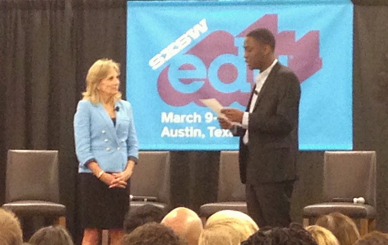
This morning, Second Lady Of The United States Dr. Jill Biden kept this dialogue moving forward in leading a summit by the Bill & Melinda Gates Foundation about redesigning higher education to fuel student success. Dr. Biden noted that education is the great equalizer, the basis for a better life. For this reason, she stressed, "Teaching is not what I do. It's who I am."

A panel discussion later with Jamie Casap, Timothy Jones, and Isis Stephanie Cerda focused more intently on the need for diversity within educational technology. Similar messages emerged in workshops on "Equal Opportunity For Deeper Learning," "My Brother's Keeper: One Year Later," and "Teaching A New Narrative For Black Male Achievement."
Source: ASIDE 2015

An equally critical thread appeared in the number of talks about empowering girls and women in technology and entrepreneurship. For example, EdTechWomen was named this year's official SXSWEdu Change Maker. Other titles included: "Women Disruptors 2.0," "Paying It Forward: Leveraging Today's Female Voice," "Empowering Girls And Women To Lead," "Digital Diversity: Minority Women In EdTech," and "EdTech For Educational Inclusion."

Another highlight of the day was Kristin Ziemke’s and Cheryl Boes’ presentation of innovative project examples to engage young learners with voice, choice, and audience. Their use of easy apps and elementary blogging revealed the many avenues that let children demonstrate understanding in exciting, authentic ways.

A later workshop featured a panel of thought leaders who promoted creativity in schools. They championed "less talking and more doing." The speakers paraded both theoretical and tangible ways to inspire kids as imaginative thinkers. As Jonathan Plucker, Professor at the University Of Connecticut, noted, “creativity is about constraints.” A teacher’s task, therefore, is to help students identify constraints and then decide which ones to get rid of, which ones to ignore, and which ones to live with.

Ultimately, after a day of education and introspection, of creativity and contemplation, we recalled John Ashbery's lines from Three Poems, which speak to the impossibility of certainty and the elusiveness of knowing:
"The term ignorant is indeed perhaps an overstatement, implying as it does that something is known somewhere, whereas in reality we are not even sure of this: we in fact cannot aver with any degree of certainty that we are ignorant. Yet this is not so bad; we have at any rate kept our open-mindedness -- that, at least, we may be sure that we have -- and are not in any danger, or so it seems, of freezing into the pious attitudes of those true spiritual bigots whose faces are turned toward eternity and who therefore can see nothing.” 

Thursday, January 29, 2015

Creating Infographics With Young Learners

Source: ASIDE, 2015
In our previous post, we wrote about the infographics that second grade students created for their social studies unit. We’ve created infographics this year with a number of our elementary grades, and through trial and error, we’ve perfected the process to help them gather their data facts for the topics they researched.

Source, ASIDE, 2015
For younger learners, a clearly defined way of collecting the information is key. To do this, we designed the simple graphic organizer in this post to help them. The purpose of separating the number from the description is twofold. It not only clearly delineates the data from the facts, but it also aids in designing the actual infographic.

In order for the number to stand apart, it needs to be in its own textbox. This allows the data to be sized differently from the text in the infographic. The data piece is important. It should be more pronounced, in order to highlight each key fact in the overall design. We found that using this method with younger students also helped guide them through the editing process in writing the descriptions without repeating the number within the text.

Empowering kids to be their own content creators helps them visually look at ways to encode the design of information. We firmly believe that building the skills of design literacy develops a keen sense of how to manipulate content for maximum impact. It develops visual literacy and visual thinking, the key components of graphicacy. The process of shifting from linear to visual information aids the learning process by providing context for content individually and by educating others about their topics.
Source: ASIDE, 2012
The earlier students learn to do this, the savvier they become at scrutinizing other information they see on a daily basis in the media. Understanding that design and media play a huge role in content creation can only help them as they go through the continual bombardment of advertising by infographics in the future.

Source: ASIDE, 2015

Sunday, January 25, 2015

Words, Pictures, Numbers, WOW! – 2nd Grade Infographics Attract Attention

Source: ASIDE, 2014
For the past four years, we’ve been using infographics with our students at different grade levels. This year, our second graders were studying New York City to make comparisons between its historical past at the turn of the last century with today. Instead of the typical presentation poster, they made infographics using the Easelly app.

Source: ASIDE, 2014
We worked with our colleagues Stefani Rosenthal (@StefRosenthal) and Jessica Raffaele (@miss_raffaele) to help the students gather the data facts they needed. With an array of examples from other students displayed in and around the library, these young learners easily picked up the basic elements and principles of design to create the examples in this post.

The synchronicity of words, pictures, and numbers found in infographics enables students to visualize what they have learned and share it with an audience of their peers and others. Moving the content from writing journals or note-taking apps, where no one else sees it, to a place for others to interact with it changes the engagement with the information. A teacher alone does not make an audience.

Source: ASIDE, 2014
Students worked out the details of learning the simple principles of contrast, and color for the best arrangement of their facts and figures. Knowing that their work would be on view during a presentation and printed for the infographics wall in the library provided that extra incentive to make it their best.

While we digitally show our students work, there is something different about having it on view around the building. Kids notice and love to see their creations exhibited live. The content reach also expands through the visual presentation on display. We constantly see others looking and discovering. As in advertising, the visual design of information solicits the viewer’s attention.

The participation by an audience provides learners with an opportunity to demonstrate their understanding collectively to groups of spectators, whether peers, parents, or teachers. For kids, that encounter makes a difference.

Source: ASIDE, 2014
This collective consumption of content broadens the learning environment far beyond a simple grade level or subject area. The power of audience changes the dynamic from static, self-contained learning to one of organic assimilation of knowledge.

For more information, please see:

Tuesday, October 14, 2014

Seeing Is Believing: Visual vs. Linear Content

Source: ASIDE, 2014
In order for our learners to see how designing information changes how it is viewed, the students this year placed their visual infographics side-by-side with their linear notes to see the transformation. It was the “ah ha” moment, when they could examine how the delivery of content mattered and how the deliberate choices in font hierarchy, color selection, and placement changed the way others perceived the ideas.

Source: ASIDE, 2014
Reflecting on their own work, the students saw firsthand how media could change and enhance a message. Paralleling the visual and linear content enabled them to observe the full effect of how design could give content power. It provided context for the information.

Source: ASIDE, 2014
For more than four years, we’ve been working with our students to think about the design of information and how presentation changes its perception. This newest crop of acronym infographics exceeded our expectations, in part because we worked closely to develop a stronger understanding of both the elements and principles of design. As with any other skill, students need guidance in this area. Design literacy requires the same instruction as media and financial literacies.

To help them better understand "the tools to make art" as compared to "how to use the tools to make art," we supplied them with the charts below to clearly separate the elements and principles of design.

Source: Split Complementary

The students were given other resources and guidelines to help train their eyes to think like designers. They looked at infographics created by professionals and deconstructed what they saw. The process of learning to look at visual information is a core skill of graphicacy. The ability to decode information helps students transfer these visual thinking concepts into creating their own work.

Of course, before the students started, they researched and gathered the information from various websites as notes. This included citations for the resources. We stressed that quality infographics source the information at the bottom. Our students know we stand by our mantra, “Content First, Pretty Second.” Without strong content and the evidence to support it, the message is questionable.

Seeing the shift from linear to visual helped the students teach others about their topic. It’s the same art of persuasion we refer to in media literacy. The best way for learners to understand how to manipulate information is to do it. Attraction and appeal matter, and perhaps it’s a lesson for us as educators as well. Designing information provides context for content; the more visual it is, the stronger the retention.

For other resources, please see:

Saturday, April 5, 2014

Content and Design: Pushing Learners Beyond Mediocrity

Source: ASIDE, 2014
In today’s world of fast-paced touch screens, snaps, clicks, and tweets, we increasingly find it difficult to get our learners to see that design and presentation matter. We are not sure if this is the result of the over-scheduled child jumping from one activity to another, or the increasingly shorter attention span to stay with something to make it their absolute best. Now more than ever before, content and design matter in tackling a problem, iterating an idea, building a prototype, or constructing a presentation.

What is clear is that many of our learners think it’s just fine the way it is. When they are assessed on their work with a clear outline of the expectations based on instruction and modeling, they often fail to meet those expectations. As educators, our delivery of content is evaluated on presentation of material, integration of technology, engaging activities, and differentiated instruction. Yet, it seems our students think that delivering text-heavy presentations spinning out of control in Prezi, shallow research to demonstrate understanding, or shoddy work put together in haste is okay.

Design does matter, and it is not good enough to think what is created cannot be improved upon through iteration. The key to good design, however, is content. We are beginning to feel a little dictatorial about it, too. We often see students busily changing fonts, picking colors, and adding pictures before crafting the content into an organized, well thought out way. On the opposite side, we see students putting work together without using any of the evidence they’ve gathered in their research.
Source: ASIDE, 2014

We provide the time for deeper learning, choice in delivery method, and integration of technology. Sadly, we still see mediocrity. How many times have we heard “I’m done” two minutes into an activity, only to realize that they left out key requirements because of a failure to read instructions? While we don’t mind doing something over to make it better, there’s a certain responsibility in not getting a “do over, and over” as a result of sheer carelessness.

We’re sure that many have heard the expression “failure is not an option;” well, what about “mediocrity is not an option?” The problem is not a matter of flipping, blending, empowering, engaging, or any other buzzword; it’s a constant push for sustainable, deep thinking on the part of our learners. They need to know that it is not fine to be run-of-the-mill. The “everyone is a winner” mentality drives mediocrity, and learning that is a “mile wide and inch deep” leads to pedestrian thinking.


Source: ASIDE, 2014
We spoon feed our learners so much with testing, multiple choice options, and detailed review sheets that they cannot organize their own thoughts to learn. Parents besiege us when the “grade” is a B-, requesting extra help for nothing more than a failure to read instructions or follow requirements. It’s an attention to detail and organizational issue; it’s also a sign of a lackadaisical approach on the part of the learner to put in the effort. Barely satisfactory (BS) is not an “A.”

We’re not giving up; we want the kids to sink their teeth into things. So we will keep pushing them beyond mediocrity, because the “ah hah” moment becomes a life-long curiosity for wanting to know more.

Tuesday, January 28, 2014

If The World Were ... An Infographic

Source: ASIDE, 2014
With the plethora of infographics in the media, it's important for our learners to understand how to design information. We continue to incorporate the creation of infographics as part of our curricula to help them do just that.

Our students have made several visuals since the beginning of the school year to explain acronyms and to promote fundraisers. With each new attempt, they’ve continued to hone their design skills.

The most recent infographics featured in this post were based on the books If The World Were A Village and If America Were A Village by David Smith. Each student was given a specific aspect addressed in the books to create his or her design. Since the topics covered in the books included the data, this ready access to facts and figures enabled the students to focus on the design of the information to visually represent their content.

Source: ASIDE, 2014
We also set certain parameters. Their font selection was limited, and they could only use design elements such as shapes and colors to emphasize the information. Our objective was to help them realize that design shouldn’t overshadow the message being portrayed.

They went through several iterations before arriving at the final product, and it paid off. Even the kids remarked that these were the best infographics they’d design thus far. We could only smile and appreciate how proud they felt.


Design literacy, like other literacies, needs to be learned. We can’t assume that because our students have access to the bells and whistles of technology that they know how to do it. We’ve written many posts on DLIT, talking about the combination of design, literacy, information, and technology to create content. Today, more than ever, it’s a prowess we need to continually cultivate.
Related Posts Plugin for WordPress, Blogger...


Pin It