Showing posts with label typography. Show all posts

Wednesday, July 10, 2013

Why Students Should Care About Typography

Please check out our earlier post in Part 1: "Why Teachers Should Care About Typography."

Source: Behance
Students hate Times New Roman. They hate it more than they hate Courier. At least to them Courier seems like a quaint typewriter. Times New Roman, however, has a stupid name. The three words hardly go together. The font is boring enough to be boring and ornate enough to be annoying. Also, at 12-point, which all teachers seem to demand, it doesn't fill up a page nearly as much as Trebuchet or Verdana. Amid a lengthy drop-down menu of fonts, virtually no student can offer a compelling explanation about why Microsoft (old!) and teachers (old!) are fixated on Times New Roman.

Students love Comic Sans. Elementary learners love seeing it on their homework pages. Some skeptics might say they like it because they don't know any better, but in fact they know enough. Kids respond to Comic Sans' "non-font" status. It looks like child chalk, not parent script. It is not fussy, it is not adult-ish, it is not foreign to a marble notebook, and it is not counter-intuitive to a child's handwriting.

Source: Comic Sans Criminal
Students like Comic Sans because Comic Sans likes them. And with a little bit of exposure, they would happily pick from a cornucopia of other more interesting fonts, should they be given the chance to control their destinies.

Most tech-types disdain Comic Sans for its overuse and undersophistication. There is a popular Ban Comic Sans website, a Kill Comic Sans video game, a Comic Sans Project Tumblr, a Comic Sans criminal pledge, and a satirical Comic Sans song.

Michael Stevens of Vsauce, however, has produced the brilliant "A Defense Of Comic Sans" video that explores the reasons for Comic Sans' pop-culture proliferation. As he notes, "when words and letters are printed, they have to wear the clothing of a typeface, a font family. We don't always think of it this way, but you cannot type without using a typeface."


In essence, the video offers a quirky (and surprisingly scholarly) history of how typefaces ("Textura") emerged from the Guttenberg press, and how French pieces that had to be melted ("fondue") ended up establishing the nomenclature of letter forms ("fonts"). Other fascinating revelations include the reasons for the lower- and uppercase names and the actual origins of Comic Sans in the cartoon imagination of Melinda Gates.

Source: BBC
Amid all of the debate, Corey Holms points out that "Comic Sans is proof that design works. The public understands that type means more than words." That's why children like it, because it appeals to their imaginative sense. And David Kadavy argues that, "Just as interchangeable type led to a spread of literacy, Comic Sans and the personal publishing it comes along with should lead us toward a spread of design literacy." This thesis reinforces the reasons why we as educators should explain to our students each visual choice that we make. We should mention why we have formatted our Keynote slides in a certain way, or why we have selected a particular typeface for a particular use. In drawing back the curtain on our own aesthetic rationales, we model for our classes the possible thought processes that they, as designers, might make in their own projects.

Source: Splashnology
Kids live in a web world. They scroll Instagram comments and Twitter updates. They subconsciously digest the letter forms used on these popular sites. They don't understand, therefore, why their term papers should be typed in priggish serifs. They want their Wuthering Heights words to scaffold the screen in contemporary letters. They want the multi-tasking efficiency of their daily regimen to be somewhat echoed in the academic crispness of the letters they clack onto the page.

If you show us a blog that's written in Times New Roman, we'll show you a blog that kids aren't reading. Try an experiment in class: tell your students to open up Microsoft Word or Pages, and tell them to pick a font for their writing. We'll bet our morning coffee they don't pick TNR.

As digital natives, kids today are bombarded with ads in YouTube clips and web banners. They aren't yet trained to dissect and repel these media influences, but they see them, and they know them, and they make choices about them. That's why students should care about typography. Because in the same way that glitzy logos attract their respect, other fonts could give credence to their creative in-class projects and could boost their grades in open-ended PBL endeavors.

Source: Smashing Magazine

If you tell students that a font will raise their grade, they'll listen. If you tell students to choose a design scheme that will complement their message, they'll skip the default blueprint and instead choose an inventive layout.

Students think Gothic or Roman fonts are old-fashioned, until they realize that Juicy Couture for years has intentionally been playing off the heritage reputation of an over-styled letterface in its tween marketing campaign. A realization of the power of type could mean wondrous outcomes in student projects, such as Prezi presentations or iMovie embeds or Tumblr pages.

Source: Smashing Magazine

The following resources offer terrific examples for student learning and in-class use. The first link is particular instructive in laying out the essential definitions and distinctions of font choices:
Source: 1st Web Designer

Monday, July 1, 2013

Why Teachers Should Care About Typography

Please check back for Part 2: "Why Students Should Care About Typography."

Source: PRINT
The purpose of typography is to communicate. That is its essential function. Any classical definition will tell you that font families and typefaces exist only to craft the most effective message for the most appropriate audience. Any design, therefore, that works to undermine that goal is a suboptimal type.

That is why teachers should care about typography. They are both in the communication business. In fact, if you take the classical definition above and replace a few words, it sounds like a fairly appropriate description of the role of an educator: to deliver information and to design insight.

For a detailed overview of the role that typography can play in the classroom, we recommend these two earlier posts:
Source: Macworl
Teachers have actually been teaching about typefaces for years. They regularly scaffold formal outlines with Roman numerals and lowercase letters to show students what is more and less important. The traditional third-grade instruction in cursive lettering is another argument for the time-honored importance of word-craft. Elementary schools recognize the higher-level thinking and the patient practice required in transitioning from block letters to fluid script. In fact, the current consternation over whether to abandon cursive writing for the laptop generation centers on whether to give up on a refined art that was once held sacrosanct.

If you haven't yet seen the video above, by Ben Barrett-Forrest of Forrest Media, that's been making the rounds of blogs and Twitter, it's a must-watch. Tracing the history of typography in stop-action, hand-and-paper style, the clip marches engagingly through all of the innovative advances in printing and lettering.

A shorter, lower-tech clip from Art Factory that focuses on animated or kinetic typography is another good gotcha film for grabbing student attentions and introducing the potential of well-chosen styles.


Typography Sample from Art Factory on Vimeo.

By taking typography into account, teachers can't help but help students. Whether filling in PowerPoint slides or typing up worksheets or writing unit tests, teachers can make purposeful decisions regarding letter families. A crisply arranged page makes information delivery neat and tidy. A gaudy or funky font on the screen elicits smiles and coaxes curiosity. Carefully laid-out assessments can mean all the difference in students' ability to demonstrate learning. In fact, many children with IEPs or distinct learning styles have genuine trouble making sense of dense fields of words. Considerations of spacing, leading, and kerning can help these learners do their best (and also fulfill what may be legally mandated by district classifications).

The following articles offer valuable resources for learning and teaching about typography. The first post is especially relevant, with a thorough, visual explanation of how to format pleasing text and how to avoid frying the eyes of viewers.
Source: Design Taxi, Yulia Brodskaya
Finally, the example above from designer Yulia Brodskaya is a nice graphic to use in a classroom discussion of fonts. It's right on the tipping point between flash and substance. Teachers can throw it up on the screen and ask students about the pluses and minuses of the colors, shadows, and swirls as an overall communication elements. Typefaces, in this case, exemplify our favorite mantra in student projects, which is "content first, pretty second." Our kids enjoy chanting it when we go through various PBL steps in class, and they'll probably enjoy repeating it for typography, too.

Saturday, May 4, 2013

The Design Of Project-Based Learning - Color Theory For Web 3.0

Source: Colourlov.in
One of the promising truths about project-based learning (PBL) is that it's coming whether schools like it or not. Even in an age of race-to-the-top testing, children are slowly but surely doing more and more work via technology.

Even as some instructors fall back on "project-oriented" learning, rather than true PBL, the gradual spread of tablets and BYOD tasks will invariably shift classroom education toward a more hands-on model. The hope, therefore, is that personalized iPads and home tech assignments will encourage creative interactions and self-directed investigations.


Color Theory Infographic from Sean Ferguson on Vimeo.

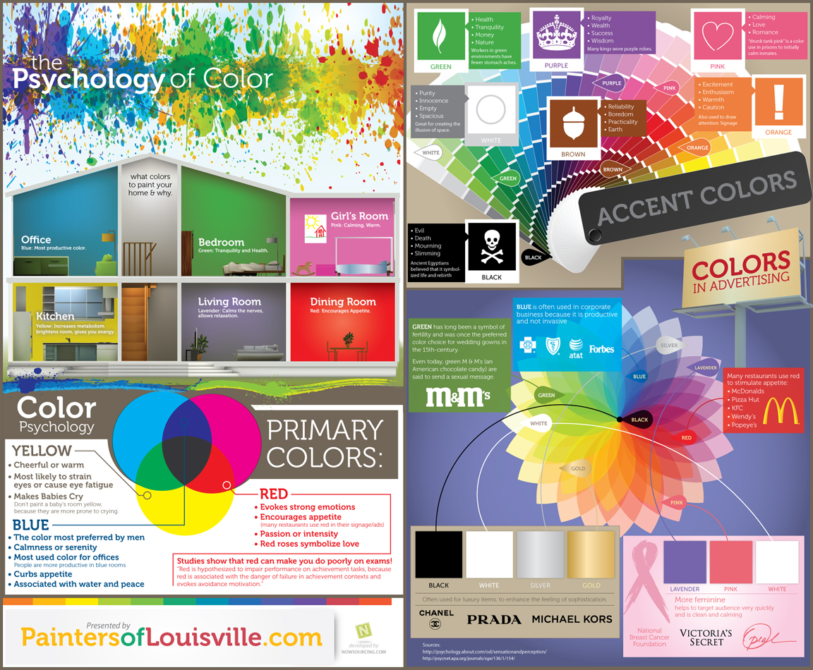
One of the most basic choices in producing a technology project is the selection of color. Students in their iMovies, Keynotes, and Tumblrs can now pick from a palate of pixelated paints. All too often they get over-excited and click on a madcap miasma of mismatched hues. Knowing a little bit about color theory can go a long way toward designing an appealing and effective project in the open-source web 3.0 world.

Source: Visual.ly
Many of the modern concepts around the use of color, particularly in technology or multimedia formats, spring not from classes in oil painting but from theories of branding. Crafting an alluring logo or a unique web banner both draw from evolving notions of Internet marketing. These graphic schemes can relate effectively back to the classroom, as students pair fonts and tints in their Prezis or as they select background themes for their project blogs.

The motion infographic above by Sean Ferguson gives a crisp and helpful primer in fundamental color theory. It lays out the guidelines of partnered tones, in addition to other considerations of visual design.

Source: Feel Guide
For other resources about color theory, we recommend:
Choosing among styles of lettering, by the way, can often have the same positive impact on projects. Check out "A New Typography Of Language" for ideas on teaching students about fonts.

Thursday, March 7, 2013

Visual Letters: Language In Motion


ALPHABETIC from BlinkmyBrain" on Vimeo.

We came across a visually arresting video called "Alphabetic" that offers a dynamic way to approach lettering with students. Created by Ariel Costa of BlinkmyBrain, the clip presents a quirky, three-dimensional animation of the alphabet. On the surface, it's a fun film with clever transitions and an inventive personification of each character. On another level, however, it offers terrific possibilities for a range of learners.

For Early Childhood classrooms, the clip is a engaging way to introduce letters. Each unique visual cue serves as a reminder of each shape and structure. The peppy electronic music also underscores the figures with zippy sound effects. For older students, it presents a fine complement to phonics, and it would be a whimsical addition to ESL courses.

For graphic design students, the sophisticated video offers a great tutorial in typography. It also reveals the potential of rapidly evolving computer applications. In fact, the clip reminded us of a similar film, "I Love Motion" from Kasra Design. This other animated infographic demonstrates the effectiveness of feisty visual language.


I Love Motion from Kasra Design on Vimeo.

Sunday, May 13, 2012

Fun With Fonts or Teaching Typefaces As Tools

Source: Johnson Banks
To many, typefaces may not seem foxy. Teaching about lettering probably assumes a low priority in most classrooms. But font choices can be some of the most critical and overlooked drivers of success in presentations. Our students typically suffer from two polar malaises: they either go font-crazy in choosing the wildest, neon-est, most calligraphic choices possible, or they completely ignore fonts in defaulting to bland, obscure, dark-on-dark presets. Either way, their creations end up difficult to read.

Source: 9GAG
In pamphlets, iMovies, essays, and posters, typefaces can matter a great deal. Fonts can become part of the messaging and design. They become tools for media literacy, in conveying a mood or a brand. The bursting popularity of typography blogs and Pinterest boards makes sense given the visual nature of today's communication. Logos and slogans spread easily these days amid an ad-soaked culture and a cheap dissemination of graphics.

We like to think that our students' yen for elaborate scripts is a testament to their appreciation for design and messaging. Really, they probably just like having a choice in exploring imaginative styles. We've posted before about the link between typography and language, and luckily, teaching about typefaces can be painless. There are plenty of easy tools and games to get kids juiced about picking the right font for the right moment.

Resources:


Source: A Type Primer
In teaching students about fonts, our favorite place to start is "A Type Primer," by John Kane. An extension of his book by the same name, Kane's clean, efficient site offers exercises and explanations to guide anyone in tracing the importance of lettering and line. Scholarly and comprehensive, Kane's resources are intended for anyone to explore at their own pace. Hands-on and practical, his systematic guide offers students a master course in typefaces.

Another useful resource is the "So You Need A Typeface" graphic from Abdul Jaleel Kavungal Kunnumpurath (or abjaleelkk). This flowchart begins with the intended use of a font (logo, book, infographic, invitation, etc.). It then charts various preferences to reach an optimal selection. Part handy resource and part tongue-in-cheek visualization, this illustration would be prime for a 1:1 class bulletin board or tech lab.

Source: abjaleelkk

Games and Tools:


Source: Kern Type
When lessons are over, games can offer fun extensions of learning. Kern Type is a game to teach kids about visual arrangement. "Kerning" refers to the spacing of adjacent letters within a text. Kern Type, also offered as a multi-touch app on the iPad, invites users to nudge and tweak letters to achieve an appealing word spacing.

A whimsical partner is the Google Kerning Trick. If you do a search for "kerning," the programming rascals at Mountain View will change the spaces between the letters of the word "kerning" in all of the results. Check out 17 of the Coolest Hidden Google Tricks for other fun, unrelated Google quirks.

Source: Type Connection
Type Connection, another clever web tool, is billed as a "Typographic Dating Game." Here, students choose a main character to partner with another letter. They then "send them on a date" to see if they can effectively combine fonts into appealing graphic matches. The game offers descriptions of letter shapes and origins. It also asks users whether they want to "rely on family," "seek the similar," "embrace the other," or "explore the past." The site for Type Connection, by Aura Seltzer, features a beautiful layout in its own right.

Source: Identifont
A more subtle resource is the Golden Rule Typography Calculator. Users can discover the perfect typography for their websites by entering the font size, content width, and line height. Identifont also helps designers discover typefaces by revealing the name of an unknown font. Upon encountering an interesting but unfamiliar font, users can search by name, similarity, picture, designer, or question to uncover the hidden identity.

Source: Design Shack
Another funny and surprisingly detailed site for learning font differentiation is "That's Arial Hot Shot: 5 Tricks for Spotting Helvetica in the Wild." Joshua Johnson, editor of Design Shack, offers clear visual tips to distinguish between the two oft-used, oft-mistaken, and deliberately similar typefaces.


Resources and Video:


A remarkable video, dubbed "Arkitypo: the final alphabet," from the Johnson Banks design studio, chronicles 100 years of typefaces. In twirling, evolving animation, the letters slowly evolve to reflect the machine age and the technological march.

Source: Glyphosaurus
A more practical visualization comes from the Boston design firm Upstatement, creator of the new typography app, Glyphosaurus. Combining "glyphs + thesaurus," this steadily expanding resource aims to create a "web database of letters." Like Spelling With Flickr for the design set, this curated collection allows users to select from various real-world designs of the same letter, all maintained by contributors and Upstatement. A beautiful teaser video created by the firm shows an elegant range of letter examples, in vivid colors and designs, artfully set to the tune of "Love Letters" by Nat King Cole. It is worth watching in a quiet moment.


Source: Visual.ly
For more tools and examples of typographic ingenuity, here are some of our favorites:


Wednesday, April 11, 2012

A New Typography Of Language

Source: PBS Arts
Over the past few weeks, we've watched our eighth-graders give in-class research presentations. We kept making notes about the readability of their Prezis, which frequently and frustratingly paired neon colors with squinched text or dark lettering with dark backgrounds. We realized we should be doing more to teach our students about making crisp visual choices. The role of typography in education can take many worthwhile forms. For students, the crucial message is that a font must complement the information on display. The visualization must accompany the meaning.

Source: Colour Lovers
Graphic illustrators and digital artists obviously take seriously the role of visual language. Students of any age, though, are intrigued by the value of clever fonts. They hate Times New Roman and rush to change the typeface when they open MS Word. They love playing with WordArt, and they were giddy when Prezi recently expanded its font options. Typography, like any linguistic tool, can be coached to enhance rather than detract from student endeavors. We can steer them away from the dreaded Comic Sans and toward more supportive lettering choices.

Designer Steve Schoeffel argues the same point in his post, "Typography Must Honor Content," from the design blog Inspire. Schoeffel quotes Robert Bringhurst's book, The Elements of Typographic Style, noting that, "The typographer's one essential task is to interpret and communicate the text." (20)

Source: Codrops
Media specialist Carrie Cousins extends a similarly key message in her post, "Establish a Mood With Typography.' "The typefaces you select for a project," she says, "can impact what people think as much as the actual message you convey." Her engaging article would make a rich teaching guide to share with students. Typeface choices should be organized like good curriculum design, starting from the desired end and working backward to select the appropriate visual lettering.

Typography, in essence, is the pictorial incarnation of language, the visible medium by which today's kids absorb significance. We've already seen how a precisely chosen font can embody an entire political message of hope and change. Creative typography is the epitome of information design. The short, animated infographic below presents an arresting lesson about typography. Directors Boca and Ryan Uhrich from the Vancouver Film School make it clear that "typography is what language looks like."


Source: webdesign tuts+
Other terrific educational resources include "A Beginner's Guide To Pairing Fonts" by Ian Yates and "Best Practices Of Combining Typefaces" by Douglas Bonneville. Yates offers the equivalent of a graduate-level master's course in visual thinking, as he lays out a systematic, approachable list of typeface do's and don'ts. Erudite without being condescending, Yates answers common questions, such as how many fonts to include and how to balance concord with contrast. Bonneville, writing in Smashing Magazine, gives similar recommendations about keeping things simple, differentiating font weights, and assigning distinct roles to each line. Bonneville also includes a classic .pdf grid to hand out to students about which font choices are acceptable in mixing typefaces.


Source: Smashing Magazine
If students get excited about exploring fonts, PBS Arts features a seven-minute "Typography" mini-documentary from its Off Book series (recently highlighted by An Xiao Mina at Core77). The film includes great analysis from famous designers, such as Jonathan Hoefler and Tobias Frere-Jones. The clip also dissects the role of fonts in infographics and includes a one-minute tutorial at the end, called "How To Talk About Type Like You Know What You're Talking About." For example, we finally learned the actual difference between a "font" and a "typeface."


Source: Wookmark

Other valuable links to use when teaching typography include:
Related Posts Plugin for WordPress, Blogger...


Pin It