Sometimes it’s hard to convince kids that not everything is what it seems. They are so taken by advertising and too often believe everything they see is real. Kids need to know that designing information is the foundation of all media. To help them learn to question media, we have taken to using the acronyms LAMSTAIH (Look At More Stuff; Think About It Harder, from Look At More by Andy Stefanovich) and FEAR (False Evidence Appearing Real, origin unknown).
Both acronyms point the students in the right direction. In order to tell if something is true, they need to look at more things and think about them. Simply put: analyze the evidence to determine reliability.
We use several resources to drive home the point of FEAR to reinforce our students' media literacy skills. The first is the Don't Buy It website produced by PBS. This website is full of resources, from being an ad detective to buying smart, but one of our favorite parts to visit with students is the Food Advertising Tricks page. They find it amazing that food is manipulated with everything from glue to a blowtorch to make it look delicious. It's hard for them to believe at first. They are surprised to learn that photographers use dyed shortening instead of real ice cream, because it would melt too quickly under the lights. They're fascinated that to photograph a juicy hamburger, food stylists can use up to 100 hamburger buns, 2 cases of lettuce and a dozen tomatoes before they get the perfect picture for the ad.
Most kids have never heard of a "food stylist" or a food "makeup artist." It thoroughly amuses them that people do this for a living. Advertising is big money, and it costs a lot to produce beautiful ads to sell goods and services. Companies depend on getting a return on their investments. For a great closer to a lesson on creating well-dressed food, show them the following video segment, Food Ad Tricks: Helping Kids Understand Food Ads on TV. This is part of the series Buy Me That, which can be taught using a valuable lesson plan by Frank Baker, who maintains the Media Literacy Clearinghouse website.
By constantly talking to kids about FEAR, we can continue to help them grow as media savvy individuals who question what they see because they know how to LAMSTAIH.
Literacy and phonics are the bread and butter of early classrooms. The thread of language subsequently loops through all age levels. If you haven't yet seen this hypnotic clip about visual vowels, it's worth a look. Shared by Studiocanoe, the film is based "on an archival sound recording taken from the 1945 Linguaphone series." The soothing, illustrated sequence emphasizes linguistics through snapshots and crisp voicing. Teachers can use the video to reinforce word choice, self-expression, spelling, and vocabulary. The clip is somewhat hypnotic, with accented speech and intriguing word selections to highlight each vowel sound. Ambient piano chords underscore the unexpected image pairings. This type of simple movie would also be an easy project for students to recreate. They could choose their own pictures to link with their words of the week.
An interesting tie-in to the role of vowels in everyday discourse is Matt Ward's write-up about "The Vowels of Design." He uses the five phonic building blocks to point to key criteria for visual design: Aesthetics, Experience, Information, Organization, and Understanding. These principles are ideal for students when creating multimedia projects. As a freelance digital artist writing at the "echo enduring blog," Ward explains that, "there is a strong connection between language and design through the art of typography." He makes an interesting and compelling case for clarity in information design.
The integration of technology into learning at this juncture in time should be a moot point. Yet schools continually block access to websites on the Internet and struggle to decide on a policy that would allow students to bring their own devices (BYOD) into the classroom. "A New Literacy: Making Connections in Electronic Environments," by Frank Romanelli, addresses the idea of embracing the literacy of a digital native by using sketches drawn as the narration progresses.
Beginning with quill and paper, Romanelli makes the point that resistance to change has always threatened earlier ideas of how things should be done. The trouble is the change our students are experiencing is happening at lightning speed. As teachers, we need to embrace the idea that writing as we know it on paper is changing, too. In fact, kids today do more writing electronically than we might think. In addition, new genres are emerging, from text novels to tweet poetry contests. If you think about it, how many people do you know who are playing Words With Friends? It seems to be all the craze, yet it is basically online Scrabble.
The bottom line is that technology is now and is not going away. Kids, however, still need to learn how to express their ideas; that's the teacher's job. How they do it should be irrelevant. It is also our job to train them to communicate in their world. Teachers need to learn how to use new media, and schools need to support its full integration, even if it means BYOD. Like the animated video, Ode to #Pencilchat: Technology Integration in the Classroom, from the Think and Dream in English blog, technology is the game changer and we need to change with it. Perhaps both of these animations should be used not only at professional development workshops for teachers on integrating new technology in the classroom, but also for school administrators.
In our current education system, most entrepreneurship classes and programs are at the college level. Yet many of the entrepreneurs behind some of our most famous brands, including Mrs. Field’s, Domino’s Pizza and Mary Engelbreit Enterprises, started as teenagers with an idea. We think young kids can learn to think big. When given the opportunity to develop their ideas, they do more than surprise us. Our Kid Entrepreneur program for 5th graders is designed to do just that.
One of the first activities, after watching several videos, is to brainstorm the traits of an entrepreneur. We changed the “think outside the box” to a “circle.” The continuous unending line of the circle implies movement, whereas the box suggests containment.
Source: ASIDE, 5th Grader
The circle, too, allows for placement of ideas anywhere and subliminally changes the arrangement of things away from brainstorming a list along the side of a box. We encourage them to sketch and write anything that comes to mind about the traits of an entrepreneur. From the results you see in this post, many enjoy the freedom of this activity.
So how do we start? We kick off the brainstorming activity with the inspirational video "Entrepreneurs Can Change the World" from the Grasshopper group. It is a creative introduction to the topic, with an emphasis that the next entrepreneur could be you. The infographic storytelling design of this video makes it very appealing to kids.
The students get a kick out of it, too, because it starts off with, “Do you remember when you were a kid and you thought you could do anything?” We always hear, "but we are kids," when they've finished watching. That’s the point: we want them to know they can turn ideas into reality and that we believe they can do it.
They also view "What Is an Entrepreneur?" from Entrepreneurweek. This gives the students an opportunity to hear from a group of panelists as they candidly explain the way entrepreneurs think. Again the design of the video is engaging for kids. The text, which is primarily in black and white, bouncing in and out as each person speaks about what it takes to be entrepreneur, sends a clear message to young learners.
Even the 30-second commercial “Will It Be You?” from the Kauffman Foundation drives home the point that "you" can be the next entrepreneur. Many of our students saw this commercial air during the Super Bowl this past February. We make all of these videos available on our Kid Entrepreneur wiki page, and most students go back and watch them over again.
Source: ASIDE, 5th Grader
Many kids today did not sell lemonade on the corner to strangers walking and driving by, and a large majority of their lives outside of school are orchestrated around scheduled sport practices, music lessons, and play dates. We know there are dreamers out there, but they have less and less time to think and wonder about ideas. That’s why we feel it’s important to bring entrepreneurship into the classroom. This project-based learning unit is interdisciplinary by its nature and bridges learning across grade levels by making connections to real-life. Kids can do amazing things; we just need to let them.
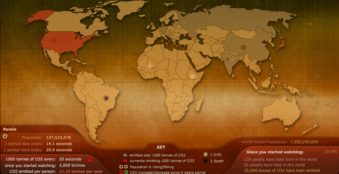
As is often the case, we go back through resources we've collected before with a different lens, not realizing the power of data visualizations such as The Miniature Earth Project, Who is the World's Most Typical Person?, and Breathing Earth. Each of these is not new, yet they are eye-catching presentations of images, data, and design. The clarity and the simplicity in the use of information mixed with sound, be it music or sizzling emissions, coalesce into an effective message. Their delivery engages the viewer to think and ask questions, and our students are fascinated by each one.
The Miniature Earth Project video breaks down what the earth's population would look like if it were reduced in size to a community of 100 people. The clarity of the data presentation, along with the images and music, mesmerize the students in such a way that they want to watch it several times. They are amazed by the distribution of numbers from religion to income. The Miniature Earth Project uses infographic storytelling to create a fluid delivery of information.
A nice complement to this visualization is the children's book If the World Were a Village by David J. Smith. The book, like the video, aims to help kids picture the planet based on 100 people. Both stimulate discussions and stimulate kids' thinking about the world as a small village using a more manageable number. Smith's other book If America Were a Village applies the same distribution to an American village of 100 people.
National Geographic's "Who Is the World's Most Typical Person?" uses the infographic storytelling technique as well. It is full of statistics that bounce along to playful music to paint the world's most typical person. According to National Geographic, that person is a 28-year-old, right-handed, cell-phone-owning Han Chinese man. Before showing the clip to students, we ask them to make predictions.
Pairing this video with The Miniature Earth Project allows for media literacy tie-ins, because the music has an effect on the way the message is perceived. The somber music of the The Miniature Earth Project is different from the melodious tune of the other. This streaming infographic is not unlike others we've mentioned, such as the NPR video Visualizing How a Population Grows to 7 Billion by Adam Cole, or How to Feed the World by Denis van Waerebeke. In all of these multimedia presentations, the visual simplification is highly effective for learners. Kids can wrap their heads around numbers they can relate to, and the design reinforces what might otherwise be abstract concepts.
One of our student's favorite websites is Breathing Earth. This simulation of global emissions, alongside birth and death rates in real time, fascinates them. The sizzling sound of CO2 emissions bursting across the map has a lingering effect. It holds their view on what otherwise would be just a running population tally. Combined, they keep the students looking at more. Like the others we mentioned above, it is one more way to view population. The students often ask us to keep it running in the background of a lesson so they can check it at the end of class to see the change.
Any one of these resources adds to the delivery of information and clearly represents how the design can stimulate visual thinking and reinforce the skills of graphicacy for learners.
What would schools be without the celebratory nature of special events? It’s not just the grass turning green with the approach of spring next week, but it's also that time of year when everyone seems to be a wee bit Irish. We thought it only fitting to pull together some infographics in the spirit of the green for St. Patrick’s Day. As with our earlier posts on holiday infographics, they fit nicely with the string of events in a given school year. These visualizations provide a quick deviation from the normal routine to add a twinkle in the eye of our “little people.”
For openers, show them the 7 Lucky Facts About St. Patrick’s Day infographic from DegreeSearch. Kids will love the variety of tidbits about the luck of the Irish, the number seven, and the special significance of shamrocks. Who knew that there were 10,000 3-leaf clovers for every one 4-leaf clover? Now there’s a math lesson. For a little more challenging math and perhaps a little science, ask the students why it only takes 100 lbs of dye to turn the Chicago River green for a week, but it takes 40 lbs a day. The notion of luck also makes for a good expository writing topic. Who knows? Maybe the kids will have their own lucky charm stories to share after analyzing the content in this image.
Another infographic on The History of St. Patrick’s Day from CashForGoldUSA.com provides its share of possible lesson topics, too. This colorful visualization of the history of the day lets viewers easily scan the information using a timeline that ends with a few quick key facts. Besides the history lesson of the holiday, it also illustrates the price of gold over time, beginning in 1792. Have students compare the price of gold with historical events of the same time period, or open a discussion about current events surrounding inflation and the gold standard.
With less luck and a little bit of ingenuity, these infographics make for interesting interdisciplinary lessons, Irish or not.
Journalism, as a form of news reporting and information intake, is barely recognizable compared to 20 years ago. Through microblogging, smartphones, tweeting, and cable TV, journalism has metamorphosed about as radically as any other form of communication. Media outlets have become personal, immediate, and varied. Public interest consequently has grown, in pursuing the 2012 election or in watching the viral Kony 2012 video. Most contemporary news sources now fall into the emerging category of "visual journalism."
Visual journalism is more than photography, more than examining fonts for a masthead. A stuffy definition of "news design" refers to page layouts and captions. In reality, it encompasses graphic displays, interactive media, and data representations to present information in illuminating ways. There is even a Society for News Design, with the mission "to enhance communication around the world through excellence in visual journalism."
The popularity of visual news sources, such as Newsmap and Doodlebuzz, and the success of graphic readers, such as Flipboard and Pinterest, all point to the importance of visual journalism in our media literacy curriculum. Even the scrolling nature of Twitter feeds and the never-ended redesign of Facebook's layout reinforce the power of visual appeal. Our students use all of these news sources, and it's important to help them make sense of their sensory inputs. Image-based news sources also appeal to kids' visual learning styles and their quick-hitting, multi-tasking habits.
O'Reilly Radar recently presented an interesting series on the "Profile of the Data Journalist." The feature about "The Visualizer" describes the multi-layered job of a data-driven reporter. The Society for News Design also offers a loaded page of "Tools for News" to help aspiring visual journalists. Another resource for students and professionals is the "Visual Editors" ning, describing itself as "the classroom for visual journalism." Some universities, too, are also beginning to offer courses in news design to students of new media.







)