Monday, March 28, 2016

Good Interactive Design Taps Into Student Engagement

Source: Inequality Is
It goes without saying that in the world of our students today static doesn’t cut it. We get it, and we’ve abandoned many old PowerPoints, moved away from textbooks, and discarded our opus of worksheets. That’s why we are constantly on the prowl to find resources to help make learning participatory. When content is combined with good design, it provides a context for stronger understanding; when the design of information is interactive, it prompts students to engage with the material in a physical way.

Each of the interactive infographics below offer students active ways to connect with content. Each one is designed slightly differently, but they all hook users into wanting to know more.

Inequality Is

In this interactive infographic about income inequality, the audience is made to feel that the issue is “personal,” and it’s hard not to stay engaged when the user is told how much they will earn based on gender, age, education, and ethnicity. It also allows for custom comparisons that instantly adjust on the screen.  Check out the video under the “created” link, adjust income distribution under "real," or head over to “fixable” for some possible solutions to the issue. Inequality Is is an eye-opening way for students see the correlation between education and personal income.

Source: Inequality Is

Evolution Of Insight

This interactive infographic tells the story of market research using a timeline to navigate from 1890 to today. As participants travel through the decades, they learn how the growth of consumer research began from the early development of public opinion polls and focus groups to the age of big data today. It provides just enough useful bits of information for students to grasp the history of media and marketing. Evolution of Insight is a good resource for media literacy lessons, or in discussions on the ethical uses of gathering data.

Source: Evolution Of Insight

115 Years Of American Homes

This interactive is designed as if the user is taking a road trip looking at homes across the decades. In this case, the design is conducive to the timeline of travel, and with each new era the car transforms to adjust to the style of the decade. There are also interesting tidbits of information regarding fashion, home furnishing, and more as the user travels through time. Use this website in social studies classes to make historical comparisons between then and now, or perhaps even to predict what’s next.

Source: 115 Years Of American Homes

Designing content to be interactive elevates the participatory part of what modern learners want. The more active they are in the pursuit, the more likely the content will stick.

For other resources please visit The Benefits Of Good Design.

Monday, February 29, 2016

Financial Literacy For This Generation - Visualizing The Future Of Wealth In America

Source: Chris Curtis

Financial literacy takes many forms. News headlines and candidate campaigns highlight the disparities of wealth between the "one percent" and the everyday Americans. In schools, traditional financial literacy classes teach older students about balancing their checkbooks and paying off their credit cards. These are noble messages, yet fundamental shifts are changing how young people spend and consume, from Bitcoin to online bill-pay.

Furthermore, financial literacy encompasses a much broader net of core fiscal issues, including stock investing, inflationary tendencies, surplus and deficit budgeting, bond and mutual fund accounts, and renting versus home ownership. Our youngest students need to be a part of this conversation, rather than waiting until high school or college, when it may be too late.

Source: Chris Curtis

Luckily, a host of digital resources exist to welcome all learners into the money discussion. A terrific explainer video from Chris Curtis, entitled "Wealth In America," tracks how life-long earnings vary for each generation. Moving from the proven past to the predicted future, this animated infographic addresses how collective wealth matters in determining future savings. The gauzy collage of photographs and stamps unites with compelling narration to inform today's students about their relative futures. This motion graphic of statistics and charts neatly blends STEM skills with the social sciences to prove that financial literacy is more than a single silo of curriculum.

Source: Chris Curtis

The video's creator, Chris Curtis, created this clip as part of his work with Deloitte University Press. As a director at Not To Scale in London, he has designed numerous short films that synthesize illustration with live action. He blogs at I'm Your Boss and shares visual and financial literacy ideas on Twitter via @imyourboss.

Source: Chris Curtis

As a whole, this video projects the dollar value of future household assets. It nods to the outsized influence of the Baby Boomers, and it highlights the fallout from the "Great Recession" of 2007. In particular, it teaches young people about earnings versus debt. The Millennials are sharers, non-idealogues, and social entrepreneurs. The salaries of these price-conscious, tech-nimble workers may rise steadily, yet their per capita wealth will lag prior generations. They will, however, force changes in the traditional marketplace that will realign how workers accumulate wealth.

Wealth in America from Chris Curtis on Vimeo.

For more ideas about teaching financial literacy, check out:

Friday, February 5, 2016

The Power Of Visual Rhetoric - Using Kinetic Typography To Learn About Black History & Civil Rights

Source: Versa

Kinetic typography and motion graphics are bringing to life the soaring oratory of the Civil Rights Era like never before. During the 1950s and 60s, many landmark speeches stood out in their power to persuade the conscience of a generation. The Reverend Dr. Martin Luther King, Jr., in particular, crafted brilliant language to inspire a burgeoning movement and to convince an at-time reluctant populace. During February’s African American History Month, the words of Dr. King are widely studied. Yet rarely before has the rhetoric of his writings emerged in such vivid portrayal as in the motion graphics below.

Kinetic typography is the combination of motion and text. Via animation, fonts take on lives of their own, scaffolding or cascading across canvases with the addition of music and/or narration. The zoom of calligraphy and the staccato of letters become at once mesmerizing and educational.

Dr. King’s addresses, when read quietly for homework, do feature his eloquent use of classical references and repetition. In silence, however, they do not achieve their most compelling effect. Like Shakespeare, his verses are meant to be heard, to be experienced, to be savored.

Source: Ryan Blackwell

When Dr. King’s words appear in the dynamic interplay of typefaces on the screen, the music and color and locomotion all elevate his passages to new heights. They take on an urgency, a potency of expressiveness, and a linguistic might. They crystalize the commitment of the freedom fighters pushing for fair housing, fair employment, fair public service. They honor the ardor of those who sacrificed much for so many.

The three videos in this post contain engrossing representations of Dr. King’s most moving rhetoric. In each case, he builds phrases and arguments in a powerful crescendo about human dignity and natural rights. His “I Have A Dream” speech may be his most famous, yet his final speech, “I’ve Been To The Mountaintop,” and his final sermon, “The Drum Major Instinct,” may together feature his most masterful craftsmanship with verbiage and values, rights and reason. By adding motion, the designers of these videos bring Dr. King’s messages to life.


The Drum Major Instinct (visualization by Versa)


Martin Luther King (kinetic typography) from versa on Vimeo.

I've Been To The Mountaintop (visualization by Ryan Blackwell)


I Have A Dream (visualization by Deco, EMAV 2012)


For more resources and ideas about lessons for African American History Month, check out "Let's Talk About Race."

Monday, February 1, 2016

Teaching Students About The Iowa Caucus - 8 Animated Explainer Videos

Source: Mic

After months of polls, predictions, and prognostications, the citizens of Iowa will finally render the first actual votes of the 2016 presidential campaign. The process, though, is far from simple. The Iowa caucuses are notoriously obtuse affairs, especially on the Democratic side. The details of the caucuses may be familiar to Iowans and political science junkies, but the precise steps in selecting delegates are enormously important for all citizens to know. Students especially should be aware of how a caucus works, because it is a true instance of civics-in-action and because one of the candidates will go on to become the next leader of the free world.

Source: MSNBC

The explainer videos featured below are all terrific tools in teaching students about the first-in-the-nation voting process. As animated motion graphics, they can effectively reach learners of all ages. They would be ideal for both in-class or flipped learning, as they outline the history and the methodology behind Iowa's quirky tradition of caucus-going.

How A Caucus Works, Explained With Lego - by Mic


What Is A Caucus? - by MSNBC


How The Iowa Democratic Caucus Works, Featuring Legos - by VPR


How The Iowa Caucus Works - by Vox


So What's A Caucus, Anyway? - by AJ+


Iowa Caucuses Explained - by ABC News


Why Does Iowa Go First?! History Of The Iowa Caucus Explained 2016 - by Political News Junkie


Primary Elections Explained - by CGP Grey


For more posts about the 2016 election, check out:

Using Brain Science To Study Smarter, Not Harder

Source: ASIDE 2016

Finding the optimum study technique is the holy grail for educators. Parents and teachers alike are joined in their quest to discover the most effective yet the most efficient process for helping their children learn. Countless conversations in the weekly parent-teacher Twitter chat (#ptchat), one of our favorites, have been dedicated to pinpointing the ideal strategies for evening study.

Source: Benedict Carey

Several peer-reviewed scientific studies have actually conducted real-world experiments to determine which methods are the most successful. The terrific explainer video, "How to study smarter, not harder," offers some surprising findings about what helps children retain information. This animated infographic comes from Benedict Carey's book, How We Learn: The Surprising Truth About When, Where, and Why It Happens (Random House, 2015). An award-winning science reporter, Carey explains the benefits of daydreaming and distraction to amplify learning – both of which are anathema to the conventional thinking about nighttime study.

Source: Benedict Carey

Carey clarifies that the brain is not a muscle. It doesn’t grow simply from hard work. Most educational theorists state that the more studying, the better – the more hours of focus, the deeper the memorization. Brain-based research, though, says the opposite. Consistency is often the enemy of learning. In fact, a control-based study proved that a simple change in venue can yield a measurable increase in the internalization of material.


Parents and teachers owe it to their children to take advantage of scientific findings to aid young people's development. If proven data points to more salient learning techniques, then the skill-and-drill mentality of flashcard homework deserves to be shuttered.

For more ideas about effective learning, check out:

Saturday, January 23, 2016

Born Digital, Live Digital, And Our Students' Obsession With Documenting Their Lives

Source: Spencer Brown
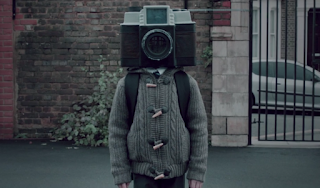
Does our obsession with technology and documentation go too far? This powerful, short film titled “The Boy With The Camera Face” by filmmaker Spencer Brown is a satirical fairy tale about a boy born with a camera instead of a head who cannot escape the lens. From the moment of his birth, everything about his life is recorded. Does this sound like our students, or maybe you?


The Boy with a Camera for a Face from Spencer Brown on Vimeo.


The narration by Steven Berkoff tells the story in a nursery rhyme or somewhat Seussical way. As the tale unfolds, it’s clear that the effect on people’s fixation with the daily life of the “Camera Boy” is hypnotic. They stop noticing things around them and become transfixed as if in a catatonic state -- a scenario we witness on a daily basis with our students on their devices.

Perhaps even more important is the issue of privacy in the always-on world. As educators, we want to take advantage of the liminal web while still preserving the anonymity of our learners. That task is a lot harder today then it was a decade ago.

This award-winning film is worth 14 minutes of your time. It puts modern reality into focus in a beautiful, strange, and moving way.

Thursday, January 21, 2016

The Great Homework Debate: Where Does Authenticity Meet Redundancy?

Source: anotherplace.tv

It may seem counterintuitive, but homework doesn’t get nearly the attention it deserves. For all the well-intentioned noise, the Great Homework Debate is still one of the least publicized (and most internalized) consternations for today's students and families.

Yes, there is a deep Lexus Nexus catalogue of articles about the pros and cons of homework in American education. And yes, Alfie Kohn has a quotable list of jeremiads against the ills of busy-work. But the real tug-of-war takes place at dinner tables each night, when school children have not yet completed their hours of worksheets.

This same push-and-pull continues in faculty meetings where educators wrestle with “how much is too much.” The rebranding of homework as “flipping the classroom” has only muddied the waters. Now instead of reading 20 pages of the textbook, kids watch 20 minutes of instructional videos. At bedtime, though, the question still lingers: where do authentic practice and independent learning meet redundant worksheets and desultory assignments?

Many institutions that have investigated the homework issue report increased learning when nightly burdens are lessened. Especially when it comes to ”studying,” the shifting of emphasis away from teacher-prescribed tasks to student-initiated review makes a world of difference in mastery and understanding.

Source: anotherplace.tv

We’ve offered ideas before about ways to teach without worksheets. This concept can hopefully apply to homework, too. Some terrific ideas come from this Jo Townsend60 Minutes” video from Australia. It addresses the decline in time spent with friends and hobbies. It also mentions that 71 percent of parents feel they aren’t spending enough quality time with their children. They are instead worrying with homework and running the household. The video ends by referencing Finland, where students have no homework at all, and which consistently outranks other nations in its literacy achievements.


60 Minutes, 'Homework' infographic. from anotherplace.tv on Vimeo.
Related Posts Plugin for WordPress, Blogger...


Pin It