Thursday, November 13, 2014

What Role Should Blogs Play In The Life Of An Educator?

Source: ASIDE, 2014

A recent #EdChat Radio show on the Bam! Radio Network discussed the topic of teacher blogging. We were invited to participate in the broadcast with hosts Tom Whitby (@tomwhitby) and Nancy Blair (@blairteach). The conversation on "What Role Should Blogs Play In The Life Of An Educator?" broached a range of topics about online writing and publishing for both teachers and students. Check out the podcast, or download the show for free from iTunes.

A few of the insights included:
Source: Jackstreet;
Bam! Radio Network
  • Blogging levels the playing field; expressing one's opinions about education is no longer about status or access
  • Writing a blog is not just about publishing, but it is also about sharing in a community of fellow educators
  • Blogging validates the voice of each teacher and allows niche ideas to rise to the mainstream
  • Blogging is the new normal for student writing, and teachers can model this literacy
  • Commenting is an important skill for young people to master and also an avenue for all teachers to enter the conversation
  • Publishing adds a pleasant pressure to stay relevant and maintain helpful resources
For other information about teacher podcasts and online broadcasts, we recommend the full slate of educational programs on the Bam! Network. Also, take a look at the article, "Add #EdChat Radio To Your PLN."

Sunday, November 9, 2014

Veterans Day: What We Don't See

Source: American Psychiatric Association
Veterans Day infographics provide a wide range of data to help us discuss this holiday with our students, and we've written a number of posts to remember the brave men and women who served so valiantly to protect our freedoms. But perhaps the infographic above from the American Psychiatric Association is the most powerful to cross our path. It's not about the numbers of veterans from different wars, or the history of the day; instead, it represents the staggering statistics about the wounds that plague the minds of so many of our veterans.

Source: American Psychiatric Association

It is difficult to get an official count of the number of soldiers with physical injuries who were wounded in Afghanistan and Iraq. According to the website, Costs of War, there are over 970,000 disability claims on record to the Veterans Administration as of March 2014, whereas the Department of Defense official count is just over 50,000. The DoD does not make this information easily accessible, and many of the news releases don't have direct links to the data.


Source: Takepart
When we add in the information for suicide and mental health issues for the wounds we can't readily see, the numbers go off the charts. The sad truth is there are far more injuries than what meet the eye. The infographic called Combating Military and Veteran Suicide and Supporting Mental Health Care points to an alarming statistic that one veteran commits suicide every 65 minutes.

While we don't want to dwell on such depressing facts with our students, we do want to educate them to understand that the costs of war are far greater than they may think. Just because someone is not physically hurt does not mean he or she is not hurting.

Thank you to all the veterans who sacrificed so much for us.

For other resources, please see:

Monday, November 3, 2014

The Best Videos Explaining Midterm Elections

Source: Yahoo! News
Many students – and many Americans – have a difficult time understanding why off-year elections are so important. Part of this confusion originates in the muddle of yard signs and Congressional ads during non-presidential years. A larger reason for the uncertainty, however, arises from the uneasy access to helpful information. Even in today's glut of online media, it can be challenging to find simple, effective tools to explain the midterm election process. The videos we collected below are some of the best resources for helping children learn about what's at stake this November and why every election is critical.

Also, check out "Does Voting Matter? Interactive Visualizations To Learn About The Midterm Elections" to find digital tools and infographics to teach students about modern civics.

Senate Midterm Elections Explained - Yahoo! News


Why You Should Care More About Midterm Elections - TestTube


The 2014 Midterms, Explained In 8 Bits - Vox


America's Midterm Elections Explained - CCTV America


Sunday, November 2, 2014

Does Voting Matter? Interactive Visualizations To Learn About The Midterm Elections

Source: Vote Easy from Project Vote Smart
We've long admired the election resources from Project Vote Smart, but some new interactive tools are taking the 2014 midterms to mind-boggling levels. The non-partisan consortium has designed two dynamic interfaces that explore issues and candidates across the country. Students of any level will be mesmerized by the vivid graphics as they accumulate an understanding about individual politicians and their votes.

Source: Political Galaxy from Project Vote Smart
The Vote Easy site uses kid-friendly animations that allow users to choose a state and zip code to hone in on candidates in their neighborhoods. The politicians are rated on "courage" depending on whether or not they agreed to answer Vote Smart's questionnaire about key issues. Students can select areas of interest, such as "Education," "Energy," or "Environment," to align their personal viewpoints with the candidates who agree with them. Each contestant's face hops backward or forward in proportional "fit" as students indicate how important a topic is to them. This clever interaction reinforces the notion that voting is relative, since citizens care about issues in varying degrees.

Source: Share America (click for full graphic)
The Political Galaxy site drills down on every state and national figure across a spinning universe of politicians. By inputting either a name or zip code, students can navigate an impressive array of facts about each official, including votes, speeches, positions, funding, and ratings across a firmament of topics. The Political Galaxy page, by the way, works fine on mobile platforms, while Vote Easy's Flash encoding doesn't work on iOS devices.

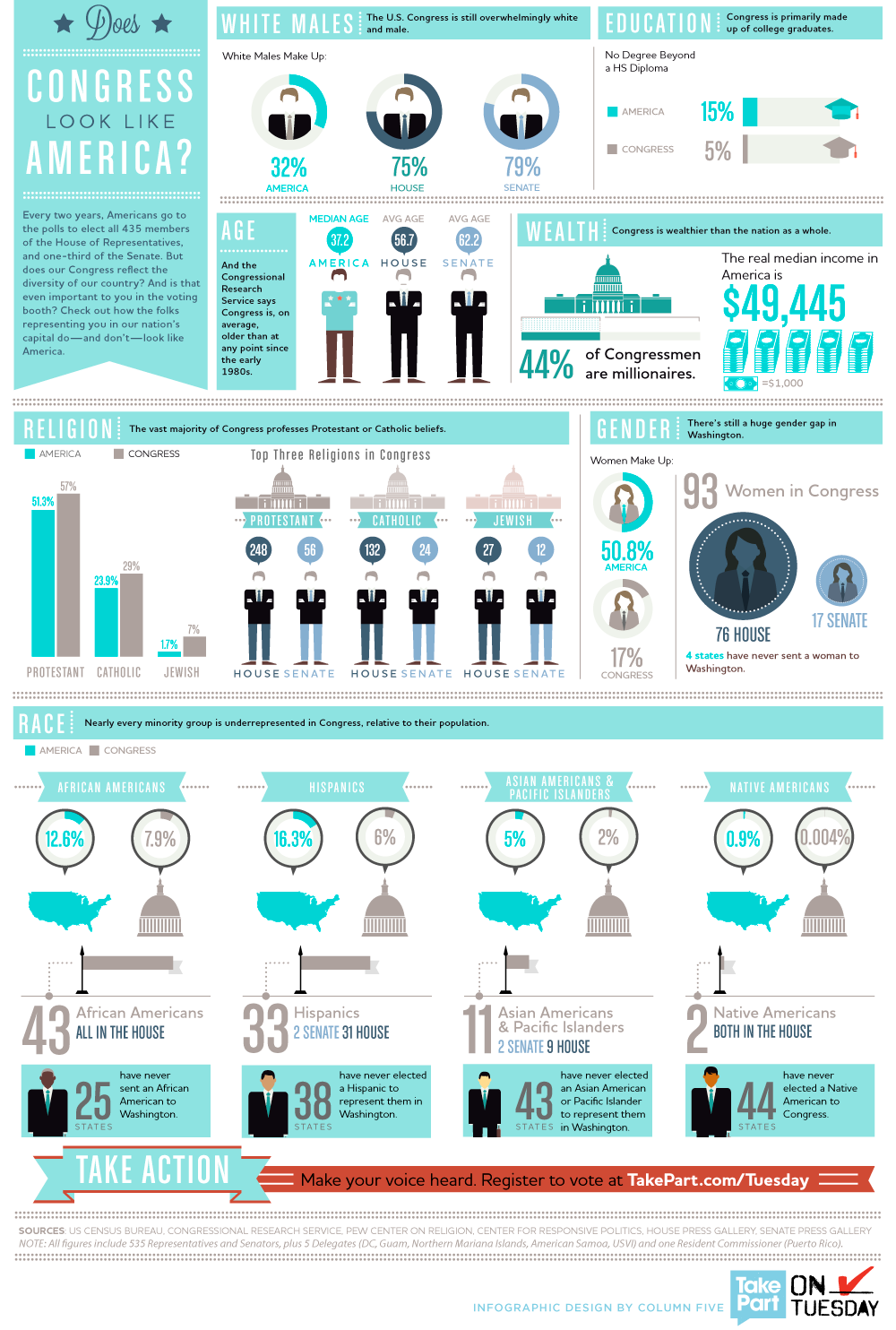
The problem in getting students excited about non-presidential elections is the same obstacle keeping actual voters away from the polls: they need a reason to care. Most Americans do not internalize the critical importance of Congressional and local contests. To address this predicament, several high-quality infographics highlight the significance of this year's fights. The "All About The 2014 Midterm Elections" graphic from Share America offers a clean layout of compelling facts to tutor students and citizens in what's at stake this November.

Source: Bloomberg Politics
Bloomberg Politics presents a simple but effective interactive infographic that demonstrates how "A Really Small Slice Of Americans Get To Decide Who Will Rule The Senate." In this relational map, the turquoise states shift in size and location as they pinpoint a handful of voters who will determine the balance of Congressional power.

Source: CivicYouth.org
Two other infographics try to inspire younger voters from opposite directions. The "Why Young People Don't Vote" image from CivicYouth.org emphasizes the impediments keeping twenty-somethings away from the polls.

On the other hand, the "Vote With Confidence" placard from Bing's Voter Guide attempts to assuage the stress that young citizens feel over their lack of political understanding.

Source: Bing Voter Guide
Other online resources that help teachers and students appreciate the pivotal role that off-year elections play include:
Glenn Wiebe from History Tech, one of our favorite educational blogs, also introduced us to the Voting Information Project, which provides "cutting-edge technology tools that give voters access to the customized information they need to cast a ballot on or before Election Day." One of these tools is an embeddable widget that helps voters unearth essential details, such as polling locations and ballot requirements.


For other lesson ideas about elections and government, we recommend:

Thursday, October 30, 2014

Real Time Lets Students Visualize Real Life

Source: Alibaba In Real Time
We've written about data visualizations in real time in the past, including the Internet In Real Time and Breathing Earth. Our students are always amazed to watch the speed at which the data changes, and they're even more curious about how it is compiled. While the numbers are staggering for the sheer volume of data for social media and the Internet, they pale in comparison to those for the Chinese company Alibaba in real time.

Since we play The Stock Market Game in our classes, our students were well aware of Alibaba and its initial public offering (IPO) this fall. They know that it was the largest IPO in history and that it trades on the New York Stock Exchange. Now they know why.

We had the students open two screens to compare Amazon data on the Internet In Real Time with Alibaba to see just how big this global wholesale trade giant is. At the end of one class period, Amazon orders were 160,000 compared to Alibaba’s 1.7 million. That got their attention and drove them to make more comparisons with other information between the two sites. It also led to discussions about the role social media plays in financial success.

Source: The Internet In Real-Time
Real time data visualizations provide kids with real world connections to what they know and recognize. They pique their curiosity; that's their power. As with other visual content, there are a host of possibilities for using them in the classroom to demonstrate the strength numbers have on perception and success.

Aside from the fascination in watching the aggregation of data, it also is a pointed reminder that this could be done for an individual as well.

For other resources, please see:

Tuesday, October 28, 2014

Halloween Safety: A Worthwhile Infographic

Source: Safe Kids
With the plethora of Halloween infographics about costumes, candy, and traditions, perhaps the most important one for this year is the Halloween Safety infographic from Safe Kids. This much anticipated holiday deserves our attention, and we should make time to talk about safety with our students. This infographic is a perfect place to start. It provides some quick tips that can be used as discussion starters. It's a worthy one to share with parents, too, especially since some of the statistics are scary.

For more resources, please see:

Tuesday, October 14, 2014

Seeing Is Believing: Visual vs. Linear Content

Source: ASIDE, 2014
In order for our learners to see how designing information changes how it is viewed, the students this year placed their visual infographics side-by-side with their linear notes to see the transformation. It was the “ah ha” moment, when they could examine how the delivery of content mattered and how the deliberate choices in font hierarchy, color selection, and placement changed the way others perceived the ideas.

Source: ASIDE, 2014
Reflecting on their own work, the students saw firsthand how media could change and enhance a message. Paralleling the visual and linear content enabled them to observe the full effect of how design could give content power. It provided context for the information.

Source: ASIDE, 2014
For more than four years, we’ve been working with our students to think about the design of information and how presentation changes its perception. This newest crop of acronym infographics exceeded our expectations, in part because we worked closely to develop a stronger understanding of both the elements and principles of design. As with any other skill, students need guidance in this area. Design literacy requires the same instruction as media and financial literacies.

To help them better understand "the tools to make art" as compared to "how to use the tools to make art," we supplied them with the charts below to clearly separate the elements and principles of design.

Source: Split Complementary

The students were given other resources and guidelines to help train their eyes to think like designers. They looked at infographics created by professionals and deconstructed what they saw. The process of learning to look at visual information is a core skill of graphicacy. The ability to decode information helps students transfer these visual thinking concepts into creating their own work.

Of course, before the students started, they researched and gathered the information from various websites as notes. This included citations for the resources. We stressed that quality infographics source the information at the bottom. Our students know we stand by our mantra, “Content First, Pretty Second.” Without strong content and the evidence to support it, the message is questionable.

Seeing the shift from linear to visual helped the students teach others about their topic. It’s the same art of persuasion we refer to in media literacy. The best way for learners to understand how to manipulate information is to do it. Attraction and appeal matter, and perhaps it’s a lesson for us as educators as well. Designing information provides context for content; the more visual it is, the stronger the retention.

For other resources, please see:
Related Posts Plugin for WordPress, Blogger...


Pin It